13 Data visualization
For a report on research report, an advantage of a visualization of the most important result can…
- help readers understand the most important result, and
- help readers remember the most important result, and
- help readers skimming the paper understand the most important result before —- or without —- reading the report.
13.1 Flaws to avoid
Let’s discuss flaws in the visualization below and how to address these flaws:
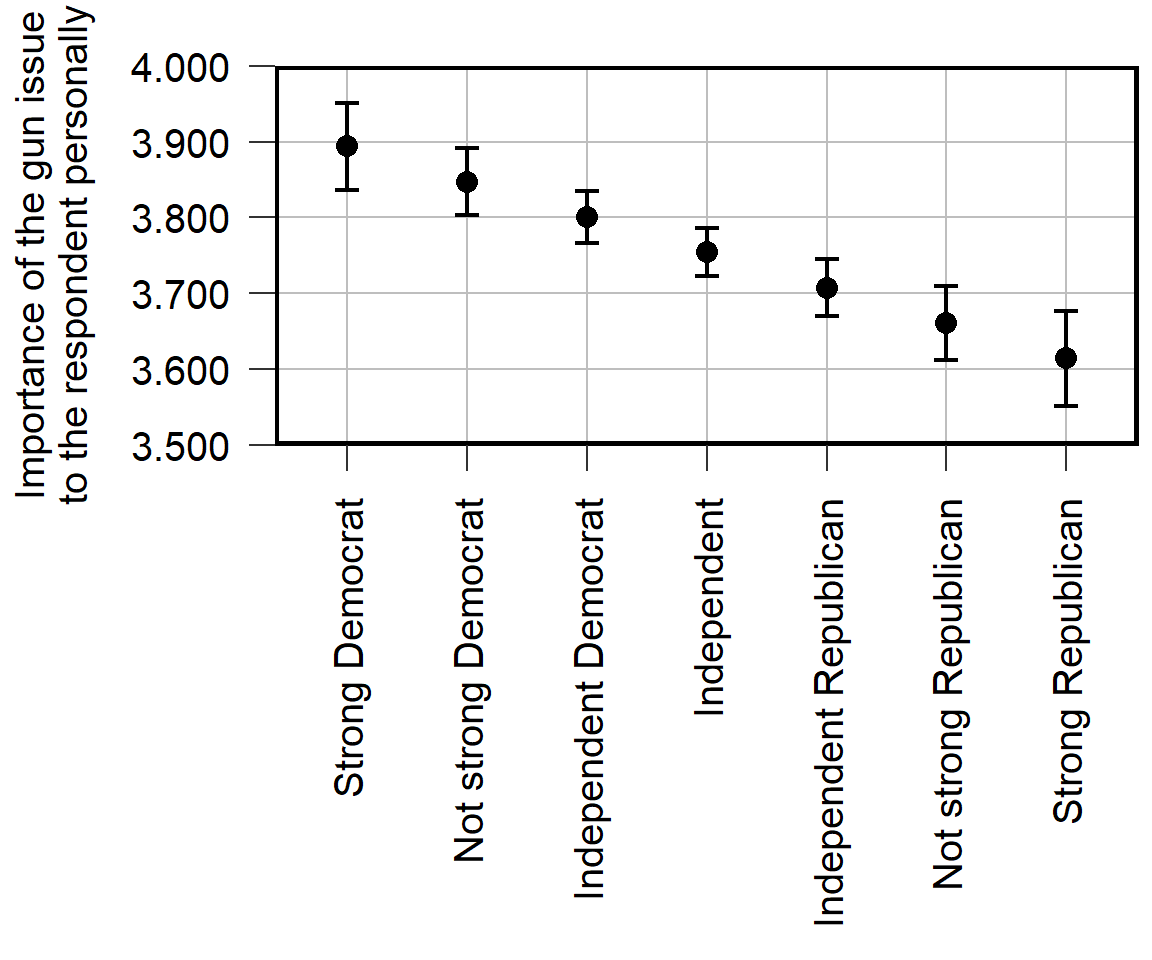
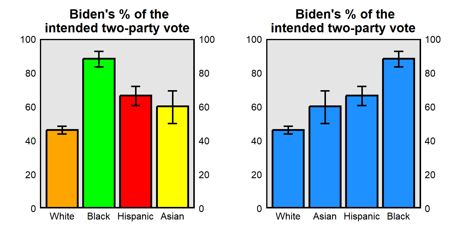
Avoid vertical text, if possible, because vertical text is more difficult to read than horizontal text.
Eliminate “chartjunk” that distracts from the key idea of the figure. For example, the plot above doesn’t need the gridlines or the axis ticks.
Use measures and scales that communicate substantive sizes. For the plot, the point estimate is about 3.9 for strong liberals and about 3.6 for strong conservatives. Is that a large difference? The plot isn’t clear what the scale is, so it’s not clear how much the plotted difference matters.
Include a note that explains the visualization, so that the visualization can stand alone and so that readers do not need to find that information in the text. For example, are the error bars 95% confidence intervals or 83.4% confidence intervals or standard errors or something else? Are the estimates adjusted for controls such as age and race?
Report results to a reasonable number of digits. For estimates of political phenomena such as how important an issue is to strong liberals, we would be lucky to estimate that correctly to 2 or 3 significant digits.
Report specific estimates that are worth citing. Suppose that a reader wanted to report the point estimate for independents in the visualization. Instead of readers estimating that the point estimate is 3.76, report the specific number in the visualization or a figure note.
Avoid unnecessary assumptions of constant effects. The visualization was based on a linear regression that plots a straight line of best fit through the points, so the reason why the mean is lower among strong Republicans than among Independents is due to that linear assumption. In the data, though, the mean is higher among strong Republicans than among Independents
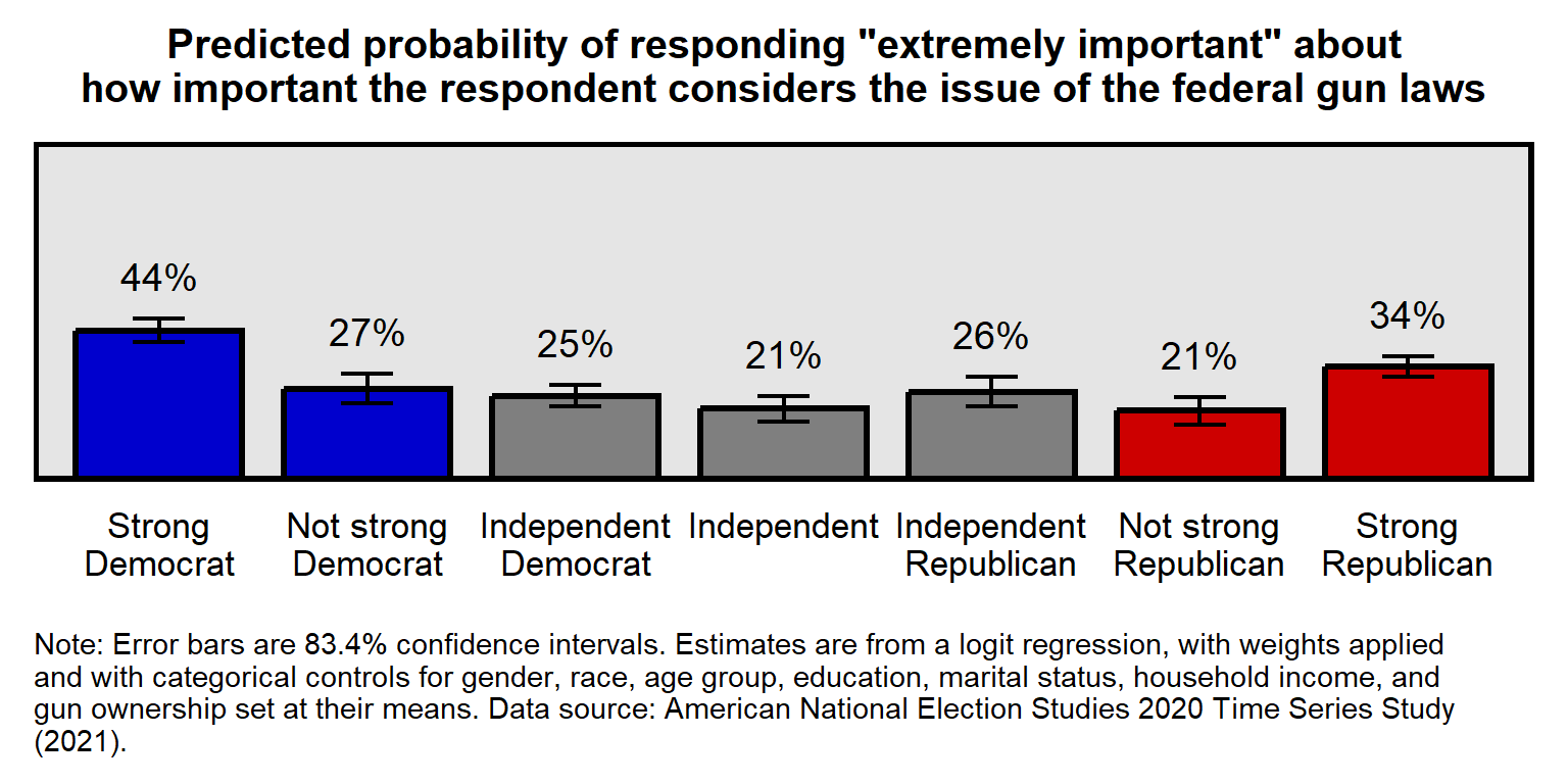
Below is a suggested improved visualization of the same data but addressing these flaws, such as using an easier-to-understand outcome of a percentage of respondents that rated their assessment of importance at the highest level on the scale.
Let’s discuss a few more flaws:
Communicate uncertainty in any uncertain estimates. 95% confidence intervals for comparing an estimate to a specific value. 83.4% confidence intervals for comparing an estimate to another estimate. Sometimes sample size might be sufficient for indicating uncertainty, if the sample size is large.
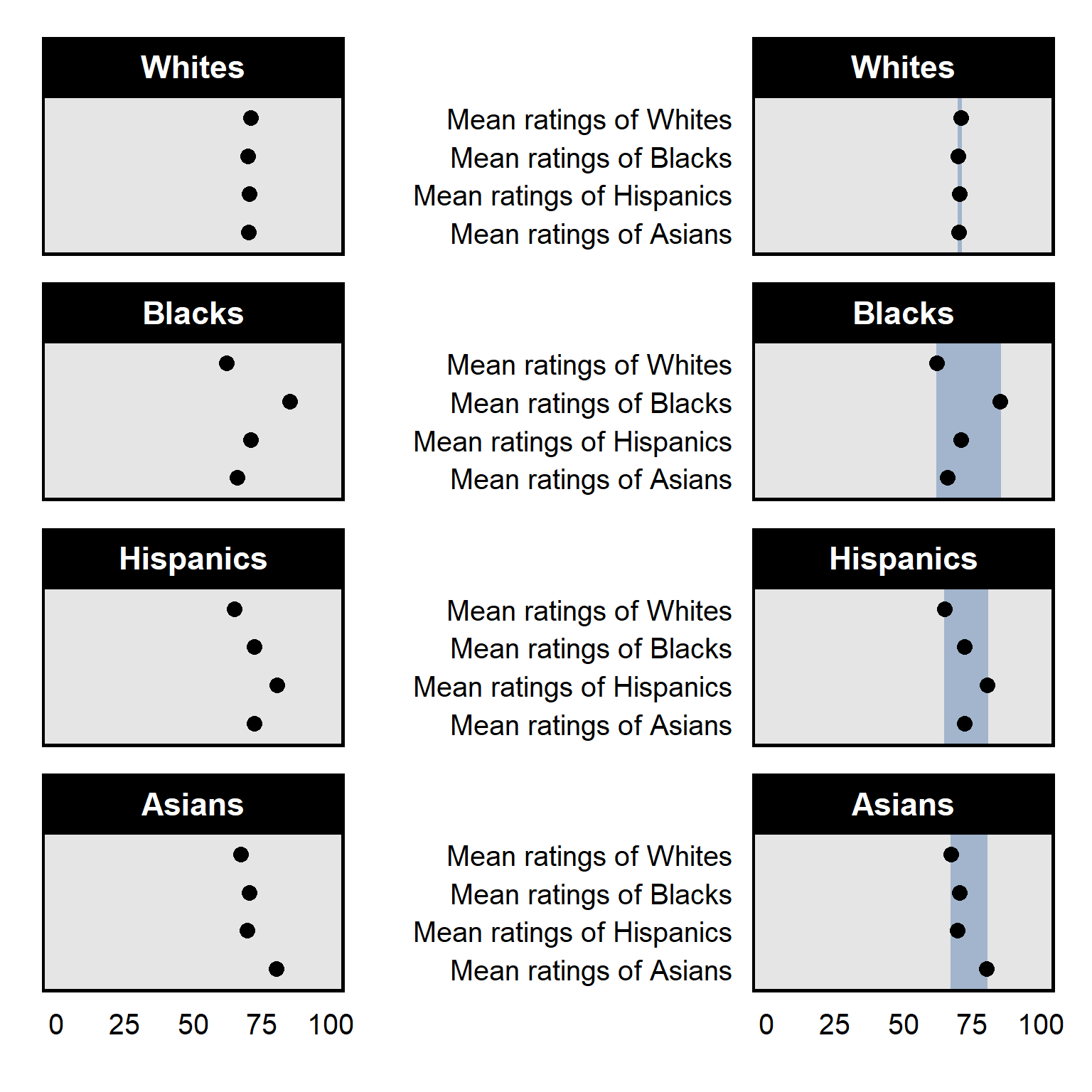
Don’t communicate information in color that will not be communicated in grayscale. For example, the color plot is from Pessim and Pojman 2022 “Visualizing Racial-Ethnic Differences in the Division of Housework among Different-Sex Couples in the United States”:
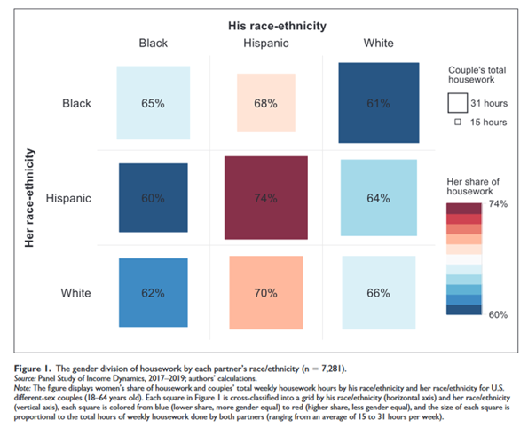
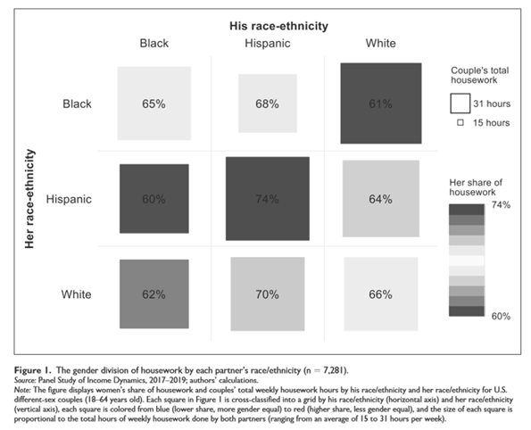
- Consider whether color helps interpretation. For example, the left plot below has a different color for each column, along with a label for each column. Such redundancy is not necessarily bad and can help interpretation if the color is intuitive, such as for U.S. politics using blue for Democrats and red for Republicans. But in the plot below the colors do not correspond intuitively to race, so the color can make the plot more difficult to process. (The plot to the right below standardizes the color and orders the columns from low to high, which can also help interpretation of the plot.)
- Emphasize the key point with shading and/or a figure title:
See Zigerell 2022 “Introducing Political Science Students to Data Visualization Strategies” in the Journal of Political Science Education for a discussion of data visualization. See my gallery of types of R tidyverse plots and corresponding code for R code for common types of visualization. For this course, it’s fine to adapt this code to your analysis and to go beyond that code.
13.2 83.4% confidence intervals
95% confidence intervals are useful for assessing whether there is sufficient evidence at p<0.05 that an estimate differs from a specific number. The p-value will be p=0.05 for a test of the null hypothesis that the estimate differs from a number at the edge of the 95% confidence interval; the p-value will be p<0.05 for a test of the null hypothesis that the estimate differs from a number outside the 95% confidence interval; and the p-value will be p>0.05 for a test of the null hypothesis that the estimate differs from a number inside the 95% confidence interval.
So, for the top panel of the plot below, the 95% confidence interval for the mean estimate among males does not contain 46.9, so that indicates that the analysis provided sufficient evidence at p=0.05 that the mean estimate among males is not 46.9. However, that p-value is about 46.9 as a specific number for which we have no uncertainty. But we need to calculate a different p-value for a test of whether the estimate for males differs from the 46.9 point estimate of the mean for females, because that 46.9 point estimate for females has been measured with uncertainty.
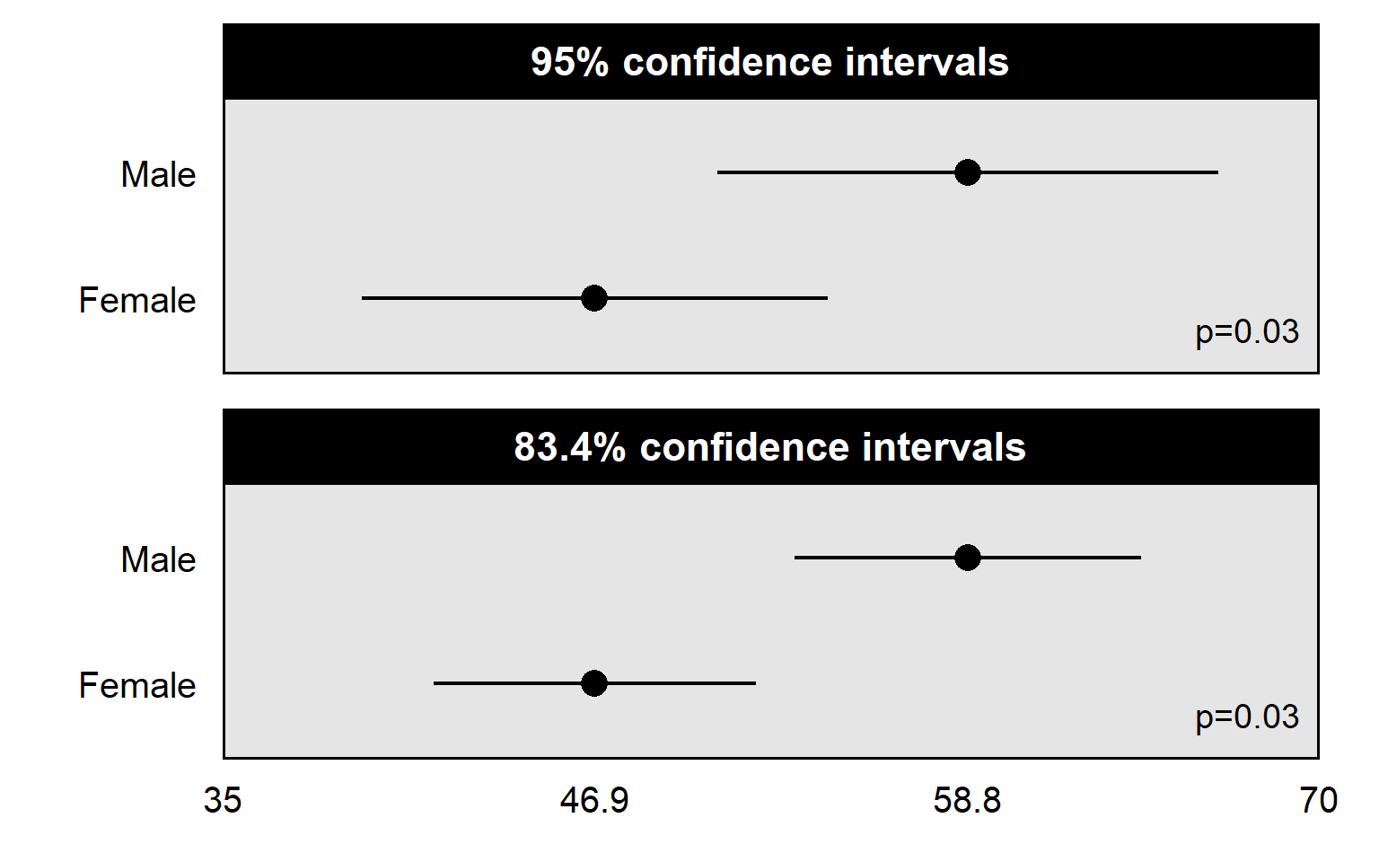
83.4% confidence intervals are better for assessing whether there is sufficient evidence at p=0.05 that one estimate differs from another estimate. In the plot above, the p-value is p=0.03 for a test of whether the mean estimate among males differs from the mean estimate among females. The 83.4% confidence intervals not overlapping each other indicates that the p-value is less than p=0.05 for a test of whether those estimates differ from each other. But the 95% confidence intervals overlapping a lot with each other isn’t as useful for helping us assess whether the mean estimate among males differs at p<0.05 from the mean estimate among females.
A general rule is to plot 95% confidence intervals when the intended comparison is of an estimate to a known number, and to plot 83.4% confidence intervals when the intended comparison is of an estimate to another estimate. The 83.4% confidence interval is an approximation based on particular assumptions but should be close enough for most analyses to be useful.
Sample practice items
Suppose that we estimated the mean approval about police among Democrats and among Republicans, and we wanted to assess whether the the mean approval among Democrats differs from the mean approval among Republicans. We plot the mean estimate among Democrats and the mean estimate among Republicans. Which confidence interval would be better to plot for each of these estimates, if our intent is to assess whether each of these estimates is above 50 percent support?
- 83.4% confidence intervals
- 95% confidence intervals
Answer
- 95% confidence intervals
The intended comparison is to a known number – 50 percent – so 95% confidence intervals are better in this situation.
Suppose that we estimated the mean approval about police among Democrats and among Republicans, and we wanted to assess whether the the mean approval among Democrats differs from the mean approval among Republicans. We plot the mean estimate among Democrats and the mean estimate among Republicans. Which confidence interval would be better to plot for each of these estimates, if our intent is to assess whether the estimate among Democrats differs from the estimate among Republicans?
- 83.4% confidence intervals
- 95% confidence intervals
Answer
- 83.4% confidence intervals
The intended comparison is between estimates, so 83.4% confidence intervals are better in this situation
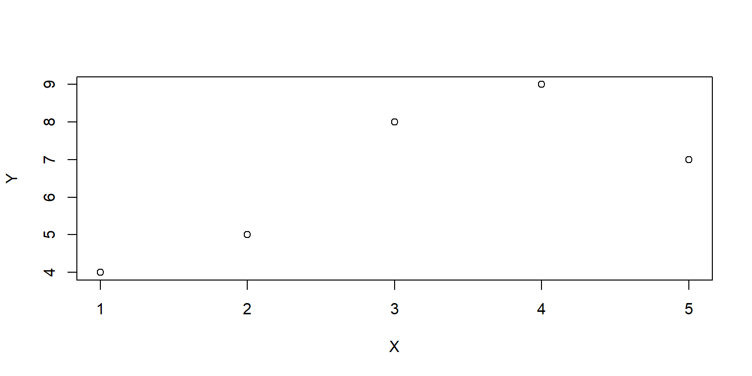
Simple plot in base R
Let’s get data for two variables: X and Y. Let’s use the combine function c to combine numbers, and then let’s use the assign function <- to assign those numbers to X and Y. Then let’s plot a scatterplot of X and Y:
13.3 Loading the tidyverse package
One of the packages that can go beyond the base R functions is called the tidyverse, which is useful for visualizing data. To use a package in R, the package must first be put onto your computer using a command such as install.packages(“tidyverse”), which will download the tidyverse package to your computer. The dependencies=TRUE option will install any packages that the tidyverse depends on, and the repos=“http://cran.us.r-project.org” option will draw from the repository of CRAN (the Comprehensive R Archive Network):
Once an R package is on your computer, the package can be loaded into a session of R using the library command. The output from #library(tidyverse) below should indicate that tidyverse packages such as ggplot2, tibble, and stringr have been attached. The output should also indicate conflicts involving functions with the same name in which one function masks (hides) another function.
The install.package function will be needed only once for a package, unless you are re-installing or updating a package. But the library function will be needed in each session of R in which you want to use that package.
13.4 Getting data into R
Let’s get data that we can plot. One way to get data into R is through a tribble function from the tidyverse package. The setup of the tribble function is to use a tilde (~) to indicate column headers and then indicate the data in the columns. The tribble code below has four columns: PID (for party identification), PE (a point estimate “best guess” for the observed frequency, which in this case is the predicted probability of a respondent selecting “extremely important” to indicate how important the respondent considers the issue of the federal gun laws), and CILO and CIHI (respectively, the low end and high end of confidence intervals that provide an estimate of the uncertainty in the point estimate). The assignment operator <- assigns these data to a dataset called GUNIMP.
GUNIMP <- tribble(
  ~PID                     , ~PE      , ~CILO    , ~CIHI    ,
  "Strong\nDemocrat"       , 0.4445886, 0.4089648, 0.4802125,
  "Not strong\nDemocrat"   , 0.2726622, 0.2290617, 0.3162628,
  "Independent\nDemocrat"  , 0.2509012, 0.218784 , 0.2830185,
  "Independent"            , 0.2135729, 0.1755062, 0.2516396,
  "Independent\nRepublican", 0.2633814, 0.218896 , 0.3078668,
  "Not strong\nRepublican" , 0.2074255, 0.1671848, 0.2476663,
  "Strong\nRepublican"     , 0.3374613, 0.308117 , 0.3668057)

GUNIMP
# A tibble: 7 × 4
  PID                          PE  CILO  CIHI
  <chr>                     <dbl> <dbl> <dbl>
1 "Strong\nDemocrat"        0.445 0.409 0.480
2 "Not strong\nDemocrat"    0.273 0.229 0.316
3 "Independent\nDemocrat"   0.251 0.219 0.283
4 "Independent"             0.214 0.176 0.252
5 "Independent\nRepublican" 0.263 0.219 0.308
6 "Not strong\nRepublican"  0.207 0.167 0.248
7 "Strong\nRepublican"      0.337 0.308 0.367
Other methods for getting data into R include functions such as read.csv for csv files, using code such as…
read.csv(file.choose())
…to open a dialog box so that you can navigate to the file. Or code such as:
read.csv(file.csv)
…which would open the file named “file.csv” in the working directory (The R function getwd() will get the working directory, and the function setwd() can be used to set the working directory). Or code such as:
read.csv(G:/plots/file.csv)
…which would open the file named “file.csv” in the G:/plots directory.
13.5 Setting up a ggplot
Now, let’s start the visualization using the ggplot function. The first line of the ggplot code will tell ggplot which data to use and which variables are to be on the x-axis and the y-axis.
GUNIMP <- tribble(
  ~PID                     , ~PE      , ~CILO    , ~CIHI    ,
  "Strong\nDemocrat"       , 0.4445886, 0.4089648, 0.4802125,
  "Not strong\nDemocrat"   , 0.2726622, 0.2290617, 0.3162628,
  "Independent\nDemocrat"  , 0.2509012, 0.218784 , 0.2830185,
  "Independent"            , 0.2135729, 0.1755062, 0.2516396,
  "Independent\nRepublican", 0.2633814, 0.218896 , 0.3078668,
  "Not strong\nRepublican" , 0.2074255, 0.1671848, 0.2476663,
  "Strong\nRepublican"     , 0.3374613, 0.308117 , 0.3668057)

ggplot(data=GUNIMP, aes(x=PID, y=PE))
Notice that the \n in the PID text inserts a line break in the text.
Note also that ggplot defaults to axes that fit the data assigned to x and y. For example, the range of the y-axis is just enough to fit the low PE value of 0.2074255 and to fit the high PE value of 0.4445886.
13.6 Geoms
Now, let’s add columns to the plot. The new line below involves geom_col, but other geoms are available such as geom_point and geom_rect. Note that the code below connects the two ggplot commands with a plus sign.
#library(tidyverse)

GUNIMP <- tribble(
  ~PID                     , ~PE      , ~CILO    , ~CIHI    ,
  "Strong\nDemocrat"       , 0.4445886, 0.4089648, 0.4802125,
  "Not strong\nDemocrat"   , 0.2726622, 0.2290617, 0.3162628,
  "Independent\nDemocrat"  , 0.2509012, 0.218784 , 0.2830185,
  "Independent"            , 0.2135729, 0.1755062, 0.2516396,
  "Independent\nRepublican", 0.2633814, 0.218896 , 0.3078668,
  "Not strong\nRepublican" , 0.2074255, 0.1671848, 0.2476663,
  "Strong\nRepublican"     , 0.3374613, 0.308117 , 0.3668057)

ggplot(data=GUNIMP, aes(x=PID, y=PE)) +
  geom_col()
Note that, for the column geom, the columns start at zero.
Options can be added to commands, like below with size, width, color, and fill for the geom_col command. For geom_col, “size” is for the thickness of the outline of the column, and “width” is for the width of a column. For a geom that is filled, “color” is for the outer edge of the geom, and “fill” is for the inside of the geom. The rep.int function tells R to repeat [the first thing in parentheses] for [the second thing in parentheses] number of times, so that, for example, rep.int(“blue3”,2) returns “blue3”, “blue3”. The c() function combines elements, so that, for example, c(1,4) would return 1 4.
#library(tidyverse)

GUNIMP <- tribble(
  ~PID                     , ~PE      , ~CILO    , ~CIHI    ,
  "Strong\nDemocrat"       , 0.4445886, 0.4089648, 0.4802125,
  "Not strong\nDemocrat"   , 0.2726622, 0.2290617, 0.3162628,
  "Independent\nDemocrat"  , 0.2509012, 0.218784 , 0.2830185,
  "Independent"            , 0.2135729, 0.1755062, 0.2516396,
  "Independent\nRepublican", 0.2633814, 0.218896 , 0.3078668,
  "Not strong\nRepublican" , 0.2074255, 0.1671848, 0.2476663,
  "Strong\nRepublican"     , 0.3374613, 0.308117 , 0.3668057)

ggplot(data=GUNIMP, aes(x=PID, y=PE)) +
  geom_col(linewidth=1.1, width=0.8, color="black",
           fill=c(rep.int("blue3",2), rep.int("gray50",3), rep.int("red3",2)))
Here is equivalent code using the geom for points. Note that the y-axis reverts to merely fitting the data instead of starting at zero:
#library(tidyverse)

GUNIMP <- tribble(
  ~PID                     , ~PE      , ~CILO    , ~CIHI    ,
  "Strong\nDemocrat"       , 0.4445886, 0.4089648, 0.4802125,
  "Not strong\nDemocrat"   , 0.2726622, 0.2290617, 0.3162628,
  "Independent\nDemocrat"  , 0.2509012, 0.218784 , 0.2830185,
  "Independent"            , 0.2135729, 0.1755062, 0.2516396,
  "Independent\nRepublican", 0.2633814, 0.218896 , 0.3078668,
  "Not strong\nRepublican" , 0.2074255, 0.1671848, 0.2476663,
  "Strong\nRepublican"     , 0.3374613, 0.308117 , 0.3668057)

ggplot(data=GUNIMP, aes(x=PID, y=PE)) +
  geom_point(size=5, shape=21, color="black",
             fill=c(rep.int("blue3",2), rep.int("gray50",3), rep.int("red3",2)))
Let’s add error bars to indicate the uncertainty in the point estimates. First, let’s put the error bar line before the geom_col() line, to illustrate how ggplot layers lines of code, with, in this case, the error bars plotted first with the points plotted on top of the error bars.
#library(tidyverse)

GUNIMP <- tribble(
  ~PID                     , ~PE      , ~CILO    , ~CIHI    ,
  "Strong\nDemocrat"       , 0.4445886, 0.4089648, 0.4802125,
  "Not strong\nDemocrat"   , 0.2726622, 0.2290617, 0.3162628,
  "Independent\nDemocrat"  , 0.2509012, 0.218784 , 0.2830185,
  "Independent"            , 0.2135729, 0.1755062, 0.2516396,
  "Independent\nRepublican", 0.2633814, 0.218896 , 0.3078668,
  "Not strong\nRepublican" , 0.2074255, 0.1671848, 0.2476663,
  "Strong\nRepublican"     , 0.3374613, 0.308117 , 0.3668057)

ggplot(data=GUNIMP, aes(x=PID, y=PE)) +
  geom_errorbar(aes(ymin=CILO, ymax=CIHI), linewidth=0.75, width=0.25, color="orange") +
  geom_point(size=5, shape=21, color="black",
             fill=c(rep.int("blue3",2), rep.int("gray50",3), rep.int("red3",2)))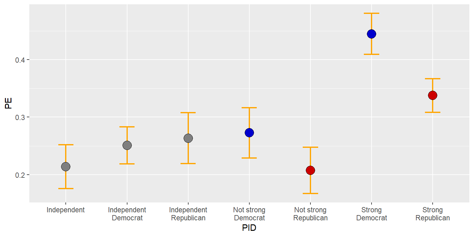
But let’s put the error bars on top of the points.
#library(tidyverse)

GUNIMP <- tribble(
  ~PID                     , ~PE      , ~CILO    , ~CIHI    ,
  "Strong\nDemocrat"       , 0.4445886, 0.4089648, 0.4802125,
  "Not strong\nDemocrat"   , 0.2726622, 0.2290617, 0.3162628,
  "Independent\nDemocrat"  , 0.2509012, 0.218784 , 0.2830185,
  "Independent"            , 0.2135729, 0.1755062, 0.2516396,
  "Independent\nRepublican", 0.2633814, 0.218896 , 0.3078668,
  "Not strong\nRepublican" , 0.2074255, 0.1671848, 0.2476663,
  "Strong\nRepublican"     , 0.3374613, 0.308117 , 0.3668057)

ggplot(data=GUNIMP, aes(x=PID, y=PE)) +
  geom_point(size=5, shape=21, color="black",
             fill=c(rep.int("blue3",2), rep.int("gray50",3), rep.int("red3",2))) +
geom_errorbar(aes(ymin=CILO, ymax=CIHI), linewidth=0.75, width=0.25, color="orange") 
13.7 Saving plots
We can send a plot to a file in our working directory using a ggsave command, with commands such as…
…which saves to the G:/plots folder. Or with commands such as…
…which saves to the working directory.
The ggsave command doesn’t get added as a plus (+) line to the ggplot command but instead is below the ggplot set of commands.
To get the working directory, use the command
The command openFile in the package PBSmodelling can be used to automatically open a file, such as the code below, if there is an available D drive:
install.packages("PBSmodelling", repos="http://cran.us.r-project.org")
#library(PBSmodelling)
openFile("D:R plot gunIMP.pdf")
13.8 Factors for ordering elements
ggplot puts the elements in a character vector into alphabetical order, but, in our case, it is better to order the levels of partisanship from the political left to the political right. To do this, let’s make the PID character vector into a factor.
R permits multiple datasets to be loaded at once per session, so the $ is a way to tell R which dataset to get a vector from. We could have multiple datasets in an R session that have a vector named PID, so we need to tell R which PID vector we want. In code such as GUNIMP$PID, the dollar sign ($) separates the dataset from the vector in the dataset, so that, GUNIMP$PID refers to the vector PID in the dataset GUNIMP.
For this plot, let’s go back to columns.
#library(tidyverse)

GUNIMP <- tribble(
  ~PID                     , ~PE      , ~CILO    , ~CIHI    ,
  "Strong\nDemocrat"       , 0.4445886, 0.4089648, 0.4802125,
  "Not strong\nDemocrat"   , 0.2726622, 0.2290617, 0.3162628,
  "Independent\nDemocrat"  , 0.2509012, 0.218784 , 0.2830185,
  "Independent"            , 0.2135729, 0.1755062, 0.2516396,
  "Independent\nRepublican", 0.2633814, 0.218896 , 0.3078668,
  "Not strong\nRepublican" , 0.2074255, 0.1671848, 0.2476663,
  "Strong\nRepublican"     , 0.3374613, 0.308117 , 0.3668057)

GUNIMP$PID <- factor(GUNIMP$PID, levels=GUNIMP$PID)

ggplot(data=GUNIMP, aes(x=PID, y=PE)) +
  geom_col(linewidth=1.1, width=0.8, color="black",
           fill=c(rep.int("blue3",2), rep.int("gray50",3), rep.int("red3",2))) +
geom_errorbar(aes(ymin=CILO, ymax=CIHI), linewidth=0.75, width=0.25) 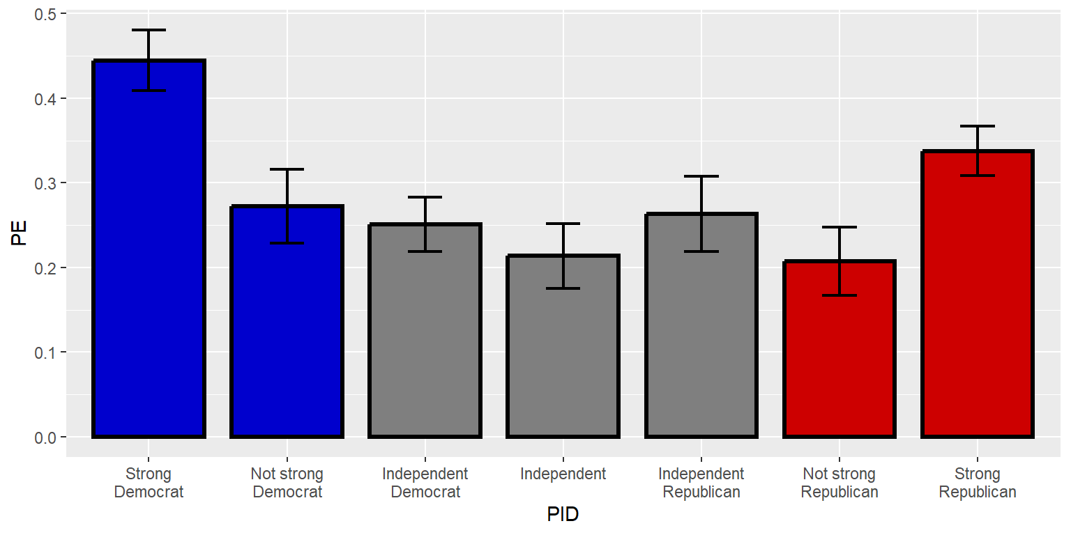
13.9 Axes
ggplot2 has particular defaults about how far to extend axes. You might have noticed that the y-axis extended farther after the error bars were added, compared to when only the columns were plotted. Often for plotting percentages, it makes sense to plot the full range of possible percentages, such as from 0 to 100 (for plotting percentages) or from 0 to 1 (for plotting decimal percentages). Let’s tell ggplot to do that.
#library(tidyverse)

GUNIMP <- tribble(
  ~PID                     , ~PE      , ~CILO    , ~CIHI    ,
  "Strong\nDemocrat"       , 0.4445886, 0.4089648, 0.4802125,
  "Not strong\nDemocrat"   , 0.2726622, 0.2290617, 0.3162628,
  "Independent\nDemocrat"  , 0.2509012, 0.218784 , 0.2830185,
  "Independent"            , 0.2135729, 0.1755062, 0.2516396,
  "Independent\nRepublican", 0.2633814, 0.218896 , 0.3078668,
  "Not strong\nRepublican" , 0.2074255, 0.1671848, 0.2476663,
  "Strong\nRepublican"     , 0.3374613, 0.308117 , 0.3668057)

GUNIMP$PID <- factor(GUNIMP$PID, levels=GUNIMP$PID)

ggplot(data=GUNIMP, aes(x=PID, y=PE)) +
  geom_col(linewidth=1.1, width=0.8, color="black",
           fill=c(rep.int("blue3",2), rep.int("gray50",3), rep.int("red3",2))) +
  geom_errorbar(aes(ymin=CILO, ymax=CIHI), linewidth=0.75, width=0.25) +
scale_y_continuous(limits=c(0,1)) 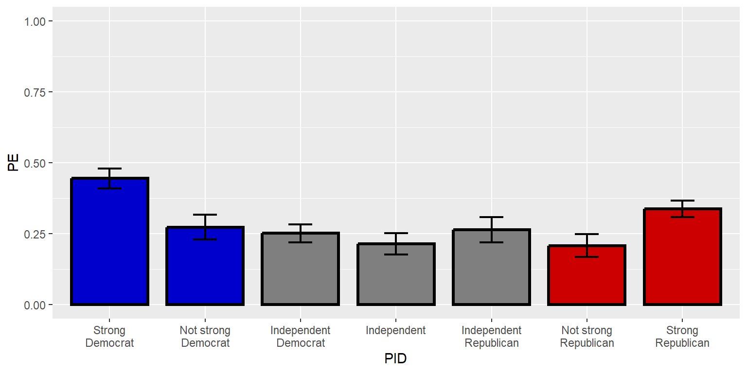
The “expand” option can remove or add buffer space around the plot. Let’s get rid of the buffer space on the y-axis by setting expand to expand=c(0,0).
#library(tidyverse)

GUNIMP <- tribble(
  ~PID                     , ~PE      , ~CILO    , ~CIHI    ,
  "Strong\nDemocrat"       , 0.4445886, 0.4089648, 0.4802125,
  "Not strong\nDemocrat"   , 0.2726622, 0.2290617, 0.3162628,
  "Independent\nDemocrat"  , 0.2509012, 0.218784 , 0.2830185,
  "Independent"            , 0.2135729, 0.1755062, 0.2516396,
  "Independent\nRepublican", 0.2633814, 0.218896 , 0.3078668,
  "Not strong\nRepublican" , 0.2074255, 0.1671848, 0.2476663,
  "Strong\nRepublican"     , 0.3374613, 0.308117 , 0.3668057)

GUNIMP$PID <- factor(GUNIMP$PID, levels=GUNIMP$PID)

ggplot(data=GUNIMP, aes(x=PID, y=PE)) +
  geom_col(linewidth=1.1, width=0.8, color="black",
           fill=c(rep.int("blue3",2), rep.int("gray50",3), rep.int("red3",2))) +
  geom_errorbar(aes(ymin=CILO, ymax=CIHI), linewidth=0.75, width=0.25) +
  scale_y_continuous(limits=c(0,1), expand=c(0,0))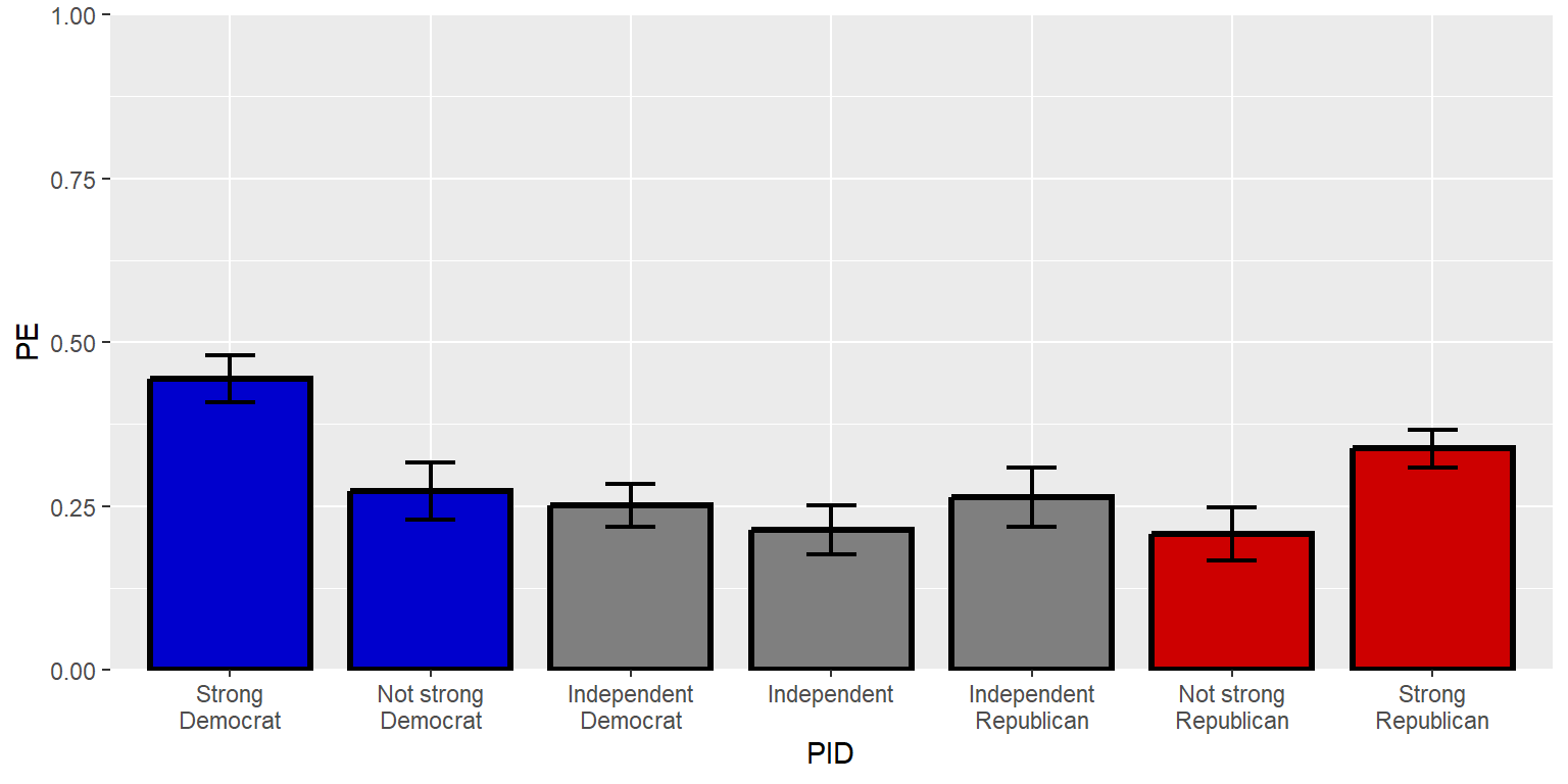
Let’s tell ggplot2 where to place the axis labels, using a sequence function seq that tells ggplot to start at the first number, keep adding the third number, and stop when you reach the second number. In this case, seq(0,1,0.2) will return 0 to start, return new numbers every additional 0.2, and then stop at 1. The second number might or might not be the final number. For example, seq(0,0.3,0.2) would return only 0 and 0.2.
#library(tidyverse)

GUNIMP <- tribble(
  ~PID                     , ~PE      , ~CILO    , ~CIHI    ,
  "Strong\nDemocrat"       , 0.4445886, 0.4089648, 0.4802125,
  "Not strong\nDemocrat"   , 0.2726622, 0.2290617, 0.3162628,
  "Independent\nDemocrat"  , 0.2509012, 0.218784 , 0.2830185,
  "Independent"            , 0.2135729, 0.1755062, 0.2516396,
  "Independent\nRepublican", 0.2633814, 0.218896 , 0.3078668,
  "Not strong\nRepublican" , 0.2074255, 0.1671848, 0.2476663,
  "Strong\nRepublican"     , 0.3374613, 0.308117 , 0.3668057)

GUNIMP$PID <- factor(GUNIMP$PID, levels=GUNIMP$PID)

ggplot(data=GUNIMP, aes(x=PID, y=PE)) +
  geom_col(linewidth=1.1, width=0.8, color="black",
           fill=c(rep.int("blue3",2), rep.int("gray50",3), rep.int("red3",2))) +
  geom_errorbar(aes(ymin=CILO, ymax=CIHI), linewidth=0.75, width=0.25) +
  scale_y_continuous(limits=c(0,1), expand=c(0,0), breaks=seq(0,1,0.2))
The three parts of the sequence function can be thought of as “from”, “to”, and “by”, and R will assume as a default that three numbers in a sequence function are intended to indicate the “from”, “to”, and “by” arguments. But the arguments can be made explicit and in a different order, such as below, with seq(from=0, by=0.2, to=1).
#library(tidyverse)

GUNIMP <- tribble(
  ~PID                     , ~PE      , ~CILO    , ~CIHI    ,
  "Strong\nDemocrat"       , 0.4445886, 0.4089648, 0.4802125,
  "Not strong\nDemocrat"   , 0.2726622, 0.2290617, 0.3162628,
  "Independent\nDemocrat"  , 0.2509012, 0.218784 , 0.2830185,
  "Independent"            , 0.2135729, 0.1755062, 0.2516396,
  "Independent\nRepublican", 0.2633814, 0.218896 , 0.3078668,
  "Not strong\nRepublican" , 0.2074255, 0.1671848, 0.2476663,
  "Strong\nRepublican"     , 0.3374613, 0.308117 , 0.3668057)

GUNIMP$PID <- factor(GUNIMP$PID, levels=GUNIMP$PID)

ggplot(data=GUNIMP, aes(x=PID, y=PE)) +
  geom_col(linewidth=1.1, width=0.8, color="black",
           fill=c(rep.int("blue3",2), rep.int("gray50",3), rep.int("red3",2))) +
  geom_errorbar(aes(ymin=CILO, ymax=CIHI), linewidth=0.75, width=0.25) +
  scale_y_continuous(limits=c(0,1), expand=c(0,0), breaks=seq(from=0, by=0.2, to=1))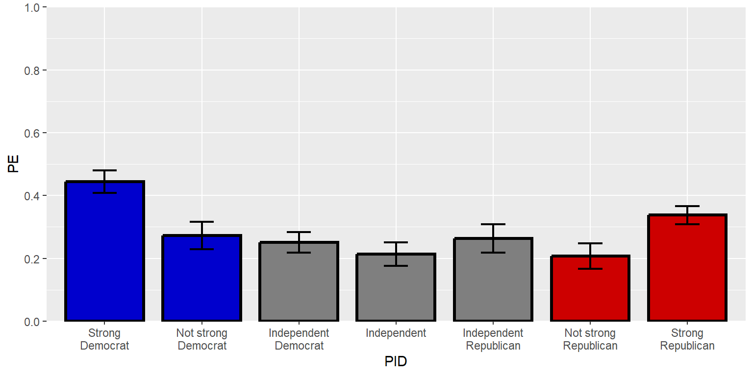
If an axis has breaks but no labels indicated, ggplot uses the corresponding numbers as labels. But other values – including non-numeric values – can be assigned as labels.
#library(tidyverse)

GUNIMP <- tribble(
  ~PID                     , ~PE      , ~CILO    , ~CIHI    ,
  "Strong\nDemocrat"       , 0.4445886, 0.4089648, 0.4802125,
  "Not strong\nDemocrat"   , 0.2726622, 0.2290617, 0.3162628,
  "Independent\nDemocrat"  , 0.2509012, 0.218784 , 0.2830185,
  "Independent"            , 0.2135729, 0.1755062, 0.2516396,
  "Independent\nRepublican", 0.2633814, 0.218896 , 0.3078668,
  "Not strong\nRepublican" , 0.2074255, 0.1671848, 0.2476663,
  "Strong\nRepublican"     , 0.3374613, 0.308117 , 0.3668057)

GUNIMP$PID <- factor(GUNIMP$PID, levels=GUNIMP$PID)

ggplot(data=GUNIMP, aes(x=PID, y=PE)) +
  geom_col(linewidth=1.1, width=0.8, color="black",
           fill=c(rep.int("blue3",2), rep.int("gray50",3), rep.int("red3",2))) +
  geom_errorbar(aes(ymin=CILO, ymax=CIHI), linewidth=0.75, width=0.25) +
  scale_y_continuous(limits=c(0,1), expand=c(0,0),
                     breaks=seq(from=0, by=0.5, to=1), labels=c("Zero percent", "Half", "100%"))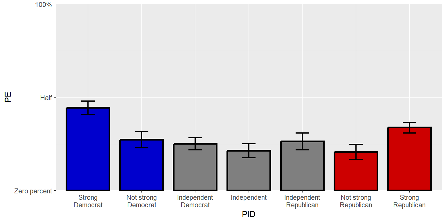
A secondary axis can be added to the other side of the plot. Let’s use a simple duplicate y-axis for now, but it is possible to have a different secondary axis so that, for instance, one side has labels in counts and another side has labels in percentages.
#library(tidyverse)

GUNIMP <- tribble(
  ~PID                     , ~PE      , ~CILO    , ~CIHI    ,
  "Strong\nDemocrat"       , 0.4445886, 0.4089648, 0.4802125,
  "Not strong\nDemocrat"   , 0.2726622, 0.2290617, 0.3162628,
  "Independent\nDemocrat"  , 0.2509012, 0.218784 , 0.2830185,
  "Independent"            , 0.2135729, 0.1755062, 0.2516396,
  "Independent\nRepublican", 0.2633814, 0.218896 , 0.3078668,
  "Not strong\nRepublican" , 0.2074255, 0.1671848, 0.2476663,
  "Strong\nRepublican"     , 0.3374613, 0.308117 , 0.3668057)

GUNIMP$PID <- factor(GUNIMP$PID, levels=GUNIMP$PID)

ggplot(data=GUNIMP, aes(x=PID, y=PE)) +
  geom_col(linewidth=1.1, width=0.8, color="black",
           fill=c(rep.int("blue3",2), rep.int("gray50",3), rep.int("red3",2))) +
  geom_errorbar(aes(ymin=CILO, ymax=CIHI), linewidth=0.75, width=0.25) +
  scale_y_continuous(limits=c(0,1), expand=c(0,0), breaks=seq(0,1,0.2), sec.axis=dup_axis())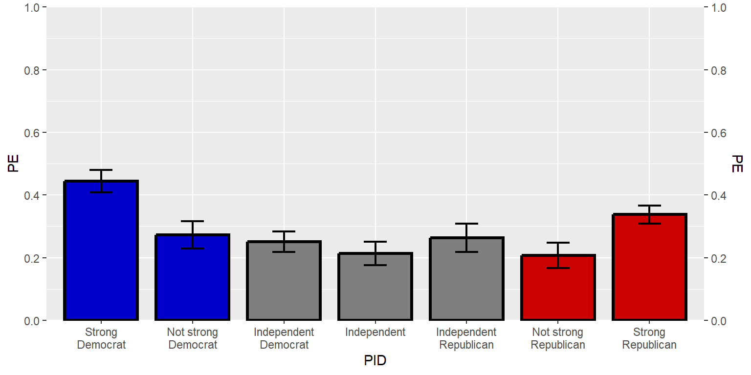
Sample practice items
Which one of the following would be returned by: seq(0,6,3)?
- 0 6 3
- 0 3 6
- 0 6 0 6 0 6
- 9
Answer
- 0 3 6
Which one of the following would be returned by: seq(0,6,4)
- 0 6 4
- 0 4
- 0 6 0 6 0 6 0 6
- 0 6 12 18
Answer
- 0 4
Suppose that a ggplot axis command for a continuous vector indicates to put breaks at seq(0,100,50) but does not indicate what the the labels should be. In this case, ggplot will…
- not plot any labels
- not plot any labels
- plot labels at 0, 50, and 100
Answer
- plot labels at 0, 50, and 100
13.10 Titles and other labels
Let’s add a title. Notice that we need to put a slash before internal quotation marks, so that ggplot doesn’t get fooled into thinking that the title stops at the first internal quotation mark.
#library(tidyverse)

GUNIMP <- tribble(
  ~PID                     , ~PE      , ~CILO    , ~CIHI    ,
  "Strong\nDemocrat"       , 0.4445886, 0.4089648, 0.4802125,
  "Not strong\nDemocrat"   , 0.2726622, 0.2290617, 0.3162628,
  "Independent\nDemocrat"  , 0.2509012, 0.218784 , 0.2830185,
  "Independent"            , 0.2135729, 0.1755062, 0.2516396,
  "Independent\nRepublican", 0.2633814, 0.218896 , 0.3078668,
  "Not strong\nRepublican" , 0.2074255, 0.1671848, 0.2476663,
  "Strong\nRepublican"     , 0.3374613, 0.308117 , 0.3668057)

GUNIMP$PID <- factor(GUNIMP$PID, levels=GUNIMP$PID)

ggplot(data=GUNIMP, aes(x=PID, y=PE)) +
  geom_col(linewidth=1.1, width=0.8, color="black",
           fill=c(rep.int("blue3",2), rep.int("gray50",3), rep.int("red3",2))) +
  geom_errorbar(aes(ymin=CILO, ymax=CIHI), linewidth=0.75, width=0.25) +
  scale_y_continuous(limits=c(0,1), expand=c(0,0), breaks=seq(0,1,0.2), sec.axis=dup_axis()) +
  labs(title="Predicted probability of responding \"extremely important\" about how important the respondent considers the issue of the federal gun laws")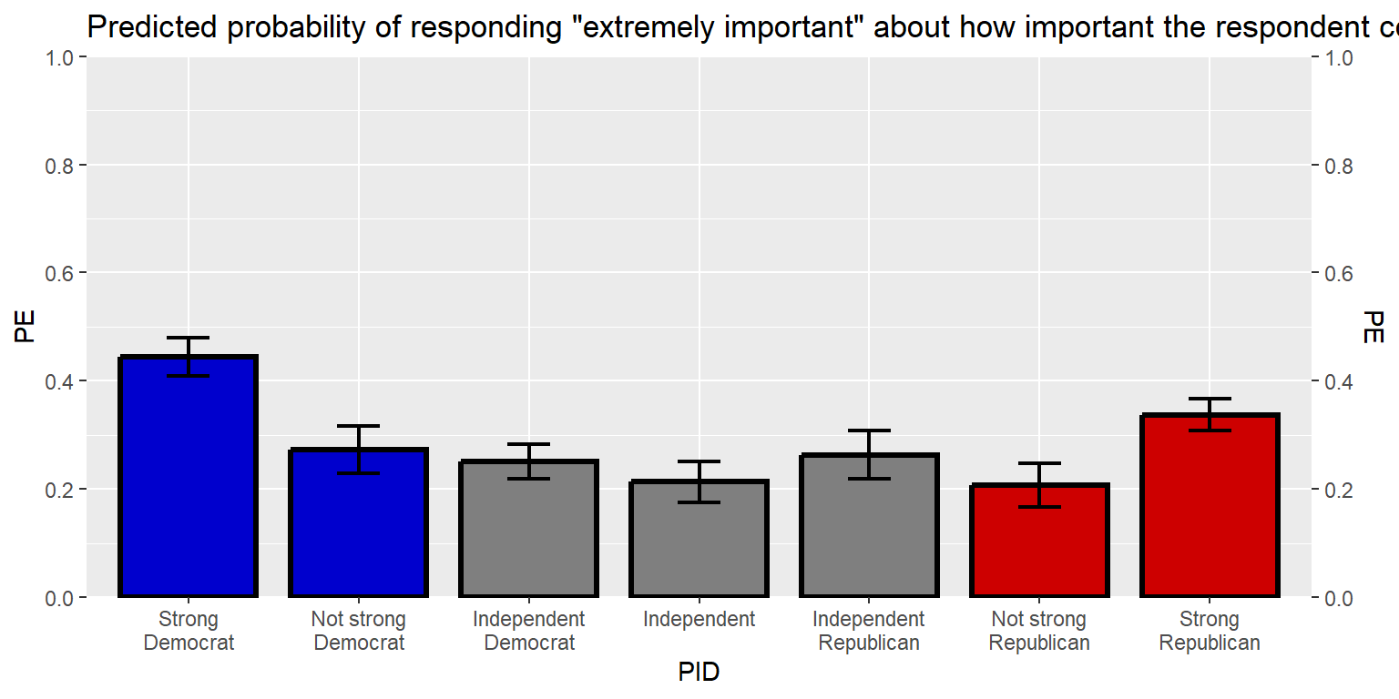
That title is long, so let’s break the title into two lines, using \n to tell ggplot to start a new line. Let’s also add a caption.
#library(tidyverse)

GUNIMP <- tribble(
  ~PID                     , ~PE      , ~CILO    , ~CIHI    ,
  "Strong\nDemocrat"       , 0.4445886, 0.4089648, 0.4802125,
  "Not strong\nDemocrat"   , 0.2726622, 0.2290617, 0.3162628,
  "Independent\nDemocrat"  , 0.2509012, 0.218784 , 0.2830185,
  "Independent"            , 0.2135729, 0.1755062, 0.2516396,
  "Independent\nRepublican", 0.2633814, 0.218896 , 0.3078668,
  "Not strong\nRepublican" , 0.2074255, 0.1671848, 0.2476663,
  "Strong\nRepublican"     , 0.3374613, 0.308117 , 0.3668057)

GUNIMP$PID <- factor(GUNIMP$PID, levels=GUNIMP$PID)

ggplot(data=GUNIMP, aes(x=PID, y=PE)) +
  geom_col(linewidth=1.1, width=0.8, color="black",
           fill=c(rep.int("blue3",2), rep.int("gray50",3), rep.int("red3",2))) +
  geom_errorbar(aes(ymin=CILO, ymax=CIHI), linewidth=0.75, width=0.25) +
  scale_y_continuous(limits=c(0,1), expand=c(0,0), breaks=seq(0,1,0.2), sec.axis=dup_axis()) +
  labs(title="Predicted probability of responding \"extremely important\" about\nhow important the respondent considers the issue of the federal gun laws", caption="Note: Error bars are 83.4% confidence intervals. Estimates are from a logit regression, with weights applied and with categorical controls for gender, race, age group, education, marital status, household income, and gun ownership set at their means. Data source: American National Election Studies 2020 Time Series Study (2021).")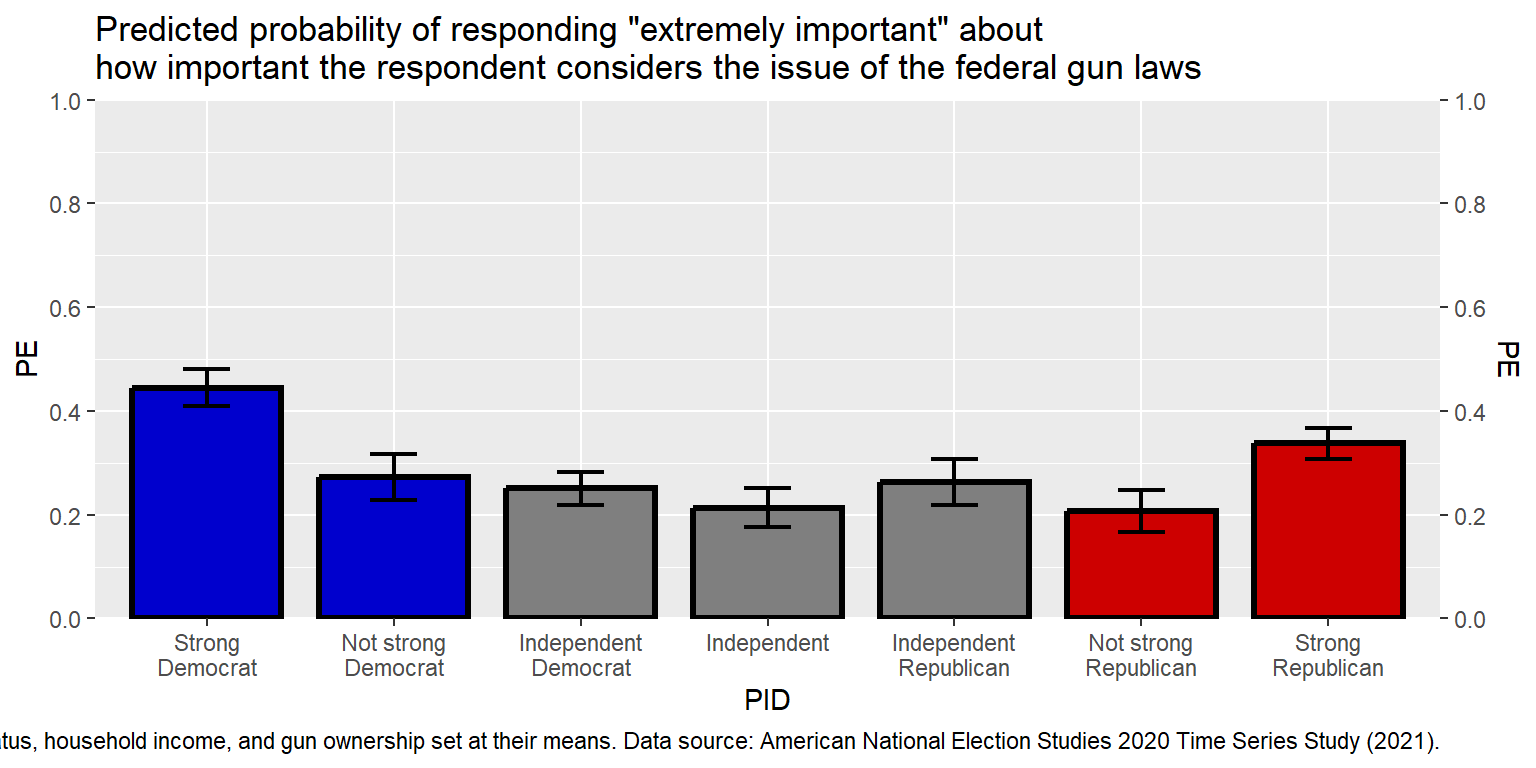
That caption is really long. Instead of breaking it into several lines using , let’s use the str_wrap function. I’ll also move the caption outside of the main plot code, and then call the caption in the code. The 100 width inside the str_wrap function is the width of the lines in number of characters.
#library(tidyverse)

GUNIMP <- tribble(
  ~PID                     , ~PE      , ~CILO    , ~CIHI    ,
  "Strong\nDemocrat"       , 0.4445886, 0.4089648, 0.4802125,
  "Not strong\nDemocrat"   , 0.2726622, 0.2290617, 0.3162628,
  "Independent\nDemocrat"  , 0.2509012, 0.218784 , 0.2830185,
  "Independent"            , 0.2135729, 0.1755062, 0.2516396,
  "Independent\nRepublican", 0.2633814, 0.218896 , 0.3078668,
  "Not strong\nRepublican" , 0.2074255, 0.1671848, 0.2476663,
  "Strong\nRepublican"     , 0.3374613, 0.308117 , 0.3668057)

GUNIMP$PID <- factor(GUNIMP$PID, levels=GUNIMP$PID)

CAPTION  <- str_wrap("Note: Error bars are 83.4% confidence intervals. Estimates are from a logit
                     regression, with weights applied and with categorical controls for gender,
                     race, age group, education, marital status, household income, and gun ownership
                     set at their means. Data source: American National Election Studies 2020 Time
                     Series Study (2021).", width=120)

ggplot(data=GUNIMP, aes(x=PID, y=PE)) +
  geom_col(linewidth=1.1, width=0.8, color="black",
           fill=c(rep.int("blue3",2), rep.int("gray50",3), rep.int("red3",2))) +
  geom_errorbar(aes(ymin=CILO, ymax=CIHI),linewidth=0.75, width=0.25) +
  scale_y_continuous(limits=c(0,1), expand=c(0,0), breaks=seq(0,1,0.2), sec.axis=dup_axis()) +
  labs(title="Predicted probability of responding \"extremely important\" about\nhow important the respondent considers the issue of the federal gun laws", caption=CAPTION)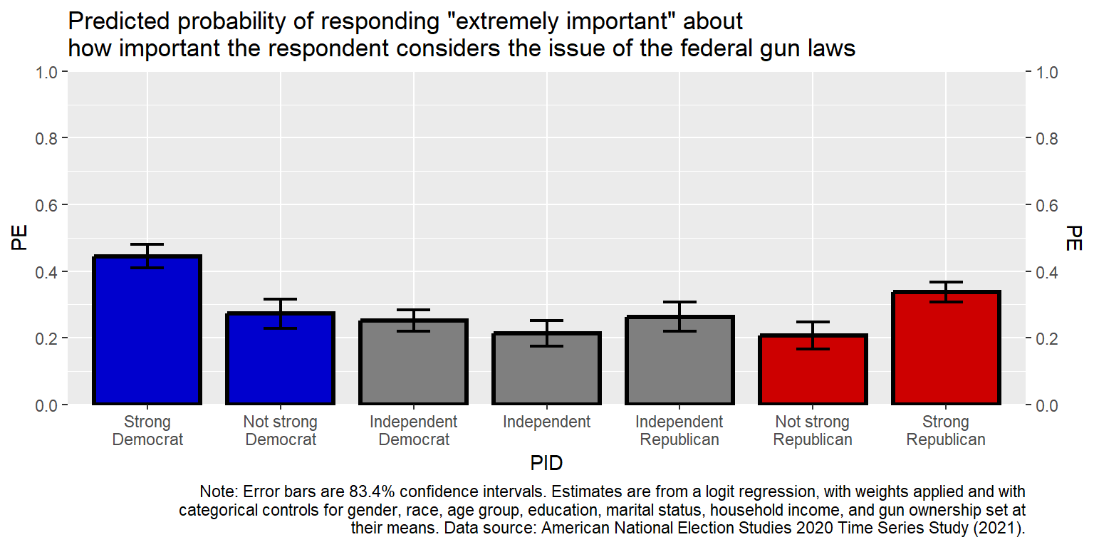
Sample practice items
How can we get ggplot2 to ignore internal quotation marks?
- Put a \ in front of the internal quotation marks.
- Put a + in front of the internal quotation marks.
- Put an ! in front of the internal quotation marks.
- Put fancy brackets {} around the internal quotation marks.
Answer
- Put a \ in front of the internal quotation marks.
Which one of the following can be used to keep the width of a text string within a particular number of characters?
- facet
- factor
- str_wrap
- tribble
Answer
- str_wrap
13.11 Text in the data region
Let’s add the point estimates above the columns. The hjust values of 0, 0.5, and 1 are respectively for left, center, and right justification. The vjust values of 0, 0.5, and 1 are respectively for bottom, middle, and top justification.
#library(tidyverse)

GUNIMP <- tribble(
  ~PID                     , ~PE      , ~CILO    , ~CIHI    ,
  "Strong\nDemocrat"       , 0.4445886, 0.4089648, 0.4802125,
  "Not strong\nDemocrat"   , 0.2726622, 0.2290617, 0.3162628,
  "Independent\nDemocrat"  , 0.2509012, 0.218784 , 0.2830185,
  "Independent"            , 0.2135729, 0.1755062, 0.2516396,
  "Independent\nRepublican", 0.2633814, 0.218896 , 0.3078668,
  "Not strong\nRepublican" , 0.2074255, 0.1671848, 0.2476663,
  "Strong\nRepublican"     , 0.3374613, 0.308117 , 0.3668057)

GUNIMP$PID <- factor(GUNIMP$PID, levels=GUNIMP$PID)

CAPTION  <- str_wrap("Note: Error bars are 83.4% confidence intervals. Estimates are from a logit
                     regression, with weights applied and with categorical controls for gender,
                     race, age group, education, marital status, household income, and gun ownership
                     set at their means. Data source: American National Election Studies 2020 Time
                     Series Study (2021).", width=120)

ggplot(data=GUNIMP, aes(x=PID, y=PE)) +
  geom_col(linewidth=1.1, width=0.8, color="black",
           fill=c(rep.int("blue3",2), rep.int("gray50",3), rep.int("red3",2))) +
  geom_errorbar(aes(ymin=CILO, ymax=CIHI), linewidth=0.75, width=0.25) +
  geom_text(aes(y=CIHI+0.05, label=PE, size=5, hjust=0.5, vjust=0), show.legend=FALSE) +
  scale_y_continuous(limits=c(0,1), expand=c(0,0), breaks=seq(0,1,0.2), sec.axis=dup_axis()) +
  labs(title="Predicted probability of responding \"extremely important\" about\nhow important the respondent considers the issue of the federal gun laws", caption=CAPTION)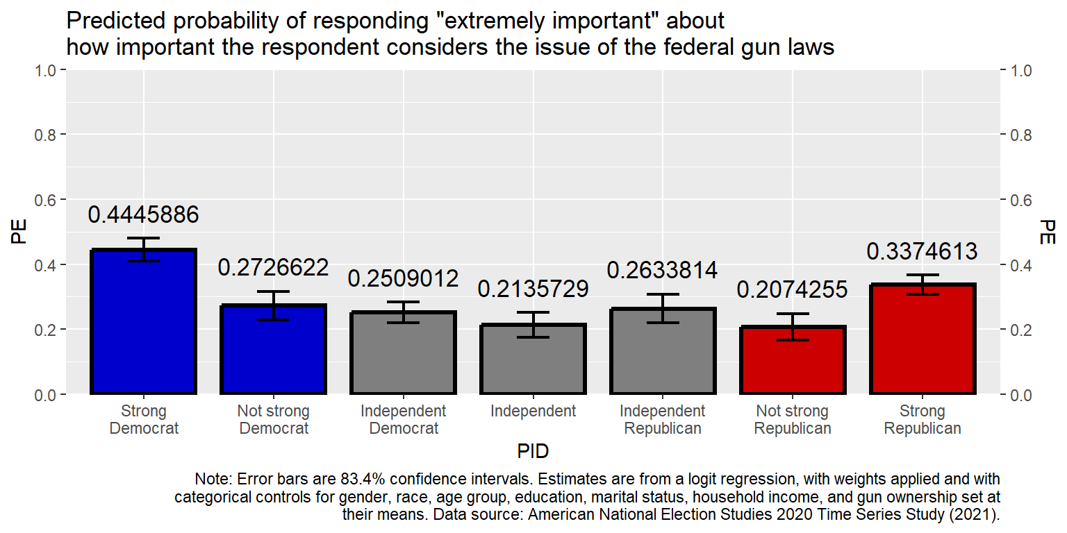
Let’s get the point estimates to be percentages rounded to the nearest whole number (accuracy=1).
#library(tidyverse)

GUNIMP <- tribble(
  ~PID                     , ~PE      , ~CILO    , ~CIHI    ,
  "Strong\nDemocrat"       , 0.4445886, 0.4089648, 0.4802125,
  "Not strong\nDemocrat"   , 0.2726622, 0.2290617, 0.3162628,
  "Independent\nDemocrat"  , 0.2509012, 0.218784 , 0.2830185,
  "Independent"            , 0.2135729, 0.1755062, 0.2516396,
  "Independent\nRepublican", 0.2633814, 0.218896 , 0.3078668,
  "Not strong\nRepublican" , 0.2074255, 0.1671848, 0.2476663,
  "Strong\nRepublican"     , 0.3374613, 0.308117 , 0.3668057)

GUNIMP$PID <- factor(GUNIMP$PID, levels=GUNIMP$PID)

CAPTION  <- str_wrap("Note: Error bars are 83.4% confidence intervals. Estimates are from a logit
                     regression, with weights applied and with categorical controls for gender,
                     race, age group, education, marital status, household income, and gun ownership
                     set at their means. Data source: American National Election Studies 2020 Time
                     Series Study (2021).", width=120)

ggplot(data=GUNIMP, aes(x=PID, y=PE)) +
  geom_col(linewidth=1.1, width=0.8, color="black",
           fill=c(rep.int("blue3",2), rep.int("gray50",3), rep.int("red3",2))) +
  geom_errorbar(aes(ymin=CILO, ymax=CIHI), linewidth=0.75, width=0.25) +
  geom_text(aes(y=CIHI+0.05, label=scales::percent(PE, accuracy=1)), size=5, hjust=0.5, vjust=0) +
  scale_y_continuous(limits=c(0,1), expand=c(0,0), breaks=seq(0,1,0.2), sec.axis=dup_axis()) +
  labs(title="Predicted probability of responding \"extremely important\" about\nhow important the respondent considers the issue of the federal gun laws", caption=CAPTION)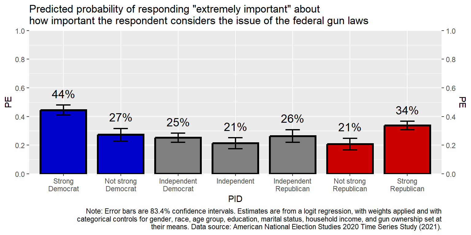
The code accuracy = 0.01 would round to the hundredths place and accuracy = 5 would round to the nearest multiple of 5.
13.12 Themes
Let’s edit some non-data theme elements of the plot. First, let’s remove elements that aren’t needed, such as the y-axis title (PE), the x-axis title (PID), the tick marks, the grid lines, and the y-axis labels. For removing theme elements, indicate the thing to change and then list it as element_blank().
#library(tidyverse)

GUNIMP <- tribble(
  ~PID                     , ~PE      , ~CILO    , ~CIHI    ,
  "Strong\nDemocrat"       , 0.4445886, 0.4089648, 0.4802125,
  "Not strong\nDemocrat"   , 0.2726622, 0.2290617, 0.3162628,
  "Independent\nDemocrat"  , 0.2509012, 0.218784 , 0.2830185,
  "Independent"            , 0.2135729, 0.1755062, 0.2516396,
  "Independent\nRepublican", 0.2633814, 0.218896 , 0.3078668,
  "Not strong\nRepublican" , 0.2074255, 0.1671848, 0.2476663,
  "Strong\nRepublican"     , 0.3374613, 0.308117 , 0.3668057)

GUNIMP$PID <- factor(GUNIMP$PID, levels=GUNIMP$PID)

CAPTION  <- str_wrap("Note: Error bars are 83.4% confidence intervals. Estimates are from a logit
                     regression, with weights applied and with categorical controls for gender,
                     race, age group, education, marital status, household income, and gun ownership
                     set at their means. Data source: American National Election Studies 2020 Time
                     Series Study (2021).", width=120)

ggplot(data=GUNIMP, aes(x=PID, y=PE)) +
  geom_col(linewidth=1.1, width=0.8, color="black",
           fill=c(rep.int("blue3",2), rep.int("gray50",3), rep.int("red3",2))) +
  geom_errorbar(aes(ymin=CILO, ymax=CIHI), linewidth=0.75, width=0.25) +
  geom_text(aes(y=CIHI+0.05, label=scales::percent(PE, accuracy=1)), size=5, hjust=0.5, vjust=0) +
  scale_y_continuous(limits=c(0,1), expand=c(0,0), breaks=seq(0,1,0.2), sec.axis=dup_axis()) +
  labs(title="Predicted probability of responding \"extremely important\" about\nhow important the respondent considers the issue of the federal gun laws", caption=CAPTION) +
    theme(
    axis.text.y        = element_blank(),
    axis.ticks.x       = element_blank(),
    axis.ticks.y       = element_blank(),
    axis.title.x       = element_blank(),
    axis.title.y       = element_blank(),
    panel.grid.major.x = element_blank(),
    panel.grid.major.y = element_blank(),
    panel.grid.minor.x = element_blank(),
    panel.grid.minor.y = element_blank())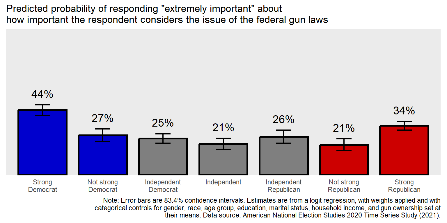
Now, let add in theme elements that involve changes that we want to see, such as larger text, darker text, and a border.
#library(tidyverse)

GUNIMP <- tribble(
  ~PID                     , ~PE      , ~CILO    , ~CIHI    ,
  "Strong\nDemocrat"       , 0.4445886, 0.4089648, 0.4802125,
  "Not strong\nDemocrat"   , 0.2726622, 0.2290617, 0.3162628,
  "Independent\nDemocrat"  , 0.2509012, 0.218784 , 0.2830185,
  "Independent"            , 0.2135729, 0.1755062, 0.2516396,
  "Independent\nRepublican", 0.2633814, 0.218896 , 0.3078668,
  "Not strong\nRepublican" , 0.2074255, 0.1671848, 0.2476663,
  "Strong\nRepublican"     , 0.3374613, 0.308117 , 0.3668057)

GUNIMP$PID <- factor(GUNIMP$PID, levels=GUNIMP$PID)

CAPTION  <- str_wrap("Note: Error bars are 83.4% confidence intervals. Estimates are from a logit
                     regression, with weights applied and with categorical controls for gender,
                     race, age group, education, marital status, household income, and gun ownership
                     set at their means. Data source: American National Election Studies 2020 Time
                     Series Study (2021).", width=120)

ggplot(data=GUNIMP, aes(x=PID, y=PE)) +
  geom_col(linewidth=1.1, width=0.8, color="black",
           fill=c(rep.int("blue3",2), rep.int("gray50",3), rep.int("red3",2))) +
  geom_errorbar(aes(ymin=CILO, ymax=CIHI), linewidth=0.75, width=0.25) +
  geom_text(aes(y=CIHI+0.05, label=scales::percent(PE, accuracy=1)), size=5, hjust=0.5, vjust=0) +
  scale_y_continuous(limits=c(0,1), expand=c(0,0), breaks=seq(0,1,0.2), sec.axis=dup_axis()) +
  labs(title="Predicted probability of responding \"extremely important\" about\nhow important the respondent considers the issue of the federal gun laws", caption=CAPTION) +
    theme(
    axis.text.x        = element_text(size=13, color="black", hjust=0.5, margin=margin(t=8,b=8)),
    axis.text.y        = element_blank(),
    axis.ticks.x       = element_blank(),
    axis.ticks.y       = element_blank(),
    axis.title.x       = element_blank(),
    axis.title.y       = element_blank(),
    panel.background   = element_rect(linewidth=0.5, color="black", fill="gray90", linetype="solid"),
    panel.border       = element_rect(linewidth=1.8, color="black", fill=NA      , linetype="solid"),
    panel.grid.major.x = element_blank(),
    panel.grid.major.y = element_blank(),
    panel.grid.minor.x = element_blank(),
    panel.grid.minor.y = element_blank(),
    plot.background    = element_rect(fill="white"),
    plot.caption       = element_text(size=10 , hjust=0  , margin=margin(t=10)),
    plot.margin        = unit(c(t=10,r=10,b=10,l=10),"pt"),
    plot.title         = element_text(size=15 , hjust=0.5, margin=margin(t=0,b=10), face="bold"))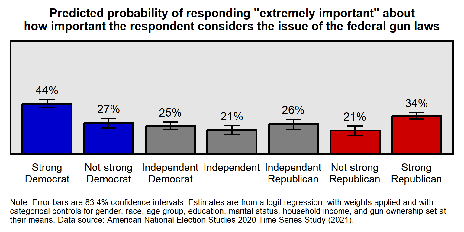
To see the list of theme elements that can be modified, a ? can be used open a help webpage:
?theme
The ? works generally to get a help page for R functions and packages:
?round
13.13 Facets
Facets can be used to plot multiple panels for the same plot. The data below are respondent ratings about the National Rifle Association, disaggregated by race/ethnicity. A few things to note about the code:
The unique function can be used to get only the unique elements of a vector. The levels argument is the order of the elements, so we only need one of each element, so in the NRA$RACE <- factor(NRA$RACE, levels=rev(unique(NRA$RACE))) command, the unique part returns only four elements: “White”, “Black”, “Hispanic”, and “Other”. The **rev* is to reverse the order of the elements. The default ggplot order is left-to-right and bottom-to-top, so for vertical axes or vertical facets the order of the elements has to be bottom-to-top or has to be top-to-bottom and then reversed.
The filter part of the geom_point command is used to limit that command to only one of the facets, so that, in this code, the points have a different color in each facet. Remember that the “color” argument is for the outline of a geom when the geom has a fill. But, in this case, the geom does not have a fill, so the color indicates the color of the geom.
The ggplot(NRA, aes(PE, RACE)) setup line does not explicitly indicate which of these is the dataset, which of these is the x variable, and which of these is the y variable. However, ggplot assumes that the first argument is the dataset and that the first “aes” argument is the x variable.
#library(tidyverse)

NRA <- tribble(
  ~IDEO         , ~RACE     , ~PE  , ~CILO, ~CIHI,
  "Liberal"     , "White"   , 19.33, 18.14, 20.51,
  "Liberal"     , "Black"   , 28.26, 23.94, 32.59,
  "Liberal"     , "Hispanic", 26.70, 22.15, 31.25,
  "Liberal"     , "Other"   , 22.51, 18.85, 26.17,
  "Moderate"    , "White"   , 48.36, 46.49, 50.23,
  "Moderate"    , "Black"   , 40.25, 35.30, 45.20,
  "Moderate"    , "Hispanic", 43.69, 39.00, 48.38,
  "Moderate"    , "Other"   , 47.59, 43.30, 51.89,
  "Conservative", "White"   , 73.43, 72.38, 74.47,
  "Conservative", "Black"   , 47.59, 39.98, 55.20,
  "Conservative", "Hispanic", 69.12, 64.73, 73.51,
  "Conservative", "Other"   , 64.76, 60.54, 68.98)

NRA$RACE <- factor(NRA$RACE, levels=rev(unique(NRA$RACE)))
NRA$IDEO <- factor(NRA$IDEO, levels=unique(NRA$IDEO))

ggplot(NRA, aes(PE, RACE)) +
  facet_wrap(~IDEO, nrow=1, dir="h") +
  geom_point(data=filter(NRA, IDEO=="Liberal")     , size=3, color="blue3" ) +
  geom_point(data=filter(NRA, IDEO=="Moderate")    , size=3, color="gray70") +
  geom_point(data=filter(NRA, IDEO=="Conservative"), size=3, color="red3"  ) +
  geom_errorbarh(aes(xmin=CILO, xmax=CIHI), height=0, linewidth=0.75) +
  scale_x_continuous(limits=c(0,100), breaks=seq(0,100,25)) +
  labs(title="Mean rating of the\nNational Rifle Association, by race",
caption="Data source: ANES 2020 Time Series Study") 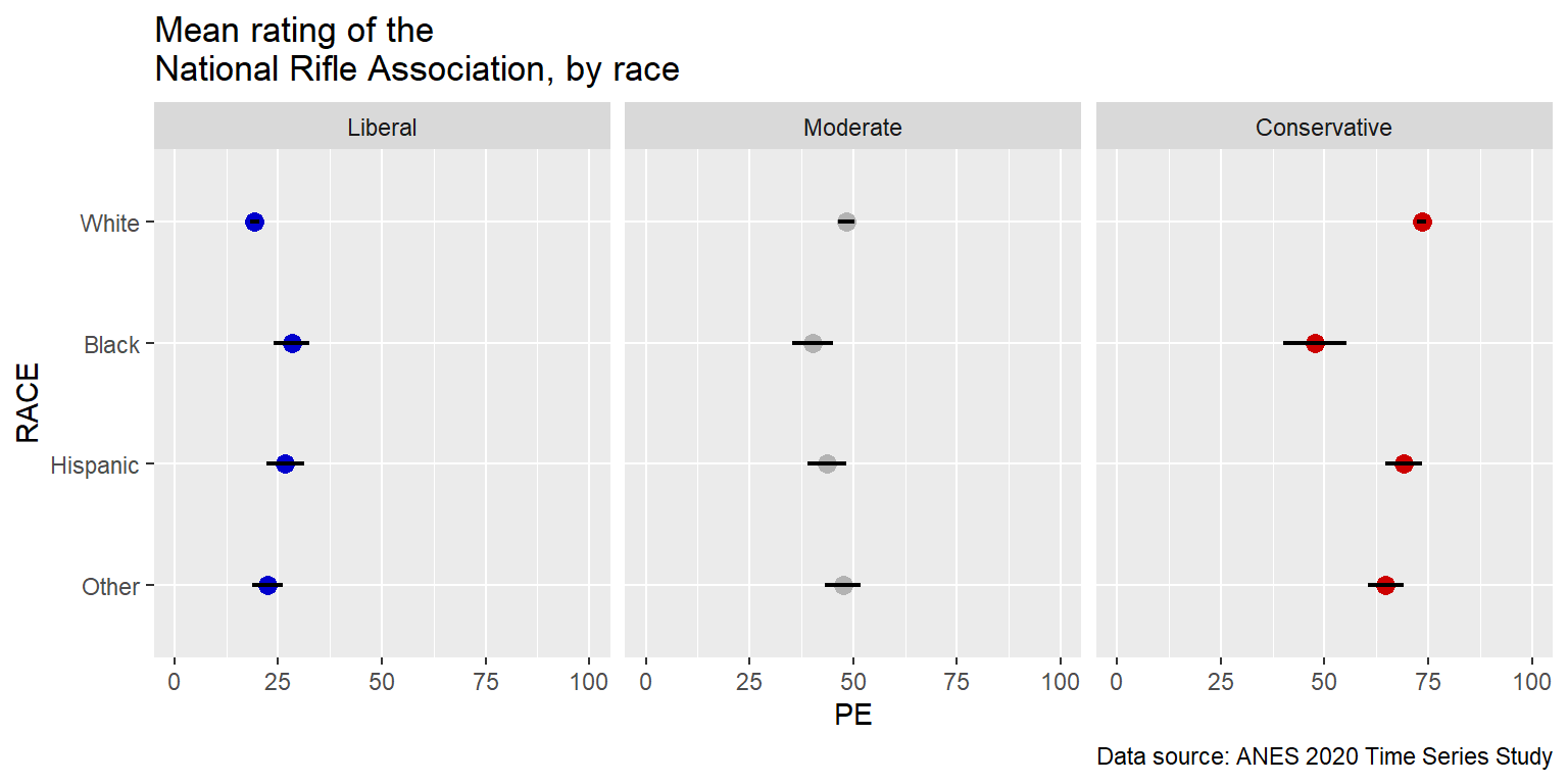
Notice that a flaw in the above plot is that it’s difficult to compare liberals of one race to conservatives of the same race. But those comparisons can be easier to make if we change the facet_wrap to be horizontal, by changing the directions to be 1 column instead of 1 row.
#library(tidyverse)

NRA <- tribble(
  ~IDEO         , ~RACE     , ~PE  , ~CILO, ~CIHI,
  "Liberal"     , "White"   , 19.33, 18.14, 20.51,
  "Liberal"     , "Black"   , 28.26, 23.94, 32.59,
  "Liberal"     , "Hispanic", 26.70, 22.15, 31.25,
  "Liberal"     , "Other"   , 22.51, 18.85, 26.17,
  "Moderate"    , "White"   , 48.36, 46.49, 50.23,
  "Moderate"    , "Black"   , 40.25, 35.30, 45.20,
  "Moderate"    , "Hispanic", 43.69, 39.00, 48.38,
  "Moderate"    , "Other"   , 47.59, 43.30, 51.89,
  "Conservative", "White"   , 73.43, 72.38, 74.47,
  "Conservative", "Black"   , 47.59, 39.98, 55.20,
  "Conservative", "Hispanic", 69.12, 64.73, 73.51,
  "Conservative", "Other"   , 64.76, 60.54, 68.98)

NRA$RACE <- factor(NRA$RACE, levels=rev(unique(NRA$RACE)))
NRA$IDEO <- factor(NRA$IDEO, levels=unique(NRA$IDEO))

ggplot(NRA, aes(PE, RACE)) +
  facet_wrap(~IDEO, ncol=1, dir="h") +
  geom_point(data=filter(NRA, IDEO=="Liberal")     , size=3, color="blue3" ) +
  geom_point(data=filter(NRA, IDEO=="Moderate")    , size=3, color="gray70") +
  geom_point(data=filter(NRA, IDEO=="Conservative"), size=3, color="red3"  ) +
  geom_errorbarh(aes(xmin=CILO, xmax=CIHI), height=0, linewidth=0.75) +
  scale_x_continuous(limits=c(0,100), breaks=seq(0,100,25)) +
  labs(title="Mean rating of the\nNational Rifle Association, by race",
caption="Data source: ANES 2020 Time Series Study") 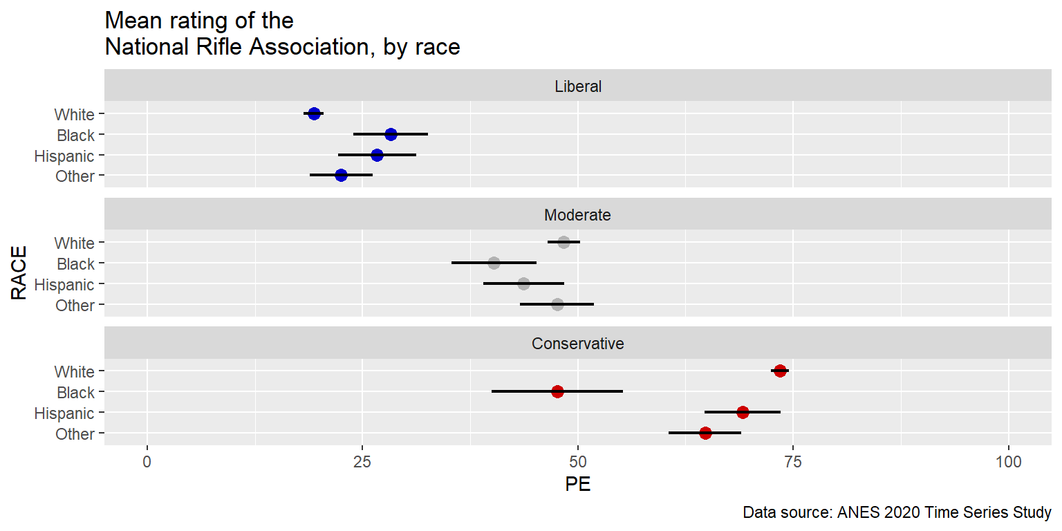
And notice how relatively easy it is to swap an axis and a facet. The only changes in the code below are [1] to change the Y variable to IDEO, change the facet variable to RACE, and [3] change the number of columns to 2.
#library(tidyverse)

NRA <- tribble(
  ~IDEO         , ~RACE     , ~PE  , ~CILO, ~CIHI,
  "Liberal"     , "White"   , 19.33, 18.14, 20.51,
  "Liberal"     , "Black"   , 28.26, 23.94, 32.59,
  "Liberal"     , "Hispanic", 26.70, 22.15, 31.25,
  "Liberal"     , "Other"   , 22.51, 18.85, 26.17,
  "Moderate"    , "White"   , 48.36, 46.49, 50.23,
  "Moderate"    , "Black"   , 40.25, 35.30, 45.20,
  "Moderate"    , "Hispanic", 43.69, 39.00, 48.38,
  "Moderate"    , "Other"   , 47.59, 43.30, 51.89,
  "Conservative", "White"   , 73.43, 72.38, 74.47,
  "Conservative", "Black"   , 47.59, 39.98, 55.20,
  "Conservative", "Hispanic", 69.12, 64.73, 73.51,
  "Conservative", "Other"   , 64.76, 60.54, 68.98)

NRA$RACE <- factor(NRA$RACE, levels=rev(unique(NRA$RACE)))
NRA$IDEO <- factor(NRA$IDEO, levels=unique(NRA$IDEO))

ggplot(NRA, aes(PE, IDEO)) +
  facet_wrap(~RACE, ncol=2, dir="h") +
  geom_point(data=filter(NRA, IDEO=="Liberal")     , size=3, color="blue3" ) +
  geom_point(data=filter(NRA, IDEO=="Moderate")    , size=3, color="gray70") +
  geom_point(data=filter(NRA, IDEO=="Conservative"), size=3, color="red3"  ) +
  geom_errorbarh(aes(xmin=CILO, xmax=CIHI), height=0, linewidth=0.75) +
  scale_x_continuous(limits=c(0,100), breaks=seq(0,100,25)) +
  labs(title="Mean rating of the\nNational Rifle Association, by race",
caption="Data source: ANES 2020 Time Series Study") 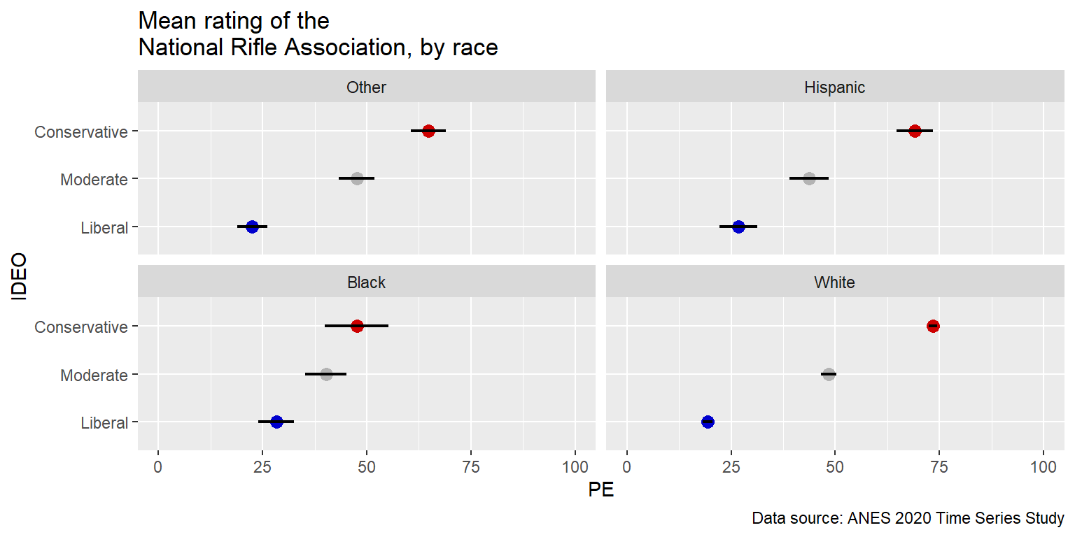
Below is an example of a line of code (starting with “geom_rect”) that can be used to add an element to a particular facet:
#library(tidyverse)

NRA <- tribble(
  ~IDEO         , ~RACE     , ~PE  , ~CILO, ~CIHI,
  "Liberal"     , "White"   , 19.33, 18.14, 20.51,
  "Liberal"     , "Black"   , 28.26, 23.94, 32.59,
  "Liberal"     , "Hispanic", 26.70, 22.15, 31.25,
  "Liberal"     , "Other"   , 22.51, 18.85, 26.17,
  "Moderate"    , "White"   , 48.36, 46.49, 50.23,
  "Moderate"    , "Black"   , 40.25, 35.30, 45.20,
  "Moderate"    , "Hispanic", 43.69, 39.00, 48.38,
  "Moderate"    , "Other"   , 47.59, 43.30, 51.89,
  "Conservative", "White"   , 73.43, 72.38, 74.47,
  "Conservative", "Black"   , 47.59, 39.98, 55.20,
  "Conservative", "Hispanic", 69.12, 64.73, 73.51,
  "Conservative", "Other"   , 64.76, 60.54, 68.98)

NRA$RACE <- factor(NRA$RACE, levels=rev(unique(NRA$RACE)))
NRA$IDEO <- factor(NRA$IDEO, levels=unique(NRA$IDEO))

ggplot(NRA, aes(PE, IDEO)) +
  geom_rect(data=filter(NRA, RACE=="Black"), aes(xmin=min(NRA$PE[NRA$RACE=="Black"]), xmax=max(NRA$PE[NRA$RACE=="Black"]), ymin=-Inf, ymax=Inf), fill="slategray1", color="black", inherit.aes=FALSE) +
  facet_wrap(~RACE, ncol=2, dir="h") +
  geom_point(data=filter(NRA, IDEO=="Liberal")     , size=3, color="blue3" ) +
  geom_point(data=filter(NRA, IDEO=="Moderate")    , size=3, color="gray70") +
  geom_point(data=filter(NRA, IDEO=="Conservative"), size=3, color="red3"  ) +
  geom_errorbarh(aes(xmin=CILO, xmax=CIHI), height=0, linewidth=0.75) +
  scale_x_continuous(limits=c(0,100), breaks=seq(0,100,25)) +
  labs(title="Mean rating of the\nNational Rifle Association, by race",
caption="Data source: ANES 2020 Time Series Study") 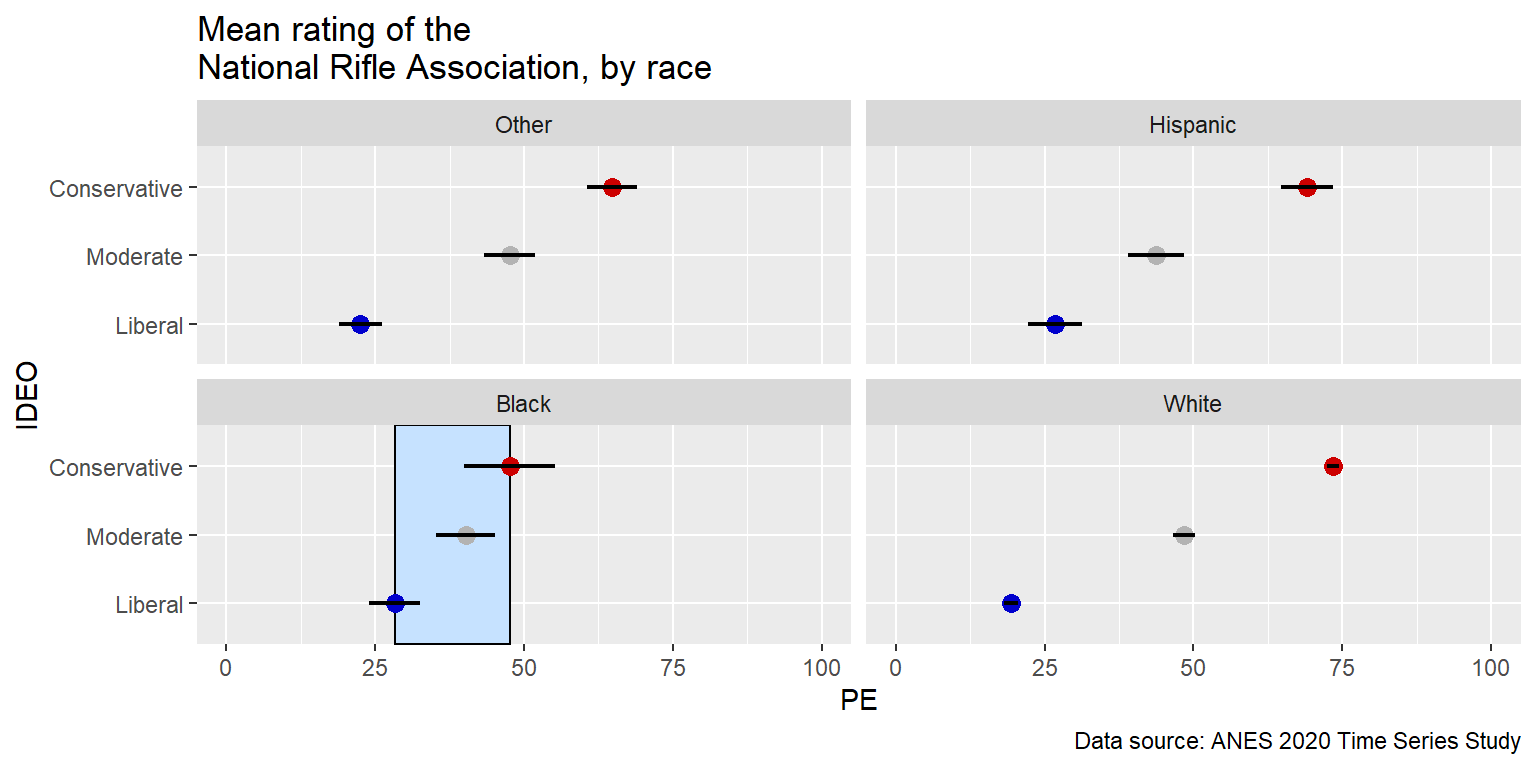
13.14 Linear regression lines
Let’s draw a linear regression line through a set of 50 points, each representing a state in the United States, on a x-axis that is an estimate of the percentage of state residents that identify as LGBT and a y-axis that is the percentage of the vote that Donald Trump received in the state in the 2016 U.S. presidential election.
#library(tidyverse)

TRUMP <- tribble(
  ~STATE, ~STATEABBV, ~PCTTRUMP, ~LGBT,
  "Alabama","AL",62.08,3, "Alaska","AK",51.28,3, "Arizona","AZ",48.67,4, "Arkansas","AK",60.57,3,
  "California","CA",31.62,4.9, "Colorado","CO",43.25,4.3, "Connecticut","CT",40.93,3.5,
  "Delaware","DE",41.71,4.7, "Florida","FL",49.02,4.2, "Georgia","GA",50.77,4, "Hawaii","HI",30.04,3.8,
  "Idaho","ID",59.26,2.8, "Illinois","IL",38.76,3.9, "Indiana","IN",56.94,4.1, "Iowa","IA",51.15,3.2,
  "Kansas","KS",56.65,3.1, "Kentucky","KY",62.52,3.3, "Louisiana","LA",58.09,3.7, "Maine","ME",44.87,4.5,
  "Maryland","MD",33.91,3.9, "Massachusetts","MA",32.81,4.9, "Michigan","MI",47.5,3.8,
  "Minnesota","MN",44.92,4, "Mississippi","MS",57.94,3.2, "Missouri","MO",56.77,3.4,
  "Montana","MT",56.17,3, "Nebraska","NE",58.75,3.6, "Nevada","NV",45.5,4.8,
  "New Hampshire","NH",46.46,4.6, "New Jersey","NJ",41.35,3.6, "New Mexico","NM",40.04,4.2,
  "New York","NY",36.52,4.5, "North Carolina","NC",49.83,3.5, "North Dakota","ND",62.96,2.7,
  "Ohio","OH",51.69,3.8, "Oklahoma","OK",65.32,3.5, "Oregon","OR",39.09,4.9,
  "Pennsylvania","PA",48.18,3.6, "Rhode Island","RI",38.9,4, "South Carolina","SC",54.94,3,
  "South Dakota","SD",61.53,2, "Tennessee","TN",60.72,3.1, "Texas","TX",52.23,3.6, "Utah","UT",45.54,3.3,
  "Vermont","VT",30.27,5.3, "Virginia","VA",44.41,3.4, "Washington","WA",36.83,4.6,
  "West Virginia","WV",68.5,3.4, "Wisconsin","WI",47.22,3.4)

ggplot(data=TRUMP, aes(x=LGBT, y=PCTTRUMP)) +
  geom_point(size=3) +
  geom_smooth(method="lm")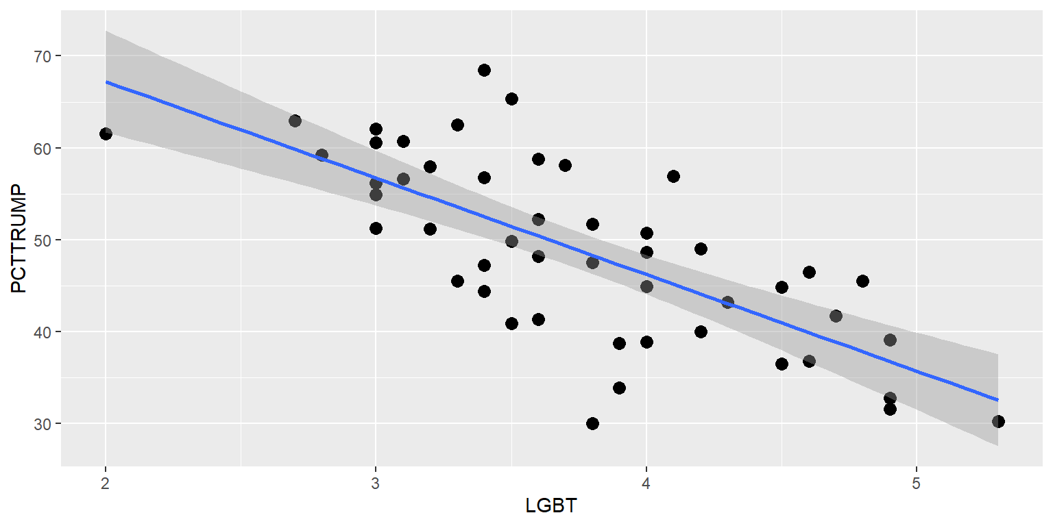
Let’s shut off the confidence interval, replace the points with state abbreviations, and put the state abbreviations on top of the linear regression line.
#library(tidyverse)

TRUMP <- tribble(
  ~STATE, ~STATEABBV, ~PCTTRUMP, ~LGBT,
  "Alabama","AL",62.08,3, "Alaska","AK",51.28,3, "Arizona","AZ",48.67,4, "Arkansas","AK",60.57,3,
  "California","CA",31.62,4.9, "Colorado","CO",43.25,4.3, "Connecticut","CT",40.93,3.5,
  "Delaware","DE",41.71,4.7, "Florida","FL",49.02,4.2, "Georgia","GA",50.77,4, "Hawaii","HI",30.04,3.8,
  "Idaho","ID",59.26,2.8, "Illinois","IL",38.76,3.9, "Indiana","IN",56.94,4.1, "Iowa","IA",51.15,3.2,
  "Kansas","KS",56.65,3.1, "Kentucky","KY",62.52,3.3, "Louisiana","LA",58.09,3.7, "Maine","ME",44.87,4.5,
  "Maryland","MD",33.91,3.9, "Massachusetts","MA",32.81,4.9, "Michigan","MI",47.5,3.8,
  "Minnesota","MN",44.92,4, "Mississippi","MS",57.94,3.2, "Missouri","MO",56.77,3.4,
  "Montana","MT",56.17,3, "Nebraska","NE",58.75,3.6, "Nevada","NV",45.5,4.8,
  "New Hampshire","NH",46.46,4.6, "New Jersey","NJ",41.35,3.6, "New Mexico","NM",40.04,4.2,
  "New York","NY",36.52,4.5, "North Carolina","NC",49.83,3.5, "North Dakota","ND",62.96,2.7,
  "Ohio","OH",51.69,3.8, "Oklahoma","OK",65.32,3.5, "Oregon","OR",39.09,4.9,
  "Pennsylvania","PA",48.18,3.6, "Rhode Island","RI",38.9,4, "South Carolina","SC",54.94,3,
  "South Dakota","SD",61.53,2, "Tennessee","TN",60.72,3.1, "Texas","TX",52.23,3.6, "Utah","UT",45.54,3.3,
  "Vermont","VT",30.27,5.3, "Virginia","VA",44.41,3.4, "Washington","WA",36.83,4.6,
  "West Virginia","WV",68.5,3.4, "Wisconsin","WI",47.22,3.4)

ggplot(data=TRUMP, aes(x=LGBT, y=PCTTRUMP)) +
  geom_smooth(method="lm", se=FALSE) +
  geom_text(size=4, label=TRUMP$STATEABBV)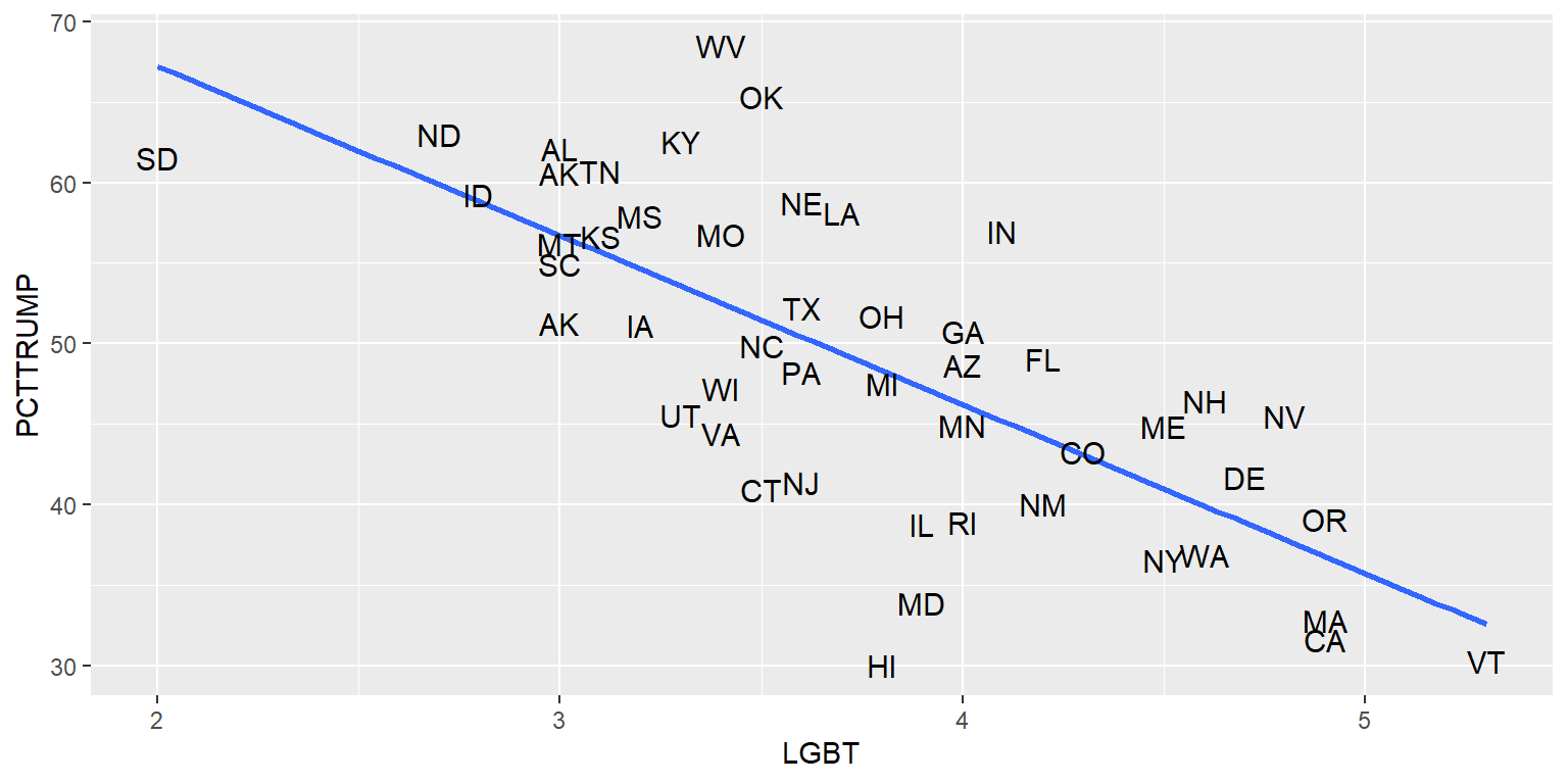
13.15 Jitters
Let’s plot on the y-axis the percentage LGBT in a state and on the x-axis whether at least half of votes in the state went to Donald Trump in the 2016 U.S. presidential election.
#library(tidyverse)

TRUMP <- tribble(
  ~STATE, ~STATEABBV, ~PCTTRUMP, ~LGBT,
  "Alabama","AL",62.08,3, "Alaska","AK",51.28,3, "Arizona","AZ",48.67,4, "Arkansas","AK",60.57,3,
  "California","CA",31.62,4.9, "Colorado","CO",43.25,4.3, "Connecticut","CT",40.93,3.5,
  "Delaware","DE",41.71,4.7, "Florida","FL",49.02,4.2, "Georgia","GA",50.77,4, "Hawaii","HI",30.04,3.8,
  "Idaho","ID",59.26,2.8, "Illinois","IL",38.76,3.9, "Indiana","IN",56.94,4.1, "Iowa","IA",51.15,3.2,
  "Kansas","KS",56.65,3.1, "Kentucky","KY",62.52,3.3, "Louisiana","LA",58.09,3.7, "Maine","ME",44.87,4.5,
  "Maryland","MD",33.91,3.9, "Massachusetts","MA",32.81,4.9, "Michigan","MI",47.5,3.8,
  "Minnesota","MN",44.92,4, "Mississippi","MS",57.94,3.2, "Missouri","MO",56.77,3.4,
  "Montana","MT",56.17,3, "Nebraska","NE",58.75,3.6, "Nevada","NV",45.5,4.8,
  "New Hampshire","NH",46.46,4.6, "New Jersey","NJ",41.35,3.6, "New Mexico","NM",40.04,4.2,
  "New York","NY",36.52,4.5, "North Carolina","NC",49.83,3.5, "North Dakota","ND",62.96,2.7,
  "Ohio","OH",51.69,3.8, "Oklahoma","OK",65.32,3.5, "Oregon","OR",39.09,4.9,
  "Pennsylvania","PA",48.18,3.6, "Rhode Island","RI",38.9,4, "South Carolina","SC",54.94,3,
  "South Dakota","SD",61.53,2, "Tennessee","TN",60.72,3.1, "Texas","TX",52.23,3.6, "Utah","UT",45.54,3.3,
  "Vermont","VT",30.27,5.3, "Virginia","VA",44.41,3.4, "Washington","WA",36.83,4.6,
  "West Virginia","WV",68.5,3.4, "Wisconsin","WI",47.22,3.4)

TRUMP$TRUMP50 <- case_when(
            TRUMP$PCTTRUMP>=50 ~ "Support Trump",
            TRUMP$PCTTRUMP< 50 ~ "Oppose Trump")

table(TRUMP$TRUMP50)

 Oppose Trump Support Trump
           27            22

ggplot(data=TRUMP, aes(x=TRUMP50, y=LGBT)) +
  geom_point()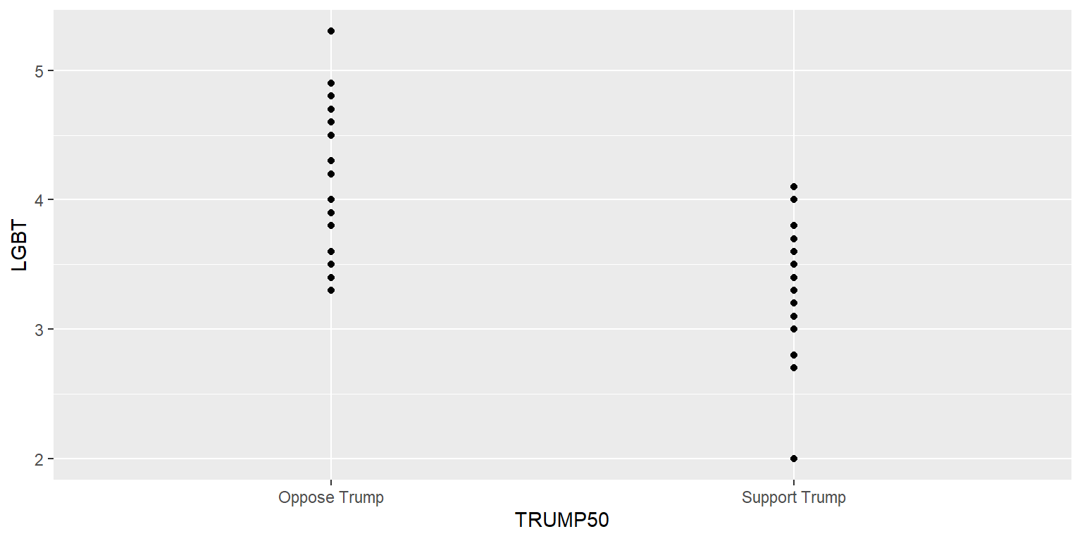
The above plot is flawed because some of the points are on top of each other and thus the plot might not accurately indicate the relative number of points in each column or the location of the points. But we can adjust this with a jitter.
#library(tidyverse)

TRUMP <- tribble(
  ~STATE, ~STATEABBV, ~PCTTRUMP, ~LGBT,
  "Alabama","AL",62.08,3, "Alaska","AK",51.28,3, "Arizona","AZ",48.67,4, "Arkansas","AK",60.57,3,
  "California","CA",31.62,4.9, "Colorado","CO",43.25,4.3, "Connecticut","CT",40.93,3.5,
  "Delaware","DE",41.71,4.7, "Florida","FL",49.02,4.2, "Georgia","GA",50.77,4, "Hawaii","HI",30.04,3.8,
  "Idaho","ID",59.26,2.8, "Illinois","IL",38.76,3.9, "Indiana","IN",56.94,4.1, "Iowa","IA",51.15,3.2,
  "Kansas","KS",56.65,3.1, "Kentucky","KY",62.52,3.3, "Louisiana","LA",58.09,3.7, "Maine","ME",44.87,4.5,
  "Maryland","MD",33.91,3.9, "Massachusetts","MA",32.81,4.9, "Michigan","MI",47.5,3.8,
  "Minnesota","MN",44.92,4, "Mississippi","MS",57.94,3.2, "Missouri","MO",56.77,3.4,
  "Montana","MT",56.17,3, "Nebraska","NE",58.75,3.6, "Nevada","NV",45.5,4.8,
  "New Hampshire","NH",46.46,4.6, "New Jersey","NJ",41.35,3.6, "New Mexico","NM",40.04,4.2,
  "New York","NY",36.52,4.5, "North Carolina","NC",49.83,3.5, "North Dakota","ND",62.96,2.7,
  "Ohio","OH",51.69,3.8, "Oklahoma","OK",65.32,3.5, "Oregon","OR",39.09,4.9,
  "Pennsylvania","PA",48.18,3.6, "Rhode Island","RI",38.9,4, "South Carolina","SC",54.94,3,
  "South Dakota","SD",61.53,2, "Tennessee","TN",60.72,3.1, "Texas","TX",52.23,3.6, "Utah","UT",45.54,3.3,
  "Vermont","VT",30.27,5.3, "Virginia","VA",44.41,3.4, "Washington","WA",36.83,4.6,
  "West Virginia","WV",68.5,3.4, "Wisconsin","WI",47.22,3.4)

TRUMP$TRUMP50 <- case_when(
            TRUMP$PCTTRUMP>=50 ~ "Trump>=50",
            TRUMP$PCTTRUMP< 50 ~ "Trump< 50")

ggplot(data=TRUMP, aes(x=TRUMP50, y=LGBT)) +
  geom_point(position=position_jitter(h=0, w=0.1, seed=1234))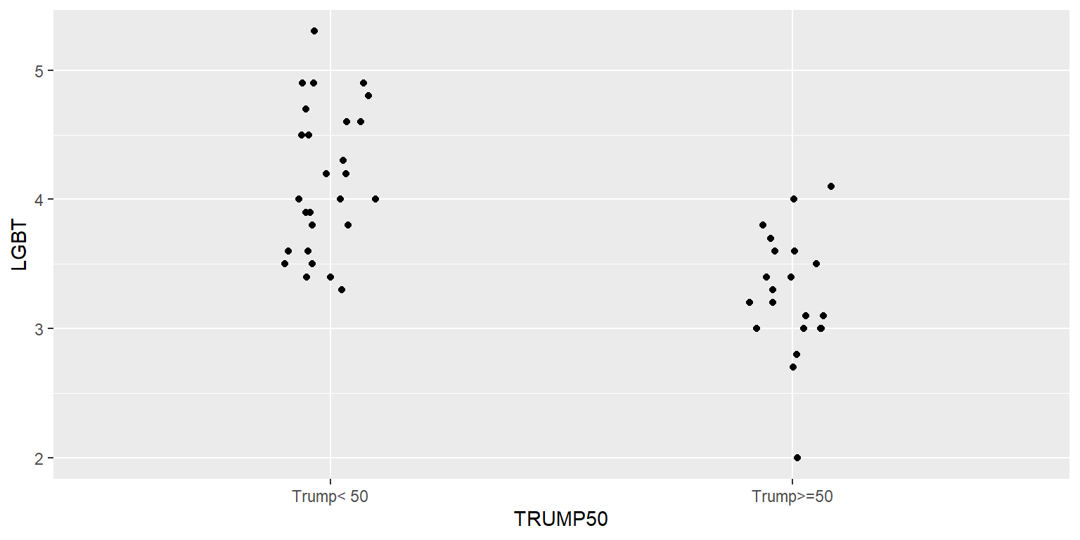
The h and w indicate the height and width of the jitter, and the seed is used if we want the jitter to be the same each time we run the code. Not setting a seed means that the jitter will be randomized each time the code is run.
#library(tidyverse)

TRUMP <- tribble(
  ~STATE, ~STATEABBV, ~PCTTRUMP, ~LGBT,
  "Alabama","AL",62.08,3, "Alaska","AK",51.28,3, "Arizona","AZ",48.67,4, "Arkansas","AK",60.57,3,
  "California","CA",31.62,4.9, "Colorado","CO",43.25,4.3, "Connecticut","CT",40.93,3.5,
  "Delaware","DE",41.71,4.7, "Florida","FL",49.02,4.2, "Georgia","GA",50.77,4, "Hawaii","HI",30.04,3.8,
  "Idaho","ID",59.26,2.8, "Illinois","IL",38.76,3.9, "Indiana","IN",56.94,4.1, "Iowa","IA",51.15,3.2,
  "Kansas","KS",56.65,3.1, "Kentucky","KY",62.52,3.3, "Louisiana","LA",58.09,3.7, "Maine","ME",44.87,4.5,
  "Maryland","MD",33.91,3.9, "Massachusetts","MA",32.81,4.9, "Michigan","MI",47.5,3.8,
  "Minnesota","MN",44.92,4, "Mississippi","MS",57.94,3.2, "Missouri","MO",56.77,3.4,
  "Montana","MT",56.17,3, "Nebraska","NE",58.75,3.6, "Nevada","NV",45.5,4.8,
  "New Hampshire","NH",46.46,4.6, "New Jersey","NJ",41.35,3.6, "New Mexico","NM",40.04,4.2,
  "New York","NY",36.52,4.5, "North Carolina","NC",49.83,3.5, "North Dakota","ND",62.96,2.7,
  "Ohio","OH",51.69,3.8, "Oklahoma","OK",65.32,3.5, "Oregon","OR",39.09,4.9,
  "Pennsylvania","PA",48.18,3.6, "Rhode Island","RI",38.9,4, "South Carolina","SC",54.94,3,
  "South Dakota","SD",61.53,2, "Tennessee","TN",60.72,3.1, "Texas","TX",52.23,3.6, "Utah","UT",45.54,3.3,
  "Vermont","VT",30.27,5.3, "Virginia","VA",44.41,3.4, "Washington","WA",36.83,4.6,
  "West Virginia","WV",68.5,3.4, "Wisconsin","WI",47.22,3.4)

TRUMP$TRUMP50 <- case_when(
            TRUMP$PCTTRUMP>=50 ~ "Trump>=50",
            TRUMP$PCTTRUMP< 50 ~ "Trump< 50")

ggplot(data=TRUMP, aes(x=TRUMP50, y=LGBT)) +
  geom_point(position=position_jitter(h=0, w=0.1))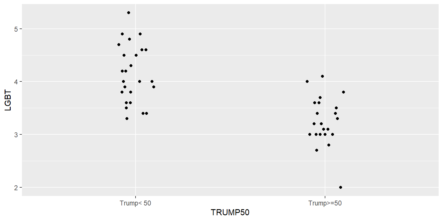
13.16 Patchwork
The patchwork package can be used to plot multiple different plots in the same plot. As indicated below, we can assign each plot to an object (“p.total <-”) and then plot these objects. The “p.histogram / (p.total + p.26)” line tells patchwork to put the p.histogram plot on top and the p.total and p.26 plots on the bottom.
#library(tidyverse)

DATA <- tribble(
  ~TEAM                  , ~WINPCT, ~PAY26    , ~PAYTOTAL ,
  "Los Angeles Dodgers"  , 0.654  , 174.661542, 266.020809,
  "New York Yankees"     , 0.568  , 141.518753, 205.669863,
  "New York Mets"        , 0.475  , 154.565754, 201.189189,
  "Philadelphia Phillies", 0.506  , 157.714046, 197.213223,
  "Houston Astros"       , 0.586  , 147.127725, 194.472041,
  "Boston Red Sox"       , 0.568  , 141.452731, 187.100784,
  "Los Angeles Angels"   , 0.475  ,  30.467086, 180.349558,
  "San Diego Padres"     , 0.488  , 125.977584, 179.764272,
  "San Francisco Giants" , 0.660  , 134.386796, 171.890308,
  "St. Louis Cardinals"  , 0.556  , 136.018560, 171.469994,
  "Atlanta Braves"       , 0.547  , 115.664387, 153.060458,
  "Toronto Blue Jays"    , 0.562  , 108.402749, 150.140253,
  "Chicago Cubs"         , 0.438  ,  33.910889, 144.607670,
  "Washington Nationals" , 0.401  ,  50.076145, 144.415187,
  "Chicago White Sox"    , 0.574  , 125.829369, 140.926169,
  "Cincinnati Reds"      , 0.512  ,  84.625436, 125.887446,
  "Minnesota Twins"      , 0.451  ,  83.609495, 120.084606,
  "Colorado Rockies"     , 0.460  ,  79.895422, 116.408966,
  "Milwaukee Brewers"    , 0.586  ,  79.937621,  99.377415,
  "Texas Rangers"        , 0.370  ,  24.843032,  95.788819,
  "Kansas City Royals"   , 0.457  ,  52.514932,  91.595545,
  "Arizona Diamondbacks" , 0.321  ,  52.829878,  91.232929,
  "Oakland Athletics"    , 0.531  ,  51.210210,  90.400598,
  "Detroit Tigers"       , 0.475  ,  61.408153,  86.348945,
  "Seattle Mariners"     , 0.556  ,  57.025609,  83.837448,
  "Tampa Bay Rays"       , 0.617  ,  44.288651,  70.836327,
  "Miami Marlins"        , 0.414  ,  16.304223,  58.157900,
  "Pittsburgh Pirates"   , 0.377  ,  16.572841,  54.356609,
  "Cleveland Indians"    , 0.494  ,  35.682311,  50.670534,
  "Baltimore Orioles"    , 0.321  ,  13.838690,  42.421870)

p.total <- ggplot(data=DATA, aes(x=PAYTOTAL, y=WINPCT)) +
  geom_point() +
  geom_smooth(method="lm", se=FALSE) +
  labs(x="Total Payroll ($ millions)", y="Win %")

p.26 <- ggplot(data=DATA, aes(x=PAY26, y=WINPCT)) +
  geom_point() +
  geom_smooth(method="lm", se=FALSE) +
  labs(x="26-man Payroll ($ millions)", y="Win %")

p.histogram <- ggplot(data=DATA, aes(x=WINPCT)) +
  geom_histogram(color="black", fill="blue3")

install.packages("patchwork", repos="http://cran.us.r-project.org")
#library(patchwork)

p.histogram / (p.total + p.26) +
  plot_annotation(title="MLB payroll and wins") & theme(plot.title=element_text(face="bold", size=18, hjust=0.5))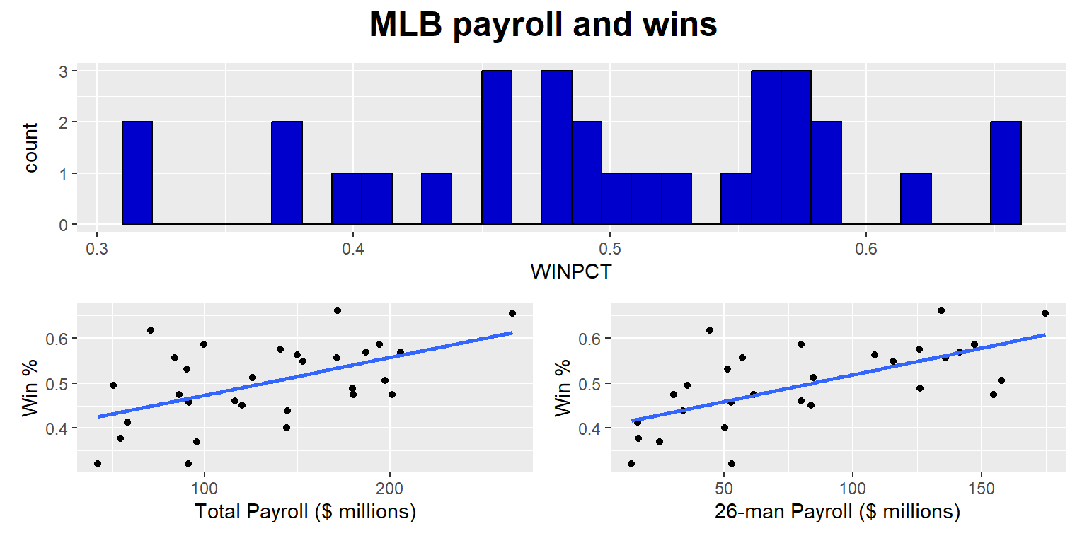
13.17 Legends
The geom_col() command below tells ggplot to plot columns. The columns will be filled with colors, so ggplot2 will add a legend to the plot.
#library(tidyverse)

DATA <- tribble(
  ~RACE                          , ~PARTY               , ~PCT    ,
  "White, non-Hispanic"          , "Democrat"           , 0.2676422,
  "White, non-Hispanic"          , "Independent / Other", 0.3238014,
  "White, non-Hispanic"          , "Republican"         , 0.4085564,
  "Black, non-Hispanic"          , "Democrat"           , 0.6743375,
  "Black, non-Hispanic"          , "Independent / Other", 0.2774533,
  "Black, non-Hispanic"          , "Republican"         , 0.0482093,
  "Hispanic"                     , "Democrat"           , 0.4365752,
  "Hispanic"                     , "Independent / Other", 0.3878438,
  "Hispanic"                     , "Republican"         , 0.1755811,
  "Asian or Native Hawaiian"     , "Democrat"           , 0.4496745,
  "Asian or Native Hawaiian"     , "Independent / Other", 0.330942 ,
  "Asian or Native Hawaiian"     , "Republican"         , 0.2193835,
  "Native American/Alaska Native", "Democrat"           , 0.2615603,
  "Native American/Alaska Native", "Independent / Other", 0.5508099,
  "Native American/Alaska Native", "Republican"         , 0.1876298,
  "Multiple races, non-Hispanic" , "Democrat"           , 0.3873582,
  "Multiple races, non-Hispanic" , "Independent / Other", 0.4645421,
  "Multiple races, non-Hispanic" , "Republican"         , 0.1480997)

DATA$RACE <- factor(DATA$RACE, levels=rev(c("Black, non-Hispanic","Multiple races, non-Hispanic","Hispanic","Native American/Alaska Native","Asian or Native Hawaiian","White, non-Hispanic")))

ggplot(data=DATA, aes(x=100*PCT, y=RACE, fill=PARTY)) +
  geom_col(color="black", linewidth=1.05, width=1) +
  scale_fill_manual(values=rev(c("Democrat"="blue3", "Independent / Other"="gray80", "Republican"="red3"))) +
  theme(
    axis.text.x        = element_text(size = 15, color = "black"),
    axis.text.y        = element_text(size = 15, color = "black"),
    axis.ticks.x       = element_blank(),
    axis.ticks.y       = element_blank(),
    axis.title.x       = element_blank(),
    axis.title.y       = element_blank(),
    panel.background   = element_rect(fill="white"))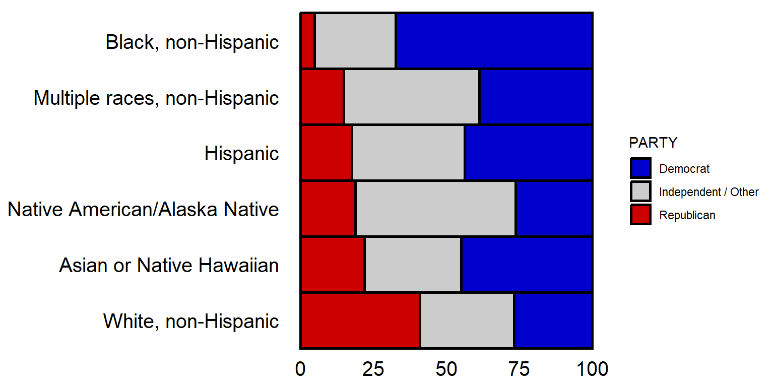
The theme code below for legend.position tells ggplot to put the legend at the bottom of the plot, and the guides command tells ggplot to do a few things, such as put all of the legend in one row.
#library(tidyverse)

DATA <- tribble(
  ~RACE                          , ~PARTY               , ~PCT    ,
  "White, non-Hispanic"          , "Democrat"           , 0.2676422,
  "White, non-Hispanic"          , "Independent / Other", 0.3238014,
  "White, non-Hispanic"          , "Republican"         , 0.4085564,
  "Black, non-Hispanic"          , "Democrat"           , 0.6743375,
  "Black, non-Hispanic"          , "Independent / Other", 0.2774533,
  "Black, non-Hispanic"          , "Republican"         , 0.0482093,
  "Hispanic"                     , "Democrat"           , 0.4365752,
  "Hispanic"                     , "Independent / Other", 0.3878438,
  "Hispanic"                     , "Republican"         , 0.1755811,
  "Asian or Native Hawaiian"     , "Democrat"           , 0.4496745,
  "Asian or Native Hawaiian"     , "Independent / Other", 0.330942 ,
  "Asian or Native Hawaiian"     , "Republican"         , 0.2193835,
  "Native American/Alaska Native", "Democrat"           , 0.2615603,
  "Native American/Alaska Native", "Independent / Other", 0.5508099,
  "Native American/Alaska Native", "Republican"         , 0.1876298,
  "Multiple races, non-Hispanic" , "Democrat"           , 0.3873582,
  "Multiple races, non-Hispanic" , "Independent / Other", 0.4645421,
  "Multiple races, non-Hispanic" , "Republican"         , 0.1480997)

DATA$RACE <- factor(DATA$RACE, levels=rev(c("Black, non-Hispanic","Multiple races, non-Hispanic","Hispanic","Native American/Alaska Native","Asian or Native Hawaiian","White, non-Hispanic")))

ggplot(data=DATA, aes(x=100*PCT, y=RACE, fill=PARTY)) +
  geom_col(color="black", linewidth=1.05, width=1) +
  scale_fill_manual(values=rev(c("Democrat"="blue3", "Independent / Other"="gray80", "Republican"="red3"))) +
  guides(fill=guide_legend(reverse=F, nrow=1, byrow=TRUE, title="")) +
  theme(
    axis.text.x        = element_text(size = 15, color = "black"),
    axis.text.y        = element_text(size = 15, color = "black"),
    axis.ticks.x       = element_blank(),
    axis.ticks.y       = element_blank(),
    axis.title.x       = element_blank(),
    axis.title.y       = element_blank(),
    legend.position    = "bottom",
    panel.background   = element_rect(fill="white"))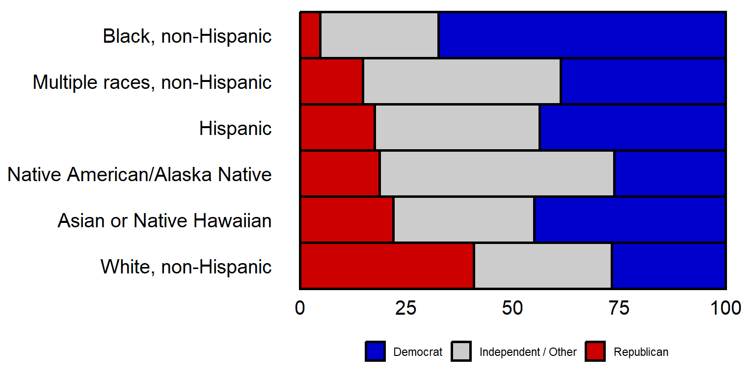
The legend can be shut off with the theme element of legend.position = “none”.
By the way, the above plot has the plot region range from Democrat > Independent > Republican, but has the reverse order for the legend. Can you figure out how to get the left-to-right order for the plot region to be the same as the left-to-right order for the legend?