15 Data visualization in R
Major learning objective(s) for this section:
- Edit R code to produce a new data visualization, as directed.
One of the best features of R is its ability to customize data visualizations. For this, the R package called the tidyverse is very useful. R has a base set of functions that are available any time R is opened. But R has the ability to load packages that are not part of base R. To work with these packages, we can first download the packages to our computer and then load the packages into our working session of R. The code below will do that:
The install.packages(“tidyverse”) command will ask you to select a mirror site to download the packages from. It’s fine to pick any site in the list. Once the package is installed in your computer, you don’t need to install the package unless you want update the package. But you will need to run the library(tidyverse) command each time you want to load the tidyverse package into your working session of R.
Let’s start with a basic plot, with the R code below:
library(tidyverse)

DATA <- tribble(
                ~GROUP                , ~PE , ~CILO, ~CIHI,
                "Joe Biden\nvoters"   , 59.8,  58.7,  60.8,
                "Donald Trump\nvoters", 84.7,  84.0,  85.4,
                "Other\nvoters"       , 62.1,  58.4,  65.9)

ggplot(data = DATA, aes(x = GROUP, y = PE, fill = GROUP)) +
  geom_col()
The library(tidyverse) command loads the tidyverse package. The tribble command is used to enter the data and the <- function sends the data to an object called DATA. For the tribble command, the tildes (~) tell R what the column names are, and the rest of the data is aligned into those columns. The \n tells R to enter a line break. The abbreviations are PE for point estimate (our best guess at the true value), CILO (the low end of our confidence interval), and CIHI (the high end of our confidence interval). ggplot is the main plotting command, aes refers to aesthetics (how things look), and geom_col tells R to plot columns.
Let’s see what that code produces:
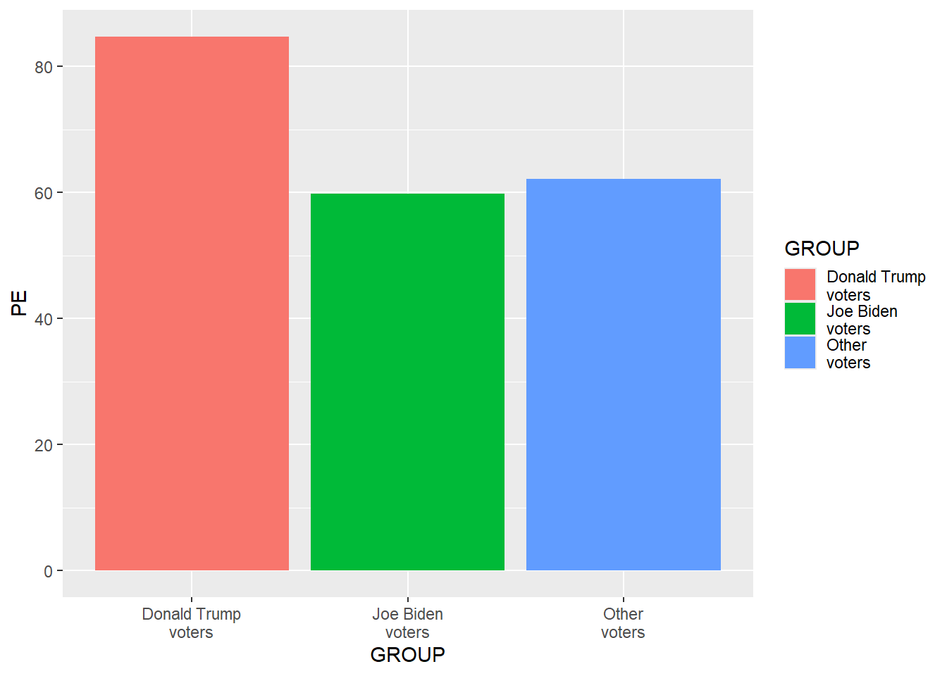
The data visualization above uses the tidyverse default features, such as the color palette, a gray background, and a legend. Moreover, the order of the groups in the DATA dataset lists Joe Biden voters first, but the data visualization has Donald Trump voters as the leftmost column, because the ggplot default is to order groups alphabetically. Let’s add a line of code to get the groups in a different order, as below. R can hold multiple datasets, so if we want to identify a variable in a particular dataset, we can use the $ to separate the dataset from the variable, so that, in the code below, DATA$GROUP refers to the variable GROUP in the dataset DATA.
library(tidyverse)

DATA <- tribble(
                ~GROUP                , ~PE , ~CILO, ~CIHI,
                "Joe Biden\nvoters"   , 59.8,  58.7,  60.8,
                "Donald Trump\nvoters", 84.7,  84.0,  85.4,
                "Other\nvoters"       , 62.1,  58.4,  65.9)

DATA$GROUP <- factor(DATA$GROUP, levels = DATA$GROUP)

ggplot(data = DATA, aes(x = GROUP, y = PE, fill = GROUP)) +
geom_col() 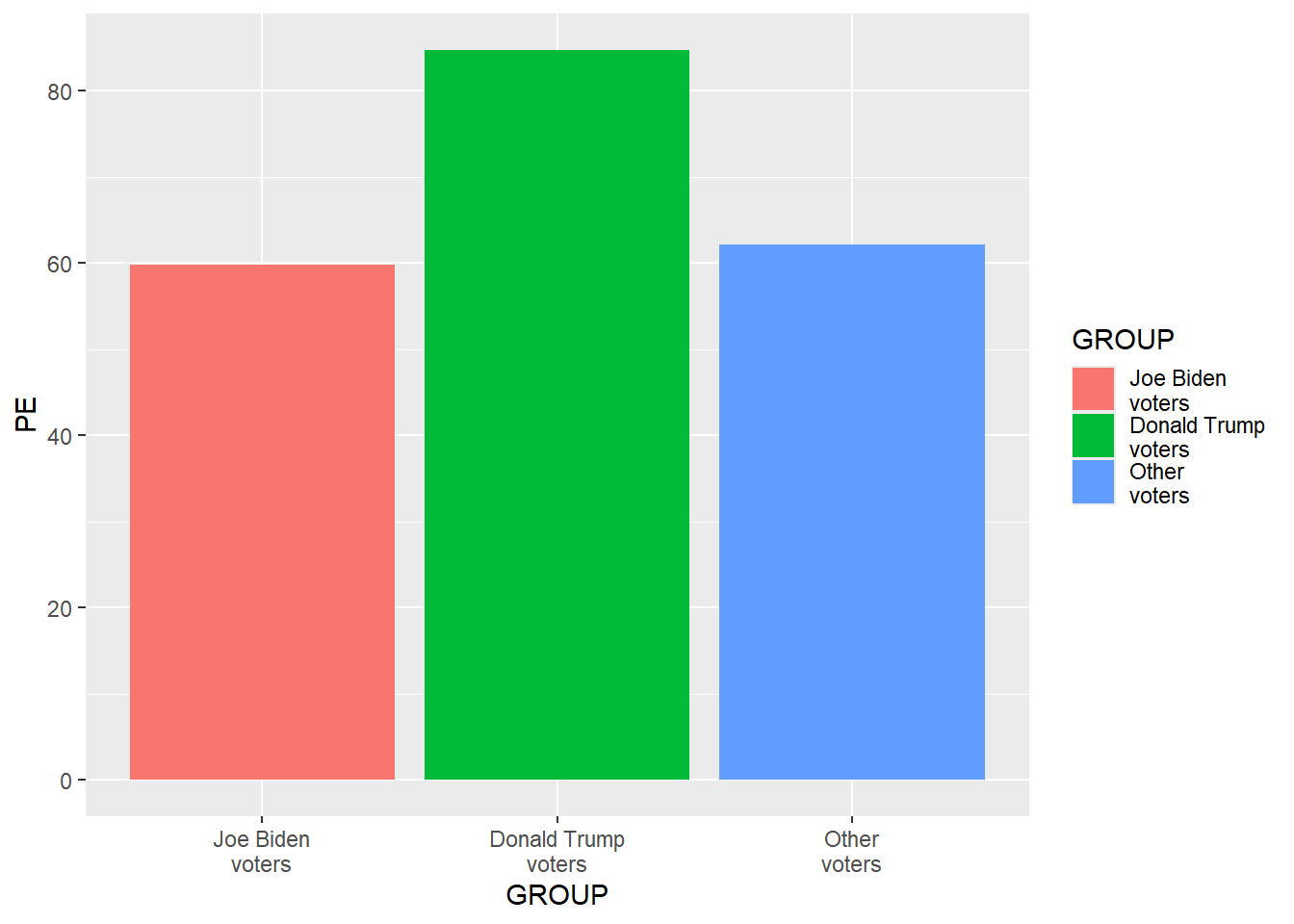
Let’s add code to customize the plot even more. Don’t worry about understanding all of the code yet.
library(tidyverse)

DATA <- tribble(
                ~GROUP                , ~PE , ~CILO, ~CIHI,
                "Joe Biden\nvoters"   , 59.8,  58.7,  60.8,
                "Donald Trump\nvoters", 84.7,  84.0,  85.4,
                "Other\nvoters"       , 62.1,  58.4,  65.9)

DATA$GROUP <- factor(DATA$GROUP, levels = DATA$GROUP)

ggplot(data = DATA, aes(x = GROUP, y = PE, fill = GROUP)) +
  geom_col(linewidth = 1.1, color = "black", width = 0.85) +
  geom_errorbar(aes(ymin = CILO, ymax = CIHI), width = 0.25) +
  geom_text(aes(x = GROUP, y = CIHI + 5, label = sprintf("%0.1f", PE)), size = 5.5) +
  scale_fill_manual(values = c("Joe Biden\nvoters" = "green3", "Donald Trump\nvoters" = "green3", "Other\nvoters" = "green3")) +
  scale_y_continuous(limits = c(0,100), breaks = seq(0,100,10), expand = c(0,0), name = "%") +
  labs(title = "Mean rating about police", subtitle = "on a 0-to-100 scale", caption = "Data source: American National Election Studies 2020 Time Series Study.\nError bars are 83.4% confidence intervals.") +
  theme(
    axis.text.x        = element_text(size = 15, color = "black", margin = margin(t = 7, b = 7)),
    axis.text.y        = element_text(size = 15, color = "black", margin = margin(r = 7)),
    axis.ticks.x       = element_blank(),
    axis.ticks.y       = element_blank(),
    axis.title.x       = element_blank(),
    axis.title.y       = element_text(size = 15, color = "black", angle = 0, vjust = 0.5),
    legend.position    = "none",
    panel.background   = element_rect(fill = "gray80"),
    panel.border       = element_rect(linewidth = 2, color = "black", fill = NA),
    panel.grid.major.x = element_blank(),
    panel.grid.major.y = element_line(linewidth = 0.25, color = "gray60"),
    panel.grid.minor.x = element_blank(),
    panel.grid.minor.y = element_blank(),
    plot.caption       = element_text(size = 12,                hjust = 0.5, margin = margin(t = 7)),
    plot.margin        = unit(c(t = 0.5, r = 0.5, b = 0.5, l = 0.5), "cm"),
    plot.subtitle      = element_text(size = 18,                hjust = 0.5, margin = margin(t = 0, b = 10)),
    plot.title         = element_text(size = 20, face = "bold", hjust = 0.5, margin = margin(t = 0, b = 5)))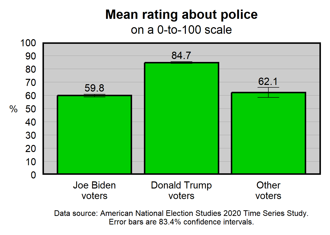
The important thing that I would like students to be able to handle at this point is to edit the code as directed. For example, in U.S. politics, blue is often used to represent Democrats, and red is often used to represent Republicans. So let’s change the code so that the column for Joe Biden voters is “blue3”, the column for Donald Trump voters is “red3”, and the column for other voters is “gray80”. For this, we can take the code…
scale_fill_manual(values = c("Joe Biden\nvoters" = "green3", "Donald Trump\nvoters" = "green3", "Other\nvoters" = "green3")) +…and change the code to…
scale_fill_manual(values = c("Joe Biden\nvoters" = "blue3", "Donald Trump\nvoters" = "red3", "Other\nvoters" = "gray80")) +…to get the plot below:
library(tidyverse)

DATA <- tribble(
                ~GROUP                , ~PE , ~CILO, ~CIHI,
                "Joe Biden\nvoters"   , 59.8,  58.7,  60.8,
                "Donald Trump\nvoters", 84.7,  84.0,  85.4,
                "Other\nvoters"       , 62.1,  58.4,  65.9)

DATA$GROUP <- factor(DATA$GROUP, levels = DATA$GROUP)

ggplot(data = DATA, aes(x = GROUP, y = PE, fill = GROUP)) +
  geom_col(linewidth = 1.1, color = "black", width = 0.85) +
  geom_errorbar(aes(ymin = CILO, ymax = CIHI), width = 0.25) +
  geom_text(aes(x = GROUP, y = CIHI + 5, label = sprintf("%0.1f", PE)), size = 5.5) +
  scale_fill_manual(values = c("Joe Biden\nvoters" = "blue3", "Donald Trump\nvoters" = "red3", "Other\nvoters" = "gray80")) +
  scale_y_continuous(limits = c(0,100), breaks = seq(0,100,10), expand = c(0,0)) +
  labs(title = "Mean rating about police", subtitle = "on a 0-to-100 scale", caption = "Data source: American National Election Studies 2020 Time Series Study.\nError bars are 83.4% confidence intervals.") +
  theme(
    axis.text.x        = element_text(size = 15, color = "black", margin = margin(t = 7, b = 7)),
    axis.text.y        = element_text(size = 15, color = "black", margin = margin(r = 7)),
    axis.ticks.x       = element_blank(),
    axis.ticks.y       = element_blank(),
    axis.title.x       = element_blank(),
    axis.title.y       = element_text(size = 15, color = "black", angle = 0, vjust = 0.5),
    legend.position    = "none",
    panel.background   = element_rect(fill = "gray80"),
    panel.border       = element_rect(linewidth = 2, color = "black", fill = NA),
    panel.grid.major.x = element_blank(),
    panel.grid.major.y = element_line(linewidth = 0.25, color = "gray60"),
    panel.grid.minor.x = element_blank(),
    panel.grid.minor.y = element_blank(),
    plot.caption       = element_text(size = 12,                hjust = 0.5, margin = margin(t = 7)),
    plot.margin        = unit(c(t = 0.5, r = 0.5, b = 0.5, l = 0.5), "cm"),
    plot.subtitle      = element_text(size = 18,                hjust = 0.5, margin = margin(t = 0, b = 10)),
    plot.title         = element_text(size = 20, face = "bold", hjust = 0.5, margin = margin(t = 0, b = 5)))
This data visualization isn’t ideal yet. For example, the numbers on the y-axis are not needed, given that the point estimates are labeled on the columns.
Canvas has an assignment that will direct you to edit a R code for a data visualization. R can be accessed in ISU campus computer labs, or by downloading R to your computer, or at websites such as WebR.