PS: Political Science & Politics recently published Hartnett and Haver 2022 "Unconditional support for Trump's resistance prior to Election Day".

Hartnett and Haver 2022 reported on an experiment conducted in October 2020 in which likely Trump voters were asked to consider the hypothetical of a Biden win in the Electoral College and in the popular vote, with a Biden popular vote percentage point win randomly assigned to be from 1 percentage point through 15 percentage points. These likely Trump voters were then asked whether the Trump campaign should resist or concede.

Data were collected before the election, but Hartnett and Haver 2022 did not report anything about a corresponding experiment involving likely Biden voters. Hartnett and Haver 2022 discussed a Reuters/Ipsos poll that "found that 41% of likely Trump voters would not accept a Biden victory and 16% of all likely Trump voters 'would engage in street protests or even violence' (Kahn 2020)". The Kahn 2020 source indicates that the corresponding percentages for Biden voters for a Trump victory were 43% and 22%, so it didn't seem like there was a good reason to not include a parallel experiment for Biden voters, especially because data on only Trump voters wouldn't permit valid inferences about the characteristics on which Trump voters were distinctive.

---

But text for a somewhat corresponding experiment involving likely Biden voters is hidden in the Hartnett and Haver 2022 codebook under white boxes or something like that. The text of the hidden items can be highlighted, copied, and pasted from the bottom of pages 19 and 20 of the codebook PDF (or more hidden text can be copied, using ctrl+A, then ctrl-C, and then pasted with ctrl-V).

The hidden codebook text indicates that the hartnett_haver block of the survey had a "bidenlose" item that asked likely Biden voters whether, if Biden wins the popular vote by the randomized percentage points and Trump wins the electoral college, the Biden campaign should "Resist the results of the election in any way possible" or "Concede defeat".

There might be an innocent explanation for Hartnett and Haver 2022 not reporting the results for those items, but that innocent explanation hasn't been shared with me yet on Twitter. Maybe Hartnett and Haver 2022 have a manuscript in progress about the "bidenlose" item.

---

NOTES

1. Hartnett and Haver 2022 seems to be the survey that Emily Badger at the New York Times referred to as "another recent survey experiment conducted by Brian Schaffner, Alexandra Haver and Brendan Hartnett at Tufts". The copied-and-pasted codebook text indicates that this was for the "2020 Tufts Class Survey".

2. On page 18 of the Hartnett and Haver 2022 codebook, above the hidden item about socialism, part of the text of the "certain advantages" item is missing, which seems to be a should-be-obvious indication that text has been covered.

3. The codebook seems to be missing pages of the full survey: in the copied-and-pasted text, page numbers jump from "Page 21 of 43" to "Page 24 of 43" to "Page 31 of 43" to "Page 33 of 43". Presumably at least some missing items were for other members of the Tufts class, although I'm not sure what happened to page 32, which seems to be part of the hartnett_haver block that started on page 31 and ended on page 33.

4. The dataset for Hartnett and Haver 2022 includes a popular vote percentage point win from 1 percentage point through 15 percentage points assigned to likely Biden voters, but the dataset has no data on a resist-or-concede outcome or on a follow-up open-ended item.

Tagged with: , , , ,

The American Political Science Review recently published a letter: Stephens-Dougan 2022 "White Americans' reactions to racial disparities in COVID-19".

Figure 1 of the Stephens-Dougan 2022 APSR letter reports results for four outcomes among racially prejudiced Whites, with the 84% confidence interval in the control overlapping with the 84% confidence interval in the treatment for only one of the four reported outcomes (zooming in on Figure 1, the confidence intervals for the parks outcome don't seem to overlap, and the code returns 0.1795327 for the upper bound for the control and 0.18800818 for the lower bound for the treatment). And results for the most obviously overlapping 84% confidence intervals seem to be interpreted as sufficient evidence of an effect, with all four reported outcomes discussed in the passage below:

When racially prejudiced white Americans were exposed to the racial disparities information, there was an increase in the predicted probability of indicating that they were less supportive of wearing face masks, more likely to feel their individual rights were being threatened, more likely to support visiting parks without any restrictions, and less likely to think African Americans adhere to social distancing guidelines.

---

There are at least three things to keep track of: [1] the APSR letter, [2] the survey questionnaire, located at the OSF site for the Time-sharing Experiments for the Social Sciences project; and [3] the pre-analysis plan, located at the OSF and in the appendix of the APSR article. I'll use the PDF of the pre-analysis plan. The TESS site also has the proposal for the survey experiment, but I won't discuss that in this post.

---

The pre-analysis plan does not mention all potential outcome variables that are in the questionnaire, but the pre-analysis plan section labeled "Hypotheses" includes the passage below:

Specifically, I hypothesize that White Americans with anti-Black attitudes and those White Americans who attribute racial disparities in health to individual behavior (as opposed to structural factors), will be more likely to disagree with the following statements:

The United States should take measures aimed at slowing the spread of the coronavirus while more widespread testing becomes available, even if that means many businesses will have to stay closed.

It is important that people stay home rather than participating in protests and rallies to pressure their governors to reopen their states.

I also hypothesize that White Americans with anti-Black attitudes and who attribute racial health disparities to individual behavior will be more likely to agree with the following statements:

State and local directives that ask people to "shelter in place" or to be "safer at home" are a threat to individual rights and freedom.

The United States will take too long in loosening restrictions and the economic impact will be worse with more jobs being lost

The four outcomes mentioned in the passage above correspond to items Q15, Q18, Q16, and Q21 in the survey questionnaire, but, of these four outcomes, the APSR letter reported on only Q16.

The outcome variables in the APSR letter are described as: "Wearing facemasks is not important", "Individual rights and freedom threatened", "Visit parks without any restrictions", and "Black people rarely follow social distancing guidelines". These outcome variables correspond to survey questionnaire items Q20, Q16, Q23A, and Q22A.

---

The pre-analysis plan PDF mentions moderators, with three moderators about racial dispositions: racial resentment, negative stereotype endorsement, and attributions for health disparities. The plan indicates that:

For racial predispositions, we will use two or three bins, depending on their distributions. For ideology and party, we will use three bins. We will include each bin as a dummy variable, omitting one category as a baseline.

The APSR letter reported on only one racial predispositions moderator: negative stereotype endorsement.

---

I'll post a link in the notes below to some of my analyses about the "Specifically, I hypothesize" outcomes, but I don't want to focus on the results, because I wanted this post to focus on deviations from the pre-analysis plan, because -- regardless of whether the estimates from the analyses in the APSR letter are similar to the estimates from the planned analyses in the pre-analysis plan -- I think that it's bad that readers can't trust the APSR to ensure that a pre-analysis plan is followed or at least to provide an explanation about why a pre-analysis plan was not followed, especially given that this APSR letter described itself as reporting on "a preregistered survey experiment" and included the pre-analysis plan in the appendix.

---

NOTES

1. The Stephens-Dougan 2022 APSR letter suggests that the negative stereotype endorsement variable was coded dichotomously ("a variable indicating whether the respondent either endorsed the stereotype that African Americans are less hardworking than whites or the stereotype that African Americans are less intelligent than whites"), but the code and the appendix of the APSR letter indicate that the negative stereotype endorsement variable was measured so that the highest level is for respondents who reported a negative relative stereotype about Blacks for both stereotypes. From Table A7:

(unintelligentstereotype 2 + lazystereotype2 )/2

In the data after running the code for the APSR letter, the negative stereotype endorsement variable is a three-level variable coded 0 for respondents who did not report a negative relative stereotype about Blacks for either stereotype, 0.5 for respondents who reported a negative stereotype about Blacks for one stereotype, and 1 for respondents who reported a negative relative stereotype about Blacks for both stereotypes.

2. The APSR letter indicated that:

The likelihood of racially prejudiced respondents in the control condition agreeing that shelter-in-place orders threatened their individual rights and freedom was 27%, compared with a likelihood of 55% in the treatment condition (p < 0.05 for a one-tailed test).

My analysis using survey weights got 44% and 29% among participants who reported a negative relative stereotype about Blacks for at least one of the two stereotype items, and my analysis got 55% and 26% among participants who reported negative relative stereotypes about Blacks for both stereotype items, with a trivial overlap in 84% confidence intervals.

But the 55% and 26% in a weighted analysis were 43% and 37% in an unweighted analysis with a large overlap in 84% confidence intervals, suggesting that at least some of the results in the APSR letter might be limited to the weighted analysis. I ran the code for the APSR letter removing the weights from the glm command and got the revised Figure 1 plot below. The error bars in the APSR letter are described as 84% confidence intervals.

I think that it's fine to favor the weighted analysis, but I'd prefer that publications indicate when results from an experiment are not robust to the application or non-application of weights. Relevant publication.

3. Given the results in my notes [1] and [2], maybe the APSR letter's Figure 1 estimates are for only respondents who reported negative relative stereotype about Blacks for both stereotypes. If so, the APSR letter's suggestion that this population is the 26% that reported anti-Black stereotypes for either stereotype might be misleading, if the Figure 1 analyses were estimated for only the 10% that reported negative relative stereotype about Blacks for both stereotypes.

For what it's worth, the R code for the APSR letter has code that doesn't use the 0.5 level of the negative stereotype endorsement variable, such as:

# Below are code for predicted probabilities using logit model

# Predicted probability "individualrights_dichotomous"

# Treatment group, negstereotype_endorsement = 1

p1.1 <- invlogit(coef(glm1)[1] + coef(glm1)[2] * 1 + coef(glm1)[3] * 1 + coef(glm1)[4] * 1)

It's possible to see what happens to the Figure 1 results when the negative stereotype endorsement variable is coded 1 for respondents who endorsed at least one of the stereotypes. Run this at the end of the Stata code for the APSR letter:

replace negstereotype_endorsement = ceil((unintelligentstereotype2 + lazystereotype2)/2)

Then run the R code for the APSR letter. Below is the plot I got for a revised Figure 1, with weights applied and the sample limited to respondents who endorsed at least one of the stereotypes:

Estimates in the figure above were close to estimates in my analysis using these Stata commands after running the Stata code from the APSR letter. Stata output.

4. Data, Stata code, and Stata output for my analysis about the "Specifically, I hypothesize" passage of the Stephens-Dougan pre-analysis plan.

My analysis in the Stata output had seven outcomes: the four outcomes mentioned in the "Specifically, I hypothesize" part of the pre-analysis plan as initially measured (corresponding to questionnaire items Q15, Q18, Q16, and Q21), with no dichotomization of five-point response scales for Q15, Q18, and Q16; two of these outcomes (Q15 and Q16) dichotomized as mentioned in the pre-analysis plan (e.g., "more likely to disagree" was split into disagree / not disagree categories, with the not disagree category including respondent skips); and one outcome (Q18) dichotomized so that one category has "Not Very Important" and "Not At All Important" and the other category has the other responses and skips, given that the pre-analysis plan had this outcome dichotomized as disagree but response options in the survey were not on an agree-to-disagree scale. Q21 was measured as a dichotomous variable.

The analysis was limited to presumed racially prejudiced Whites, because I think that that's what the pre-analysis plan hypotheses quoted above focused on. Moreover, that analysis seems more important than a mere difference between groups of Whites.

Note that, for at least some results, a p<0.05 treatment effect might be in the unintuitive direction, so be careful before interpreting a p<0.05 result as evidence for the hypotheses.

My analyses aren't the only analyses that can be conducted, and it might be a good idea to combine results across outcomes mentioned in the pre-analysis plan or across all outcomes in the questionnaire, given that the questionnaire had at least 12 items that could serve as outcome variables.

For what it's worth, I wouldn't be surprised if a lot of people who respond to survey items in an unfavorable way about Blacks backlashed against a message about how Blacks were more likely than Whites to die from covid-19.

5. The pre-analysis plan included a footnote that:

Given the results from my pilot data, it is also my expectation that partisanship will moderate the effect of the treatment or that the treatment effects will be concentrated among Republican respondents.

Moreover, the pre-analysis plan indicated that:

The condition and treatment will be blocked by party identification so that there are roughly equal numbers of Republicans and Democrats in each condition.

But the lone mention of "Repub-" in the APSR letter is:

The sample was 39% self-identified Democrats (including leaners) and 46% self-identified Republicans (including leaners).

6. Link to tweets about the APSR letter.

Tagged with: , , , , , , , ,

1.

Politics, Groups, and Identities recently published Cravens 2022 "Christian nationalism: A stained-glass ceiling for LGBT candidates?". The key predictor is a Christian nationalism index that ranges from 0 to 1, with a key result that:

In both cases, a one-point increase in the Christian nationalism index is associated with about a 40 percent decrease in support for both lesbian/gay and transgender candidates in this study.

But the 40 percent estimates are based on Christian nationalism coefficients in models in which Christian nationalism is interacted with partisanship, race, and religion, and I don't think that these coefficients can be interpreted as associations across the sample. The estimates across the sample should be from models in which Christian nationalism is not included in an interaction, of -0.167 for lesbian and gay political candidates and -0.216 for transgender political candidates. So about half of 40 percent.

Check Cravens 2022 Figure 2, which reports results for support for lesbian and gay candidates: eyeballing from the figure, the drop across the range of Christian nationalism is about 14 percent for Whites, about 18 percent for Blacks, about 9 percent for AAPI, and about 15 percent for persons of another race. No matter how you weight these four categories, the weighted average doesn't get close to 40 percent.

---

2.

And I think that the constitutive terms in the interactions are not always correctly described, either. From Cravens 2022:

As the figure shows, Christian nationalism is negatively associated with support for lesbian and gay candidates across all partisan identities in the sample. Christian nationalist Democrats and Independents are more supportive than Christian nationalist Republicans by about 23 and 17 percent, respectively, but the effects of Christian nationalism on support for lesbian and gay candidates are statistically indistinguishable between Republicans and third-party identifiers.

Table 2 coefficients are 0.231 for Democrats and 0.170 for Independents, with Republicans as the omitted category, with these partisan predictors interacted with Christian nationalism. But I don't think that these coefficients indicate the difference between Christian nationalist Democrats/Independents and Christian nationalist Republicans. In Figure 1, Christian nationalist Democrats are at about 0.90 and Christian nationalist Republicans are at about 0.74, which is less than a 0.231 gap.

---

3.

From Cravens 2022:

Christian nationalism is associated with opposition to LGBT candidates even among the most politically supportive groups (i.e., Democrats).

For support for lesbian and gay candidates and support for transgender candidates, the Democrat predictor interacted with Christian nationalism has a p-value less than p=0.05. But that doesn't indicate whether there is sufficient evidence that the slope for Christian nationalism is non-zero among Democrats. In Figure 1, for example, the point estimate for Democrats at the lowest level of Christian nationalism looks to be within the 95% confidence interval for Democrats at the highest level of Christian nationalism.

---

4.

From Cravens 2022:

In other words, a one-point increase in the Christian nationalism index is associated with a 40 percent decrease in support for lesbian and gay candidates. For comparison, an ideologically very progressive respondent is only about four percent more likely to support a lesbian or gay candidate than an ideologically moderate respondent; while, a one-unit increase in church attendance is only associated with a one percent decrease in support for lesbian and gay candidates. Compared to every other measure, Christian nationalism is associated with the largest and most negative change in support for lesbian and gay candidates.

The Christian nationalism index ranges from 0 to 1, so the one-point increase discussed in the passage is the full estimated effect of Christian nationalism. The church attendance predictor runs from 0 to 6, so the one-unit increase in church attendance discussed in the passage is one-sixth the estimated effect of church attendance. The estimated effect of Christian nationalism is still larger than the estimated effect of church attendance when both predictors are put on a 0-to-1 scale, but I don't know of a good reason to compare a one-unit increase on the 0-to-1 Christian nationalism predictor to a one-unit increase on the 0-to-6 church attendance predictor.

The other problem is that the Christian nationalism index combines three five-point items, so it might be a better measure of Christian nationalism than, say, the progressive predictor is a measure of political ideology. This matters because, all else equal, poorer measures of a concept are biased toward zero. Or maybe the ends of the Christian nationalism index represent more distance than the ends of the political ideology measure. Or maybe not. But I think that it's a good idea to discuss these concerns when comparing predictors to each other.

---

5.

Returning to the estimates for Christian nationalism, I'm not even sure that -0.167 for lesbian and gay political candidates and -0.216 for transgender political candidates are good estimates. For one thing, these estimates are extrapolations from linear regression lines, instead of comparisons of observed outcomes at low and high levels of Christian nationalism, so it's not clear whether the linear regression line is correctly estimating the outcome for high levels of Christian nationalism, given that, for each Christian nationalist statement, the majority of the sample falls on the side of the items opposing the statement, so that the estimated effect of Christian nationalism might be more influenced by opponents of Christian nationalism than by supporters of Christian nationalism.

For another thing, I think that the effect of Christian nationalism should be conceptualized as being caused by a change from indifference to Christian nationalism to support for Christian nationalism, which means that including observations from opponents of Christian nationalism might bias the estimated effect of Christian nationalism.

For an analogy, imagine that we are interested in the effect of being a fan of the Beatles. I think that it would be preferable to compare, net of controls, outcomes for fans of the Beatles to outcomes for people indifferent to the Beatles, instead of comparing, net of controls, outcomes for fans of the Beatles to outcomes for people who hate the Beatles. The fan/hate comparison means that the estimated effect of being a fan of the Beatles is *necessarily* the exact same size as the estimated effect of hating the Beatles, but I think that these are different phenomena. Similarly, I think that supporting Christian nationalism is a different phenomenon than opposing Christian nationalism.

---

NOTES

1. Cravens 2022 model 2 regressions in Tables 2 and 3 include controls plus a predictor for Christian nationalism, three partisanship categories plus Republican as the omitted category, three categories of race plus White as the omitted category, and five categories of religion plus Protestant as the omitted category, and interactions of Christian nationalism with the three included partisanship categories, interactions of Christian nationalism with the three included race categories, and interactions of Christian nationalism with the five included religion categories.

It might be tempting to interpret the Christian nationalism coefficient in these regressions as indicating the association of Christian nationalism with the outcome net of controls among the omitted interactions category of White Protestant Republicans, but I don't think that's correct because of the absence of higher-order interactions. Let me discuss a simplified simulation to illustrate this.

The simulation had participants that were either male (male=1) or female (male=0) and participants that were either Republican (gop=1) or Democrat (gop=0). In the simulation, I set the association of a predictor X with the outcome Y to be -1 among female Democrats, to be -3 among male Democrats, to be -6 among female Republicans, and to be -20 among male Republicans. So the association of X with the outcome was negative for all four combinations of gender and partisanship. But the coefficient on X was +2 in a linear regression with predictors only for X, the gender predictor, the partisanship predictor, an interaction of X and the gender predictor, and an interaction of X and the partisanship predictor.

Simulation for the code in Stata and in R.

2. Cravens 2022 indicated about Table 2 that "Model 2 is estimated with three interaction terms". But I'm not sure that's correct, given the interaction coefficients in the table and given that the Figure 1 slopes for Republican, Democrat, Independent, and Something Else are all negative and differ from each other and the Other Christian slope in Figure 3 is positive, which presumably means that there were more than three interaction terms.

3. Appendix C has data that I suspect is incorrectly labeled: 98 percent of atheists agreed or strongly agreed that "The federal government should declare the United States a Christian nation", 94 percent of atheists agreed or strongly agreed that "The federal government should advocate Christian values", and 94 percent of atheists agreed or strongly agreed that "The success of the United States is part of God's plan".

4. I guess that it's not an error per se, but Appendix 2 reports means and standard deviations for nominal variables such as race and party identification, even though these means and standard deviations depend on how the nominal categories are numbered. For example, party identification has a standard deviation of 0.781 when coded from 1 to 4 for Republican, Democrat, Independent, and Other, but the standard deviation would presumably change if the numbers were swapped for Democrat and Republican, and, as far as I can tell, there is no reason to prefer the order of Republican, Democrat, Independent, and Other.

Tagged with: , , , , ,

Research involves a lot of decisions, which in turn provides a lot of opportunities for research to be incorrect or substandard, such as mistakes in recoding a variable, not using the proper statistical method, or not knowing unintuitive elements of statistical software such as how Stata treats missing values in logical expressions.

Peer and editorial review provides opportunities to catch flaws in research, but some journals that publish political science don't seem to be consistently doing a good enough job at this. Below, I'll provide a few examples that I happened upon recently and then discuss potential ways to help address this.

---

Feinberg et al 2022

PS: Political Science & Politics published Feinberg et al 2022 "The Trump Effect: How 2016 campaign rallies explain spikes in hate", which claims that:

Specifically, we established that the words of Donald Trump, as measured by the occurrence and location of his campaign rallies, significantly increased the level of hateful actions directed toward marginalized groups in the counties where his rallies were held.

After Feinberg et al published a similar claim in the Monkey Cage in 2019, I asked the lead author about the results when the predictor of hosting a Trump rally is replaced with a predictor of hosting a Hillary Clinton rally.

I didn't get a response from Ayal Feinberg, but Lilley and Wheaton 2019 reported that the point estimate for the effect on the count of hate-motivated events is larger for hosting a Hillary Clinton rally than for hosting a Donald Trump rally. Remarkably, the Feinberg et al 2022 PS article does not address the Lilley and Wheaton 2019 claim about Clinton rallies, even though the supplemental file for the Feinberg et al 2022 PS article discusses a different criticism from Lilley and Wheaton 2019.

The Clinton rally counterfactual is an obvious way to assess the claim that something about Trump increased hate events. Even if the reviewers and editors for PS didn't think to ask about the Clinton rally counterfactual, that counterfactual analysis appears in the Reason magazine criticism that Feinberg et al 2022 discusses in its supplemental files, so the analysis was presumably available to the reviewers and editors.

Will May has published a PubPeer comment discussing other flaws of the Feinberg et al 2022 PS article.

---

Christley 2021

The impossible "p < .000" appears eight times in Christley 2021 "Traditional gender attitudes, nativism, and support for the Radical Right", published in Politics & Gender.

Moreover, Christley 2021 indicates that (emphasis added):

It is also worth mentioning that in these data, respondent sex does not moderate the relationship between gender attitudes and radical right support. In the full model (Appendix B, Table B1), respondent sex is correlated with a higher likelihood of supporting the radical right. However, this finding disappears when respondent sex is interacted with the gender attitudes scale (Table B2). Although the average marginal effect of gender attitudes on support is 1.4 percentage points higher for men (7.3) than it is for women (5.9), there is no significant difference between the two (Figure 5).

Table B2 of Christley 2021 has 0.64 and 0.250 for the logit coefficient and standard error for the "Male*Gender Scale" interaction term, with no statistical significance asterisks; the 0.64 is the only table estimate without results reported to three decimal places, so it's not clear to me from the table if the asterisks are missing or is the estimate should be, say, 0.064 instead of 0.64. The sample size for the Table B2 regression is 19,587, so a statistically significant 1.4-percentage-point difference isn't obviously out of the question, from what I can tell.

---

Hua and Jamieson 2022

Politics, Groups, and Identities published Hua and Jamieson 2022 "Whose lives matter? Race, public opinion, and military conflict".

Participants were assigned to a control condition with no treatment, to a placebo condition with an article about baseball gloves, or to an article about a U.S. service member being killed in combat. The experimental manipulation was the name of the service member, intended to signal race: Connor Miller, Tyrone Washington, Javier Juarez, Duc Nguyen, and Misbah Ul-Haq.

Inferences from Hua and Jamieson 2022 include:

When faced with a decision about whether to escalate a conflict that would potentially risk even more US casualties, our findings suggest that participants are more supportive of escalation when the casualties are of Pakistani and African American soldiers than they are when the deaths are soldiers from other racial–ethnic groups.

But, from what I can tell, this inference of participants being "more supportive" depending on the race of the casualties is based on differences in statistical significance when each racial condition is compared to the control condition. Figure 5 indicates a large enough overlap between confidence intervals for the racial conditions for this escalation outcome to prevent a confident claim of "more supportive" when comparing racial conditions to each other.

Figure 5 seems to plot estimates from the first column in Table C.7. The largest racial gap in estimates is between the Duc Nguyen condition (0.196 estimate and 0.133 standard error) and the Tyrone Washington condition (0.348 estimate and 0.137 standard error). So this difference in means is 0.152, and I don't think that there is sufficient evidence to infer that these estimates differ from each other. 83.4% confidence intervals would be about [0.01, 0.38] and [0.15, 0.54].

---

Walker et al 2022

PS: Political Science & Politics published Walker et al 2022 "Choosing reviewers: Predictors of undergraduate manuscript evaluations", which, for the regression predicting reviewer ratings of manuscript originality, interpreted a statistically significant -0.288 OLS coefficient for "White" as indicating that "nonwhite reviewers gave significantly higher originality ratings than white reviewers". But the table note indicates that the "originality" outcome variable is coded 1 for yes, 2 for maybe, and 3 for no, so that the "higher" originality ratings actually indicate lower ratings of originality.

Moreover, Walker et al 2022 claims that:

There is no empirical linkage between reviewers' year in school and major and their assessment of originality.

But Table 2 indicates p<0.01 evidence that reviewer major associates with assessments of originality.

And the "a", "b", and "c" notes for Table 2 are incorrectly matched to the descriptions; for example, the "b" note about the coding of the originality outcome is attached to the other outcome.

The "higher originality ratings" error has been corrected, but not the other errors. I mentioned only the "higher" error in this tweet, so maybe that explains that. It'll be interesting to see if PS issues anything like a corrigendum about "Trump rally / hate" Feinberg et al 2022, given that the flaw in Feinberg et al 2022 seems a lot more important.

---

Fattore et al 2022

Social Science Quarterly published Fattore et al 2022 "'Post-election stress disorder?' Examining the increased stress of sexual harassment survivors after the 2016 election". For a sample of women participants, the analysis uses reported experience being sexually harassed to predict a dichotomous measure of stress due to the 2016 election, net of controls.

Fattore et al 2022 Table 1 reports the standard deviation for a presumably multilevel categorical race variable that ranges from 0 to 4 and for a presumably multilevel categorical marital status variable that ranges from 0 to 2. Fattore et al 2022 elsewhere indicates that the race variable was coded 0 for white and 1 for minority, but indicates that the marital status variable is coded 0 for single, 1 for married/coupled, and 2 for separated/divorced/widowed, so I'm not sure how to interpret regression results for the marital status predictor.

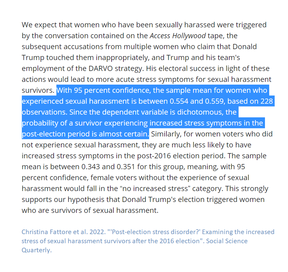
And Fattore et al 2022 has this passage:

With 95 percent confidence, the sample mean for women who experienced sexual harassment is between 0.554 and 0.559, based on 228 observations. Since the dependent variable is dichotomous, the probability of a survivor experiencing increased stress symptoms in the post-election period is almost certain.

I'm not sure how to interpret that passage: Is the 95% confidence interval that thin (0.554, 0.559) based on 228 observations? Is the mean estimate of about 0.554 to 0.559 being interpreted as almost certain? Here is the paragraph that that passage is from.

---

Hansen and Dolan 2022

Political Behavior published Hansen and Dolan 2022 "Cross‑pressures on political attitudes: Gender, party, and the #MeToo movement in the United States".

Table 1 of Hansen and Dolan 2022 reported results from a regression limited to 694 Republican respondents in a 2018 ANES survey, which indicated that the predicted feeling thermometer rating about the #MeToo movement was 5.44 units higher among women than among men, net of controls, with a corresponding standard error of 2.31 and a statistical significance asterisk. However, Hansen and Dolan 2022 interpreted this to not provide sufficient evidence of a gender gap:

In 2018, we see evidence that women Democrats are more supportive of #MeToo than their male co-partisans. However, there was no significant gender gap among Republicans, which could signal that both women and men Republican identifiers were moved to stand with their party on this issue in the aftermath of the Kavanaugh hearings.

Hansen and Dolan 2022 indicated that this inference of no significant gender gap is because, in Figure 1, the relevant 95% confidence interval for Republican men overlapped with the corresponding 95% confidence interval for Republican women.

Footnote 9 of Hansen and Dolan 2022 noted that assessing statistical significance using overlap of 95% confidence intervals is a "more rigorous standard" than using a p-value threshold of p=0.05 in a regression model. But Footnote 9 also claimed that "Research suggests that using non-overlapping 95% confidence intervals is equivalent to using a p < .06 standard in the regression model (Schenker & Gentleman, 2001)", and I don't think that this "p < .06" claim is correct or at least not misleading.

My Stata analysis of the data for Hansen and Dolan 2022 indicated that the p-value for the gender gap among Republicans on this item is p=0.019, which is about what would be expected given data in Table 1 of a t-statistic of 5.44/2.31 and more than 600 degrees of freedom. From what I can tell, the key evidence from Schenker and Gentleman 2001 is Figure 3, which indicates that the probability of a Type 1 error using the overlap method is about equivalent to p=0.06 only when the ratio of the two standard errors is about 20 or higher.

This discrepancy in inferences might have been avoided if 83.4% confidence intervals were more commonly taught and recommended by editors and reviewers, for visualizations in which the key comparison is between two estimates.

---

Footnote 10 of Hansen and Dolan 2022 states:

While Fig. 1 appears to show that Republicans have become more positive towards #MeToo in 2020 when compared to 2018, the confidence bounds overlap when comparing the 2 years.

I'm not sure what that refers to. Figure 1 of Hansen and Dolan 2022 reports estimates for Republican men in 2018, Republican women in 2018, Republican men in 2020, and Republican women in 2020, with point estimates increasing in that order. Neither 95% confidence interval for Republicans in 2020 overlaps with either 95% confidence interval for Republicans in 2018.

---

Other potential errors in Hansen and Dolan 2022:

[1] The code for the 2020 analysis uses V200010a, which is a weight variable for the pre-election survey, even though the key outcome variable (V202183) was on the post-election survey.

[2] Appendix B Table 3 indicates that 47.3% of the 2018 sample was Republican and 35.3% was Democrat, but the sample sizes for the 2018 analysis in Table 1 are 694 for the Republican only analysis and 1001 for the Democrat only analysis.

[3] Hansen and Dolan 2022 refers multiple times to predictions of feeling thermometer ratings as predicted probabilities, and notes for Tables 1 and 2 indicate that the statistical significance asterisk is for "statistical significance at p > 0.05".

---

Conclusion

I sometimes make mistakes, such as misspelling an author's name in a prior post. In 2017, I preregistered an analysis that used overlap of 95% confidence intervals to assess evidence for the difference between estimates, instead of a preferable direct test for a difference. So some of the flaws discussed above are understandable. But I'm not sure why all of these flaws got past review at respectable journals.

Some of the flaws discussed above are, I think, substantial, such as the political bias in Feinberg et al 2022 not reporting a parallel analysis for Hillary Clinton rallies, especially with the Trump rally result being prominent enough to get a fact check from PolitiFact in 2019. Some of the flaws discussed above are trivial, such as "p < .000". But even trivial flaws might justifiably be interpreted as reflecting a review process that is less rigorous than it should be.

---

I think that peer review is valuable at least for its potential to correct errors in analyses and to get researchers to report results that they otherwise wouldn't report, such as a robustness check suggested by a reviewer that undercuts the manuscript's claims. But peer review as currently practiced doesn't seem to do that well enough.

Part of the problem might be that peer review at a lot of political science journals combines [1] assessment of the contribution of the manuscript and [2] assessment of the quality of the analyses, often for manuscripts that are likely to be rejected. Some journals might benefit from having a (or having another) "final boss" who carefully reads conditionally accepted manuscripts only for assessment [2], to catch minor "p < .000" types of flaws, to catch more important "no Clinton rally analysis" types of flaws, and to suggest robustness checks and additional analyses.

But even better might be opening peer review to volunteers, who collectively could plausibly do a better job than a final boss could do alone. I discussed the peer review volunteer idea in this symposium entry. The idea isn't original to me; for example, Meta-Psychology offers open peer review. The modal number of peer review volunteers for a publication might be zero, but there is a good chance that I would have raised the "no Clinton rally analysis" criticism had PS posted a conditionally accepted version of Feinberg et al 2022.

---

Another potentially good idea would be for journals or an organization such as APSA to post at least a small set of generally useful advice, such as reporting results for a test for differences between estimates if the manuscript suggests a difference between estimates. More specific advice could be posted by topic, such as, for count analyses, advice about predicting counts in which the opportunity varies by observation: Lilley and Wheaton 2019 discussed this page, but I think that this page has an explanation that is easier to understand.

---

NOTES

1. It might be debatable whether this is a flaw per se, but Long 2022 "White identity, Donald Trump, and the mobilization of extremism" reported correlational results from a survey experiment but, from what I can tell, didn't indicate whether any outcomes differed by treatment.

2. Data for Hansen and Dolan 2022. Stata code for my analysis:

desc V200010a V202183

svyset [pw=weight]

svy: reg metoo education age Gender race income ideology2 interest media if partyid2=="Republican"

svy: mean metoo if partyid2=="Republican" & women==1

3. The journal Psychological Science is now publishing peer reviews. Peer reviews are also available for the journal Meta-Psychology.

4. Regarding the prior post about Lacina 2022 "Nearly all NFL head coaches are White. What are the odds?", Bethany Lacina discussed that with me on Twitter. I have published an update at that post.

5. I emailed or tweeted to at least some authors of the aforementioned publications discussing the planned comments or indicating at least some of the criticism. I received some feedback from one of the authors, but the author didn't indicate that I had permission to acknowledge the author.

Tagged with: , , , , ,

The Monkey Cage recently published "Nearly all NFL head coaches are White. What are the odds?" [archived], by Bethany Lacina.

Lacina reported analyses that compared observed racial percentages of NFL head coaches to benchmark percentages that are presumably intended to represent what racial percentages of NFL head coaches would occur absent racial bias. For example, Lacina compared the percentage of Whites among NFL head coaches hired since February 2021 (8 of 10, or 80%) to the percentage of Whites among the set of NFL offensive coordinators, defensive coordinators, and recently fired head coaches (which was between 70% and 80% White).

Lacina indicated that:

If the hiring process did not favor White candidates, the chances of hiring eight White people from that pool is only about one in four — or plus-322 in sportsbook terms.

I think that Lacina might have reported the probability that *exactly* eight of the ten recent NFL coach hires were White. But for assessing unfair bias favoring White candidates, it makes more sense to report the probability that *at least* eight of the ten recent NFL coach hires were White: that probability is 38% using a 70% White pool and is 67% using an 80% White pool. See Notes 1 through 3 below.

---

Lacina also conducted an analysis for the one Black NFL head coach among the 14 NFL head coaches in 2021 to 2022 who were young enough to have played in the NCAA between 1999 and 2007, given that demographic data from her source were available starting in 1999. Benchmark percentages were 30% Black from NCAA football players and 44% Black from NCAA Division I football players.

The correctness of Lacina's calculations for this analysis doesn't seem to matter, because the benchmark does not seem to be a reasonable representation of how NFL head coaches are selected. For example, quarterback is the most important player position, and quarterbacks presumably need to know football strategy relatively well compared to players at most or all other positions, so I think that the per capita probability of a college quarterback becoming an NFL head coach is likely nontrivially higher than the per capita probability of players from other positions becoming an NFL head coach; however, Lacina's benchmark doesn't adjust for player position.

---

None of the above analysis should be interpreted to suggest that selection of NFL head coaches has been free from racial bias. But I think that it's reasonable to suggest that the Lacina analysis isn't very informative either way.

---

NOTES

1. Below is R code for a simulation that returns a probability of about 24%, for the probability that *exactly* eight of ten candidates are White, drawn without replacement from a candidate pool of 32 offensive coordinators and 32 defensive coordinators that is overall 70% White:

SET  <- c(rep_len(1,45),rep_len(0,19))
LIST <- c()
for (i in 1:100000){
   LIST[i] <- sum(sample(SET,10,replace=F))
}
table(LIST)
length(LIST[LIST==8])/length(LIST)

The probability is about 32% if the pool of 64 is 80% White. Adding in a few recently fired head coaches doesn't change the percentage much.

2. In reality, 8 White candidates were hired for the 10 NFL head coaching positions. So how do we assess the extent to which this observed result suggests unfair bias in favor of White candidates? Let's first get results from the simulation...

For my 100,000-run simulation using the above code and a random seed of 123, the simulation produced exactly zero White head coaches zero times, exactly 1 White head coach 5 times, exactly 2 White head coaches 52 times, exactly 3 White head coaches 461 times, exactly 4 White head coaches 2654 times, exactly 5 White head coaches 9255 times, exactly 6 White head coaches 20987 times, exactly 7 White head coaches 29307 times, exactly 8 White head coaches 24246 times, exactly 9 White head coaches 10978 times, and exactly 10 White head coaches 2055 times.

The simulation indicated that, if candidates were randomly drawn from a 70% White pool, exactly 8 of 10 coaches would be White about 24% of the time (24,246/100,000). This 8-of-10 result represents a selection of candidates from the pool that is perfectly fair with no evidence of bias for *or against* White candidates.

The 8-of-10 result would be the proper focus if our interest were bias for *or against* White candidates. But the Lacina post didn't seem concerned about evidence of bias against White candidates, so the 9 White of 10 simulation result and the 10 White of 10 simulation result should be added to the totals to get 37%: the 9 of 10 and 10 of 10 represent simulated outcomes in which White candidates were underrepresented in reality relative to that outcome from the simulation. So the 8 of 10 represents no bias and the 9 of 10 and the 10 of 10 represent bias against Whites, so that everything else represents bias favoring Whites.

3. Below is R code for a simulation that returns a probability of about 37%, for the probability that *at least* eight of ten candidates are White, drawn with replacement from a candidate pool of 32 offensive coordinators and 32 defensive coordinators that is overall 70% White:

SET <- c(rep_len(1,45),rep_len(0,19))
LIST <- c()
for (i in 1:100000){
   LIST[i] <- sum(sample(SET,10,replace=F))
}
table(LIST)
length(LIST[LIST>=8])/length(LIST)

---

UPDATE

I corrected some misspellings of "Lacinda" to "Lacina" in the post.

---

UPDATE 2 (March 18, 2022)

Bethany Lacina discussed with me her calculation. She indicated that she did calculate at least eight of ten, but she used a joint probability method that I don't think is correct because random error would bias the inference toward unfair selection of coaches by race. Given the extra information that Bethany provided, here is a revised calculation that produces a probability of about 60%:

# In 2021: 2 non-Whites hired of 6 hires.
# In 2022: 0 non-Whites hired of 4 hires (up to the point of the calculation).
# The simulation below is for the probability that at least 8 of the 10 hires are White.

SET.2021 <- c(rep_len(0,12),rep_len(1,53)) ## 1=White candidate
SET.2022 <- c(rep_len(0,20),rep_len(1,51)) ## 1=White candidate
LIST <- c()

for (i in 1:100000){
DRAW.2021 <- sum(sample(SET.2021,6,replace=F)) 
DRAW.2022 <- sum(sample(SET.2022,4,replace=F)) 
LIST[i] <- DRAW.2021 + DRAW.2022
}

table(LIST)
length(LIST[LIST>=8])/length(LIST)
Tagged with: , ,

Political Behavior recently published Filindra et al 2022 "Beyond Performance: Racial Prejudice and Whites' Mistrust of Government". Hypothesis 1 is the expectation that "...racial prejudice (anti-Black stereotypes) is a negative and significant predictor of trust in government".

Filindra et al 2022 limits the analysis to White respondents and measures anti-Black stereotypes by combining responses to available items in which respondents rate Blacks on seven-point scales, ranging from hardworking to lazy, and/or from peaceful to violent, and/or from intelligent to unintelligent. The data include items about how respondents rate Whites on these scales, but Filindra et al 2022 didn't use these responses to measure anti-Black stereotyping.

But information about how respondents rate Whites is useful for measuring anti-Black stereotyping. For example, a respondent who rates all racial groups at the midpoint of a stereotype scale hasn't indicated an anti-Black stereotype; this respondent's rating about Blacks doesn't differ from the respondent's rating about other racial groups, and it's not clear to me why rating Blacks equal to all other racial groups would be a moderate amount of "prejudice" in this case.

But this respondent who rated all racial groups equally on the stereotype scales nonetheless falls halfway along the Filindra et al 2022 measure of "negative Black stereotypes", in the same location as a respondent who rated Blacks at the midpoint of the scale and rated all other racial groups at the most positive end of the scale.

---

I think that this flawed measurement means that more analyses need to be conducted to know whether the key Filindra et al 2022 finding is merely due to the flawed measure of racial prejudice. Moreover, I think that more analyses need to be conducted to know whether Filindra et al 2022 overlooked evidence of the effect of prejudice against other racial groups.

Filindra et al 2022 didn't indicate whether their results held when using a measure of anti-Black stereotypes that placed respondents who rated all racial groups equally into a different category than respondents who rated Blacks less positively than all other racial groups and a different category than respondents who rated Blacks more positively than all other racial groups. Filindra et al 2022 didn't even report results when their measure of anti-White stereotypes was included in the regressions estimating the effect of anti-Black stereotypes.

A better review process might have produced a Filindra et al 2022 that resolved questions such as: Is the key Filindra et al 2022 finding merely because respondents who don't trust the government rate *all* groups relatively low on stereotype scales? Is the key finding because anti-Black stereotypes and anti-White stereotypes and anti-Hispanic stereotypes and anti-Asian stereotypes *each* reduce trust in government? Or are anti-Black stereotypes the *only* racial stereotypes that reduce trust in government?

Even if anti-Black stereotypes among Whites is the most important combination of racial prejudice and respondent demographics, other combinations of racial stereotype and respondent demographics are important enough to report on and can help readers better understand racial attitudes and their consequences.

---

NOTES

1. Filindra et al 2022 did note that:

Finally, another important consideration is the possibility that other outgroup attitudes or outgroup-related policy preferences may also have an effect on public trust.

That's sort of close to addressing some of the alternate explanations that I suggested, but the Filindra et al 2022 measure for this is a measure about immigration *policy* and not, say, the measures of stereotypes about Hispanics and about Asians that are included in the data.

2. Filindra et al 2022 suggested that:

Future research should focus on the role of attitudes towards immigrants and other racial groups—such as Latinos— and ethnocentrism more broadly in shaping white attitudes toward government.

But it's not clear to me why such analyses aren't included in Filindra et al 2022.

Maybe the expectation is that another publication should report results that include the measures of anti-Hispanic stereotypes and anti-Asian stereotypes in the ANES data. And another publication should report results that include the measures of anti-White stereotypes in the ANES data. And another publication should report results that include or focus on respondents in the ANES data who aren't White. But including all this in Filindra et al 2022 or its supplemental information would be more efficient and could produce a better understanding of political attitudes.

3. Filindra et al 2022 indicated that:

All variables in the models are rescaled on 0–1 scales consistent with the nature of the original variable. This allows us to conceptualize the coefficients as maximum effects and consequently compare the size of coefficients across models.

Scaling all predictors to range from 0 to 1 means that comparison of coefficients likely produces better inferences than if the predictors were on different scales, but differences in 0-to-1 coefficients can also be due to differences in the quality of the measurement of the underlying concept, as discussed in this prior post.

4. Filindra et al 2022 justified not using a differenced stereotype measure, citing evidence such as (from footnote 2):

Factor analysis of the Black and white stereotype items in the ANES confirms that they do not fall on a single dimension.

The reported factor analysis was on ANES 2020 data and included a measure of "lazy" stereotypes about Blacks, a measure of "violent" stereotypes about Blacks, a feeling thermometer about Blacks, a measure of "lazy" stereotypes about Whites, a measure of "violent" stereotypes about Whites, and a feeling thermometer about Whites.[*] But a "differenced" stereotype measure shouldn't be constructed by combining measures like that, as if the measure of "lazy" stereotypes about Blacks is independent of the measure of "lazy" stereotypes about Whites.

A "differenced" stereotype measure could be constructed by, for example, subtracting the "lazy" rating about Whites from the "lazy" rating about Blacks, subtracting the "violent" rating about Whites from the "violent" rating about Blacks, and then summing these two differences. That measure could help address the alternate explanation that the estimated effect for rating Blacks low is because respondents who rate Blacks low also rate all other groups low. That measure could also help address the concern that using only a measure of stereotypes about Blacks underestimates the effect of these stereotypes.

Another potential coding is a categorical measure, coded 1 for rating Blacks lower than Whites on all stereotype measures, 2 for rating Blacks equal to Whites on all stereotype measures, coded 3 for rating Blacks higher than Whites on all stereotype measures, and coded 4 for a residual category. The effect of anti-Black stereotypes could be estimated as the difference net of controls between category 1 and category 2.

Filindra et al 2022 provided justifications other than the factor analysis for not using a differenced stereotype measure, but, even if you agree that stereotype scale ratings about Blacks should not be combined with stereotype scale ratings about Whites, the Filindra et al 2022 arguments don't preclude including their measure of anti-White prejudice as a separate predictor in the analyses.

[*] I'm not sure why the feeling thermometer responses were included in a factor analysis intended to justify not combining stereotype scale responses.

5. I think that labels for the panels of Filindra et al 2022 Figure 1 and the corresponding discussion in the text are backwards: the label for each plot in Figure 1a appears to be "Negative Black Stereotypes", but the Figure 1a label is "Public Trust"; the label for each plot in Figure 1b appears to be "Level of Trust in Govt", but the Figure 1b label is "Anti-Black stereotypes".

My histogram of the Filindra et al 2022 measure of anti-Black stereotypes for the ANES 2020 Time Series Study looks like their 2020 plot in Figure 1a.

6. I'm not sure what the second sentence is supposed to mean, from this part of the Filindra et al 2022 conclusion:

Our results suggest that white Americans' beliefs about the trustworthiness of the federal government have become linked with their racial attitudes. The study shows that even when racial policy preferences are weakly linked to trust in government racial prejudice does not. Analyses of eight surveys...

7. Data source for my analysis: American National Election Studies. 2021. ANES 2020 Time Series Study Full Release [dataset and documentation]. July 19, 2021 version. www.electionstudies.org.

Tagged with: , , , , ,

Below are leftover comments on publications that I read in 2021.

---

ONO AND ZILIS 2021

Politics, Groups, and Identities published Ono and Zilis 2021, "Do Americans perceive diverse judges as inherently biased?". Ono and Zilis 2021 indicated that "We test whether Americans perceive diverse judges as inherently biased with a list experiment". The statements to test whether Americans perceive diverse judges to be "inherently biased" were:

When a court case concerns issues like #metoo, some women judges might give biased rulings.

When a court case concerns issues like immigration, some Hispanic judges might give biased rulings.

Ono and Zilis 2021 indicated that "...by endorsing that idea, without evidence, that 'some' members of a group are inclined to behave in an undesirable way, respondents are engaging in stereotyping" (pp. 3-4).

But statements about whether *some* Hispanic judges and *some* women judges *might* be biased can't measure stereotypes or the belief that Hispanic judges or women judges are *inherently* biased. For example, a belief that *some* women *might* commit violence doesn't require the belief that women are inherently violent and doesn't even require the belief that women are on average more violent than men are.

---

Ono and Zilis 2021 claimed that "Hispanics do not believe that Hispanic judges are biased" (p. 4, emphasis in the original), but, among Hispanic respondents, the 95% confidence interval for agreement with the claim that Hispanic judges might be biased in cases involving issues like immigration did not cross zero in the multivariate analyses in Figure 1.

For Table 2 analyses without controls, the corresponding point estimate indicated that 25 percent of Hispanics agreed with the claim about Hispanic judges, but the ratio of the relevant coefficient to standard error was 0.25/0.15, which is about 1.67, depending on how the 0.25 and 0.15 were rounded. The corresponding p-value isn't less than p=0.05, but that doesn't support the conclusion that the percentage of Hispanics that agreed with the statement is zero.

---

BERRY ET AL 2021

Politics, Groups, and Identities published Berry et al 2021,"White identity politics: linked fate and political participation". Berry et al 2021 claimed to have found "notable partisan differences in the relationship between racial linked fate and electoral participation for White Americans". But this claim is based on differences in the presence of statistical significance between estimates for White Republicans and estimates for White Democrats ("Linked fate is significantly and consistently associated with increased electoral participation for Republicans, but not Democrats", p. 528), instead of being based on statistical tests of whether estimates for White Republicans differ from estimates for White Democrats.

The estimates in the Berry et al 2021 appendix that I highlighted in yellow appear to be incorrect, in terms of plausibility and based on the positive estimate in the corresponding regression output.

---

ARCHER AND CLIFFORD FORTHCOMING

In "Improving the Measurement of Hostile Sexism" (reportedly forthcoming at Public Opinion Quarterly), Archer and Clifford proposed a modified version of the hostile sexism scale that is item specific. For example, instead of measuring responses about the statement "Women exaggerate problems they have at work", the corresponding item-specific item measures responses to the question of "How often do women exaggerate problems they have at work?". Thus, to get the lowest score on the hostile sexism scale, instead of merely strongly disagreeing that women exaggerate problems they have at work, respondents must report the belief that women *never* exaggerate problems they have at work.

---

Archer and Clifford indicated that responses to some of their revised items are measured on a bipolar scale. For example, respondents can indicate that women are offended "much too often", "a bit too often", "about the right amount", "not quite often enough", or "not nearly often enough". So to get the lowest hostile sexism score, respondents need to indicate that women are wrong about how often they are offended, by not being offended enough.

Scott Clifford, co-author of the Archer and Clifford article, engaged me in a discussion about the item specific scale (archived here). Scott suggested that the low end of the scale is more feminist, but dropped out of the conversation after I asked how much of an OLS coefficient for the proposed item-specific hostile sexism scale is due to hostile sexism and how much is due to feminism.

The portion of the hostile sexism measure that is sexism seems like something that should have been addressed in peer review, if the purpose of a hostile sexism scale is to estimate the effect of sexism and not to merely estimate the effect of moving from highly positive attitudes about women to highly negative attitudes about women.

---

VIDAL ET AL 2021

Social Science Quarterly published Vidal et al,"Identity and the racialized politics of violence in gun regulation policy preferences". Appendix A indicates that, for the American National Election Studies 2016 Time Series Study, responses to the feeling thermometer about Black Lives Matter ranged from 0 to 999, with a standard deviation of 89.34, even though the ANES 2016 feeling thermometer for Black Lives Matter ran from 0 to 100, with 999 reserved for respondents who indicate that they don't know what Black Lives Matter is.

---

ARORA AND STOUT 2021

Research & Politics published Arora and Stout 2021 "After the ballot box: How explicit racist appeals damage constituents views of their representation in government", which noted that:

The results provide evidence for our hypothesis that exposure to an explicitly racist comment will decrease perceptions of interest representation among Black and liberal White respondents, but not among moderate and conservative Whites.

This is, as far as I can tell, a claim that the effect among Black and liberal White respondents will differ from the effect among moderate and conservative Whites, but Arora and Stout 2021 did not report a test of whether these effects differ, although Arora and Stout 2021 did discuss statistical significance for each of the four groups.

Moreover, Arora and Stout 2021 footnote 4 indicates that:

In the supplemental appendix, we confirm that explicit racial appeals have a unique effect on interest representation and are not tied to other candidate evaluations such as vote choice.

But the estimated effect for interest representation (Table 1) was -0.06 units among liberal White respondents (with a "+" indicator for statistical significance), which is the same reported number as the estimated effect for vote choice (Table A5): -0.06 units among liberal White respondents (with a "+" indicator for statistical significance).

None of the other estimates in Table 1 or Table A5 have an indicator for statistical significance.

---

Arora and Stout 2021 repeatedly labeled as "explicitly racist" the statement that "If he invited me to a public hanging, I'd be on the front row", but it's not clear to me how that statement is explicitly racist. The Data and Methodology section indicates that "Though the comment does not explicitly mention the targeted group...". Moreover, the Conclusion of Arora and Stout 2021 indicates that...

In spite of Cindy Hyde-Smith's racist comments during the 2018 U.S. Senate election which appeared to show support for Mississippi's racist and violent history, she still prevailed in her bid for elected office.

... and "appeared to" isn't language that I would expect from an explicit statement.

---

CHRISTIANI ET AL 2021

The Journal of Race, Ethnicity, and Politics published Christiani et al 2021 "Masks and racial stereotypes in a pandemic: The case for surgical masks". The abstract indicates that:

...We find that non-black respondents perceive a black male model as more threatening and less trustworthy when he is wearing a bandana or a cloth mask than when he is not wearing his face covering—especially those respondents who score above average in racial resentment, a common measure of racial bias. When he is wearing a surgical mask, however, they do not perceive him as more threatening or less trustworthy. Further, it is not that non-black respondents find bandana and cloth masks problematic in general. In fact, the white model in our study is perceived more positively when he is wearing all types of face coverings.

Those are the within-model patterns, but it's interesting to compare ratings of the models in the control, pictured below:

Appendix Table B.1 indicates that, on average, non-Black respondents rated the White model more threatening and more untrustworthy compared to the Black model: on a 0-to-1 scale, among non-Black respondents, the mean ratings of "threatening" were 0.159 for the Black model and 0.371 for the White model, and the mean ratings of "untrustworthy" were 0.128 for the Black model and 0.278 for the White model. These Black/White gaps were about five times the standard errors.

Christiani et al 2021 claimed that this baseline difference does not undermine their results:

Fortunately, the divergent evaluations of our two models without their masks on do not undermine either of the main thrusts of our analyses. First, we can still compare whether subjects perceive the black model differently depending on what type of mask he is wearing...Second, we can still assess whether people resolve the ambiguity associated with seeing a man in a mask based on the race of the wearer.

But I'm not sure that it is true, that "divergent evaluations of our two models without their masks on do not undermine either of the main thrusts of our analyses".

I tweeted a question to one of the Christiani et al 2021 co-authors that included the handles of two other co-authors, asking whether it was plausible that masks increase the perceived threat of persons who look relatively nonthreatening without a mask but decrease the perceived threat of persons who look relatively more threatening without a mask. That phenomenon would explain the racial difference in patterns described in the abstract, given that the White model in the control was perceived to be more threatening than the Black model in the control.

No co-author has yet responded to defend their claim.

---

Below are the mean ratings on the 0-to-1 "threatening" scale for models in the "no mask" control group, among non-Black respondents by high and low racial resentment, based on Tables B.2 and B.3:

Non-Black respondents with high racial resentment
0.331 mean "threatening" rating of the White model
0.376 mean "threatening" rating of the Black model

Non-Black respondents with low racial resentment
0.460 mean "threatening" rating of the White model
0.159 mean "threatening" rating of the Black model

---

VICUÑA AND PÉREZ 2021

Politics, Groups, and Identities published Vicuña and Pérez 2021, "New label, different identity? Three experiments on the uniqueness of Latinx", which claimed that:

Proponents have asserted, with sparse empirical evidence, that Latinx entails greater gender-inclusivity than Latino and Hispanic. Our results suggest this inclusivity is real, as Latinx causes individuals to become more supportive of pro-LGBTQ policies.

The three studies discussed in Vicuña and Pérez 2021 had these prompts, with the bold font in square brackets indicating the differences in treatments across the four conditions:

Using the spaces below, please write down three (3) attributes that make you [a unique person/Latinx/Latino/Hispanic]. These could be physical features, cultural practices, and/or political ideas that you hold [as a member of this group].

If the purpose is to assess whether "Latinx" differs from "Latino" and "Hispanic", I'm not sure of the value of the "a unique person" treatment.

Discussing their first study, Vicuña and Pérez 2021 reported the p-value for the effect of the "Latinx" treatment relative to the "unique person" treatment (p<.252) and reported the p-values for the effect of the "Latinx" treatment relative to the "Latino" treatment (p<.046) and the "Hispanic" treatment (p<.119). Vicuña and Pérez 2021 reported all three corresponding p-values when discussing their second study and their third study.

But, discussing their meta-analysis of the three studies, Vicuña and Pérez 2021 reported one p-value, which is presumably for the effect of the "Latinx" treatment relative to the "unique person" treatment.

I tweeted a request Dec 20 to the authors to post their data, but I haven't received a reply yet.

---

KIM AND PATTERSON JR. 2021

Political Science & Politics published Kim and Patterson Jr. 2021, "The Pandemic and Gender Inequality in Academia", which reported on tweets of tenure-track political scientists in the United States.

Kim and Patterson Jr. 2021 Figure 2 indicates that, in February 2020, the percentage of work-related tweets was about 11 percent for men and 11 percent for women, and that, shortly after Trump declared a national emergency, these percentages had dropped to about 8 percent and 7 percent respectively. Table 2 reports difference-in-difference results indicating that the pandemic-related decrease in the percentage of work-related tweets was 1.355 percentage points larger for women than for men.

That seems like a relatively small gender inequality in size and importance, and I'm not sure that this gender inequality in percentage of work-related tweets offsets the advantage of having the 31.5k follower @womenalsoknow account tweet about one's research.

---

The abstract of Kim and Patterson Jr. 2021 refers to "tweets from approximately 3,000 political scientists". Table B1 in Appendix B has sample size of 2,912, with a larger number of women than men at the rank of assistant professor, at the rank of associate professor, and at the rank of full professor. The APSA dashboard indicates that women were 37% of members of the American Political Science Association and that 79.5% of APSA members are in the United States, so I think that Table B1 suggests that a higher percentage of female political scientists might be on Twitter than male political scientists.

Oddly, though, when discussing the representatives of this sample, Kim and Patterson Jr. 2021 indicated that (p. 3):

Yet, relevant to our design, we found no evidence that female academics are less likely to use Twitter than male colleagues conditional on academic rank.

That's true about not being *less* likely, but my analysis of the data for Kim and Patterson Jr. 2021 Table 1 indicated that, controlling for academic rank, about 5 percent more female political scientists from top 50 departments were on Twitter, compared to male political scientists from top 50 departments.

Table 1 of Kim and Patterson Jr. 2021 is limited to the 1,747 tenure-track political scientists in the United States from top 50 departments. I'm not sure why Kim and Patterson Jr. 2021 didn't use the full N=2,912 sample for the Table 1 analysis.

---

My analysis indicated that the female/male gaps in the sample were as follows: 2.3 percentage points (p=0.655) among assistant professors, 4.5 percentage points (p=0.341) among associate professors, and 6.7 percentage points (p=0.066) among full professors, with an overall 5 percentage point male/female gap (p=0.048) conditional on academic rank.

---

Kim and Patterson Jr. 2021 suggest a difference in the effect by rank:

Disaggregating these results by academic rank reveals an effect most pronounced among assistants, with significant—albeit smaller—effects for associates. There is no differential effect on work-from-home at the rank of full professor, which is consistent with our hypothesis that these gaps are driven by the increased obligations placed on women who are parenting young children.

But I don't see a test for whether the coefficients differ from each other. For example, in Table 2 for work-related tweets, the "Female * Pandemic" coefficient is -1.188 for associate professors and is -0.891 for full professors, for a difference of 0.297, relative to the respective standard errors of 0.579 and 0.630.

---

Table 1 of Kim and Patterson Jr. 2021 reported a regression predicting whether a political scientist in a top 50 department was a Twitter user, and the p-values are above p=0.05 for all coefficients for "female" and for all interactions involving "female". That might be interpreted as a lack of evidence for a gender difference in Twitter use among these political scientists, but the interaction terms don't permit a clear inference about an overall gender difference.

For example, associate professor is the omitted category of rank in the regression, so the 0.045 non-statistically significant "female" coefficient indicates only that female associate professor political scientists from top 50 departments were 4.5 percentage points more likely to be a Twitter user than male associate professor political scientists from top 50 departments.

And the non-statistically significant "Female X Assistant" coefficient doesn't indicate whether female assistant professors differ from male assistant professors: instead, the non-statistically significant "Female X Assistant" coefficient indicates only that the associate/assistant difference among men in the sample does not differ at p<0.05 from the associate/assistant difference among women in the sample.

Link to the data. R code for my analysis. R output from my analysis.

---

LEFTOVER PLOT

I had the plot below for a draft post that I hadn't yet published:

Item text: "For each of the following groups, how much discrimination is there in the United States today?" [Blacks/Hispanics/Asians/Whites]. Substantive response options were: A great deal, A lot, A moderate amount, A little, and None at all.

Data source: American National Election Studies. 2021. ANES 2020 Time Series Study Preliminary Release: Combined Pre-Election and Post-Election Data [dataset and documentation]. March 24, 2021 version. www.electionstudies.org.

Stata and R code. Dataset for the plot.

Tagged with: , , , ,