R graph: barplot
If I remember correctly, my first introduction to R came when fellow Pitt graduate student Hirokazu Kikuchi requested that R be installed on the polisci lab computers. I looked into R and found this webpage based on a 2007 Perspectives on Politics article by Jonathan Kastellec and Eduardo Leoni. That link is a good place to start, but in this post I'll introduce a few lines of code to illustrate how nice and easy R can be. (Not that R is always easy.)
I'll indicate lines of R code in bold.
---
less5 <- c(40.91, 7.67, 7.11, 6.19, 15.65, 6.4, 4.57, 4.43, 2.42, 4.66)
The above command assigns the ten numbers (from 40.91 to 4.66) to a vector called "less5." c() is a concatenation function. The following command does the same thing:
c(40.91, 7.67, 7.11, 6.19, 15.65, 6.4, 4.57, 4.43, 2.42, 4.66) -> less5
---
barplot (less5, main="Countries with a mean < 5", ylab="Percent", ylim=c(0, 40), names=c("1", "2", "3", "4", "5", "6", "7", "8", "9", "10"))
The barplot function tells R to plot a bar chart. These are the arguments: less 5 indicates the vector to plot, main="Countries with a mean < 5" indicates the main plot title, ylab="Percent" indicates the label for the y-axis, ylim=c(0, 40) indicates that the y-axis should run from 0 to 40, and names=c("1", "2", "3", "4", "5", "6", "7", "8", "9", "10")) indicates the set of names that should be placed below the set of bars.
Here's what this graph looks like, based on the two lines of code:
 ---
---
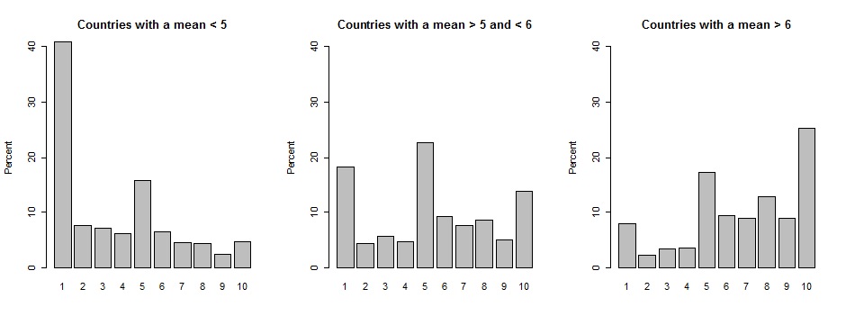
Let's plot three graphs together. Here's the code for graphs 2 and 3:
from56 <- c(18.35, 4.41, 5.68, 4.61, 22.63, 9.31, 7.63, 8.65, 4.99, 13.75)
barplot (from56, main="Countries with a mean > 5 and < 6", ylab="Percent", ylim=c(0, 40), names=c("1", "2", "3", "4", "5", "6", "7", "8", "9", "10"))
more6 <- c(7.99, 2.26, 3.37, 3.62, 17.29, 9.46, 8.95, 12.83 ,8.93, 25.3)
barplot (more6, main="Countries with a mean > 6", ylab="Percent", ylim=c(0, 40), names=c("1", "2", "3", "4", "5", "6", "7", "8", "9", "10"))
Let's put the par function at the top of the code to tell R how to plot these three graphs:
par(mfrow=c(1, 3))
The above line of code tells R to plot 1 row and 3 columns of plots. Here's the output:
 This is the output for par(mfrow=c(3, 1)):
 ---
---
That's it for this post: here is a text file of the code. By the way, the graph above can be found in my article on midpoint misperceptions.
Leave a Reply